

Tag Archives: laundry rooms

Color Me Home Episode 12: The Keys to a Happier Laundry Room
Did you know that on average, a mom can spend up to 5 months of her life doing laundry per child! On today’s episode, Betsy and Dan talk about how the right color–used in the right spots–can help you make your laundry room a better–possibly even happier–place to be.
Check out all the laundry room ideas we discussed on the episode!
- The Thrilling (Depressing) News Article about Laundry! (0:48)
- The Importance of Color in Decorating (4:00)
- A Brief Overview of the Psychology of Color (4:24)
- Choose Color Based on Your Goals for the Room: (6:17)
- Great Colors for Laundry Rooms (6:50)
- How To Bring Color Into Your Room
- Put the Color on the Walls (7:30)
- Tips for Working With Yellow in Your Decorating: (9:32)
- Put the Color on the Cabinets (12:11)
- Bring in Unexpected “Pops” of Color (16:22)
- Put the Color on the Walls (7:30)
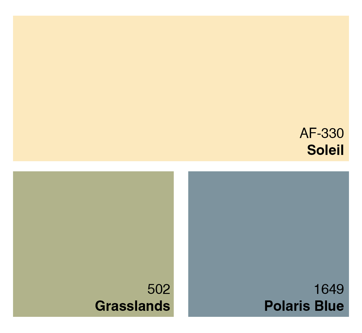
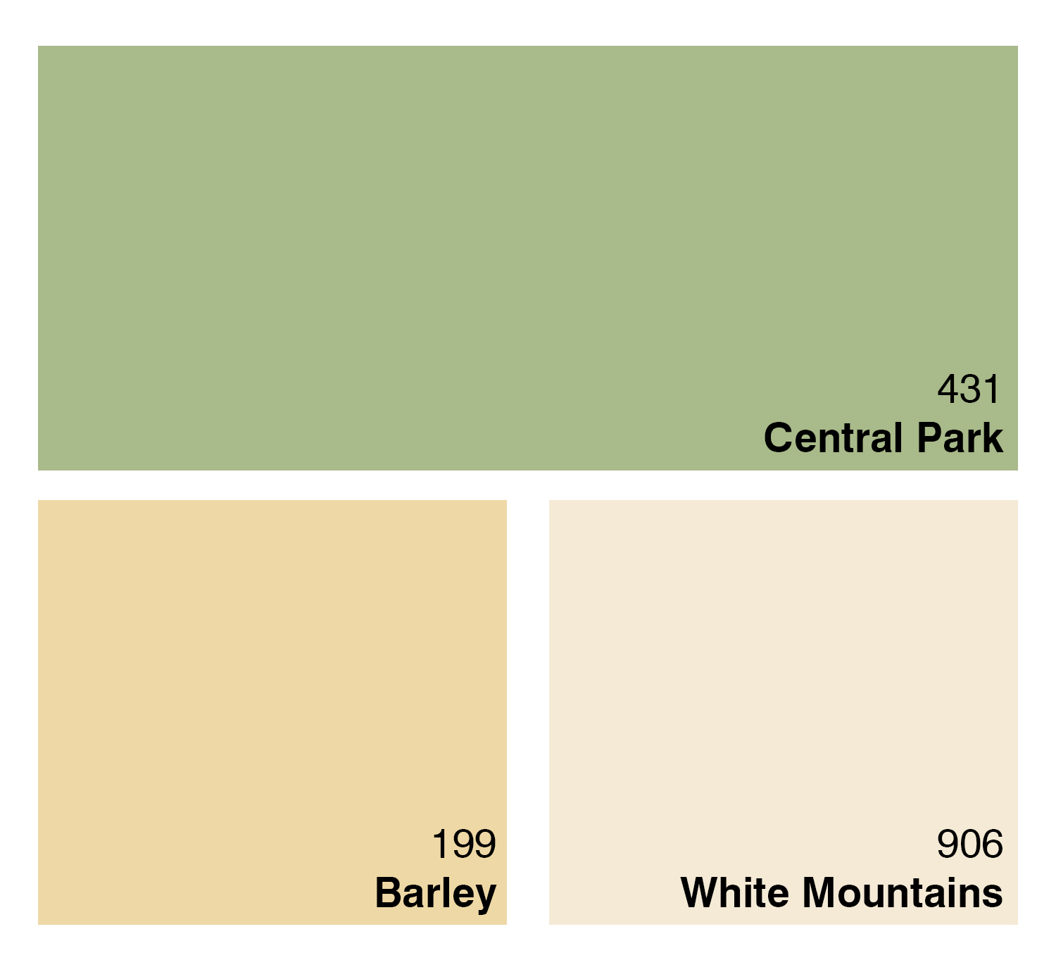
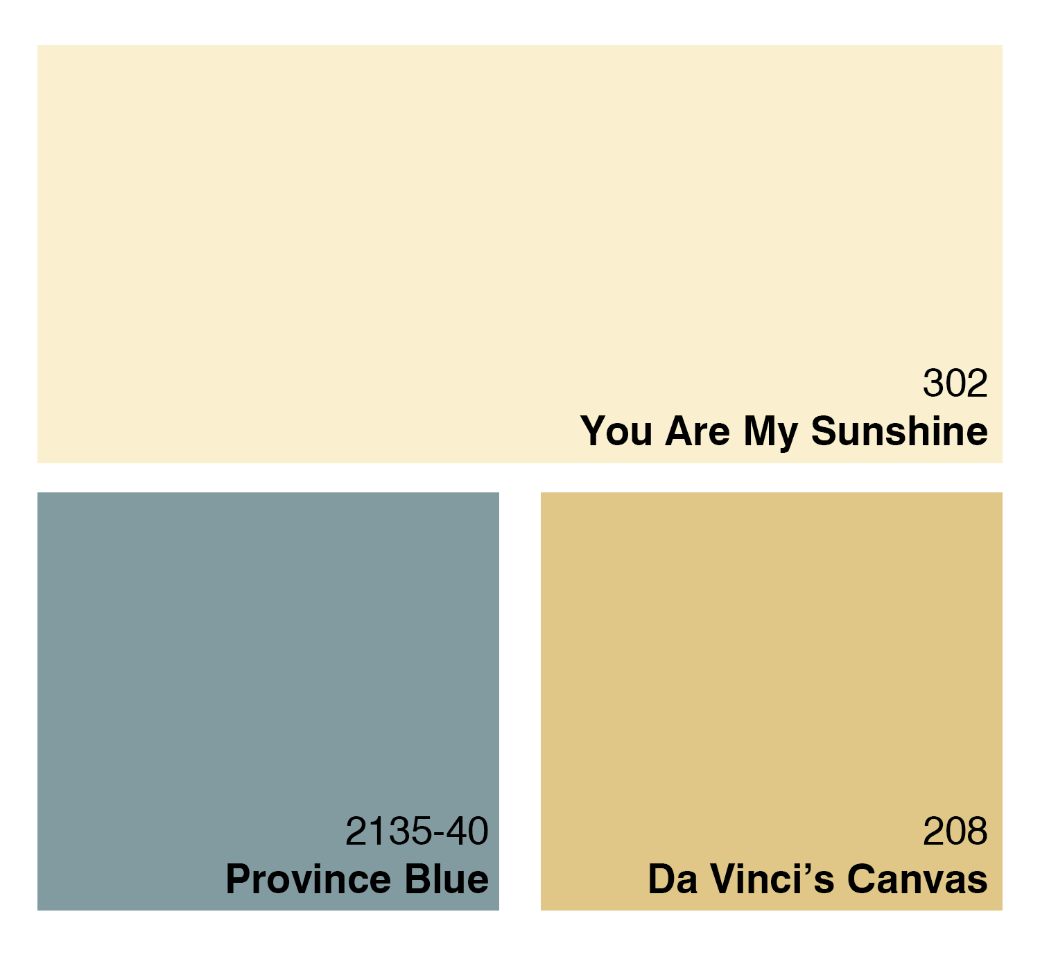
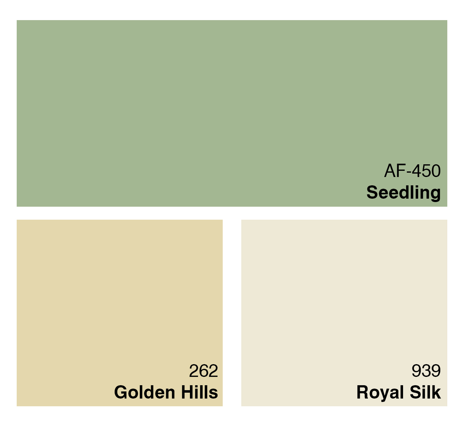
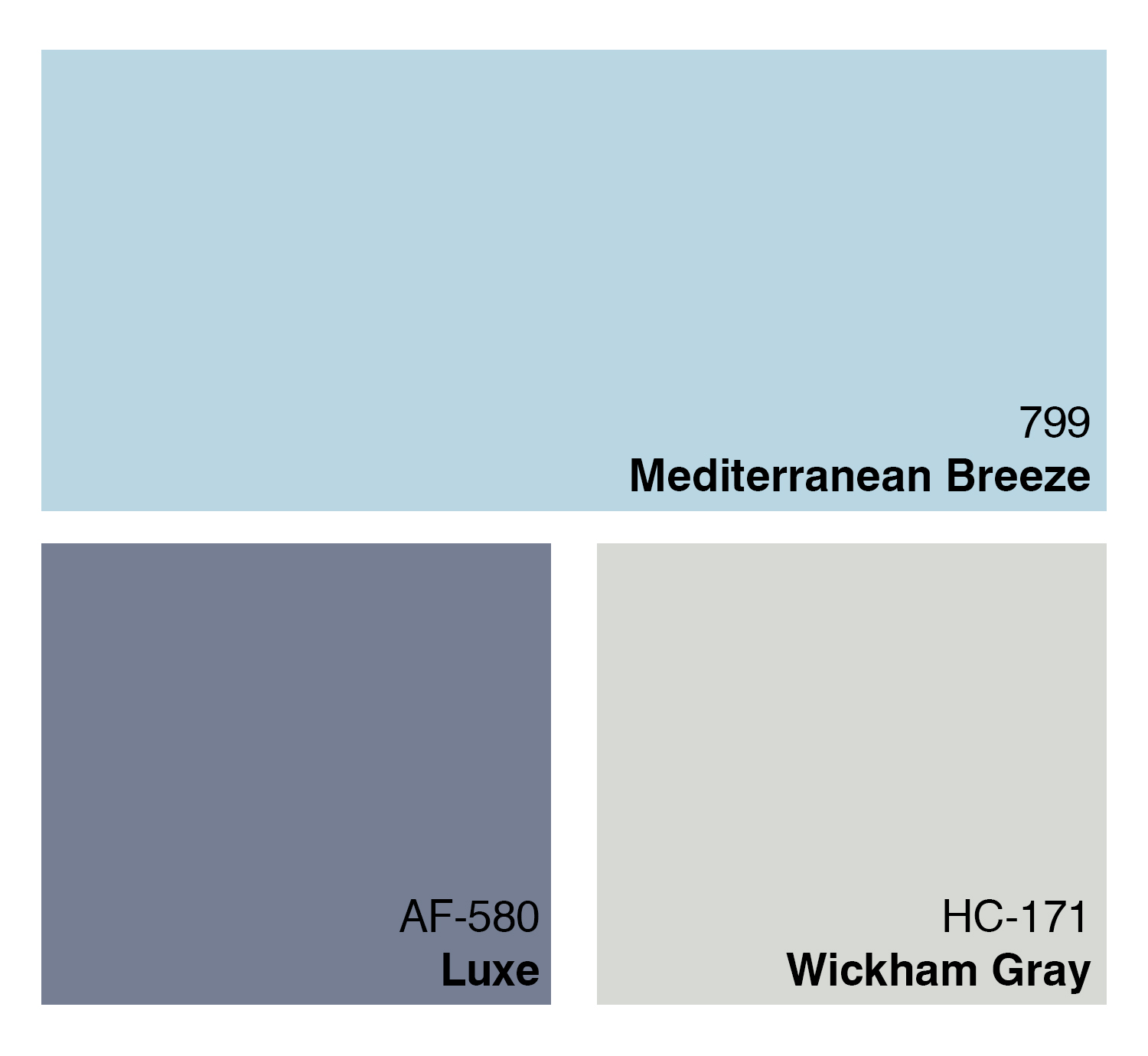
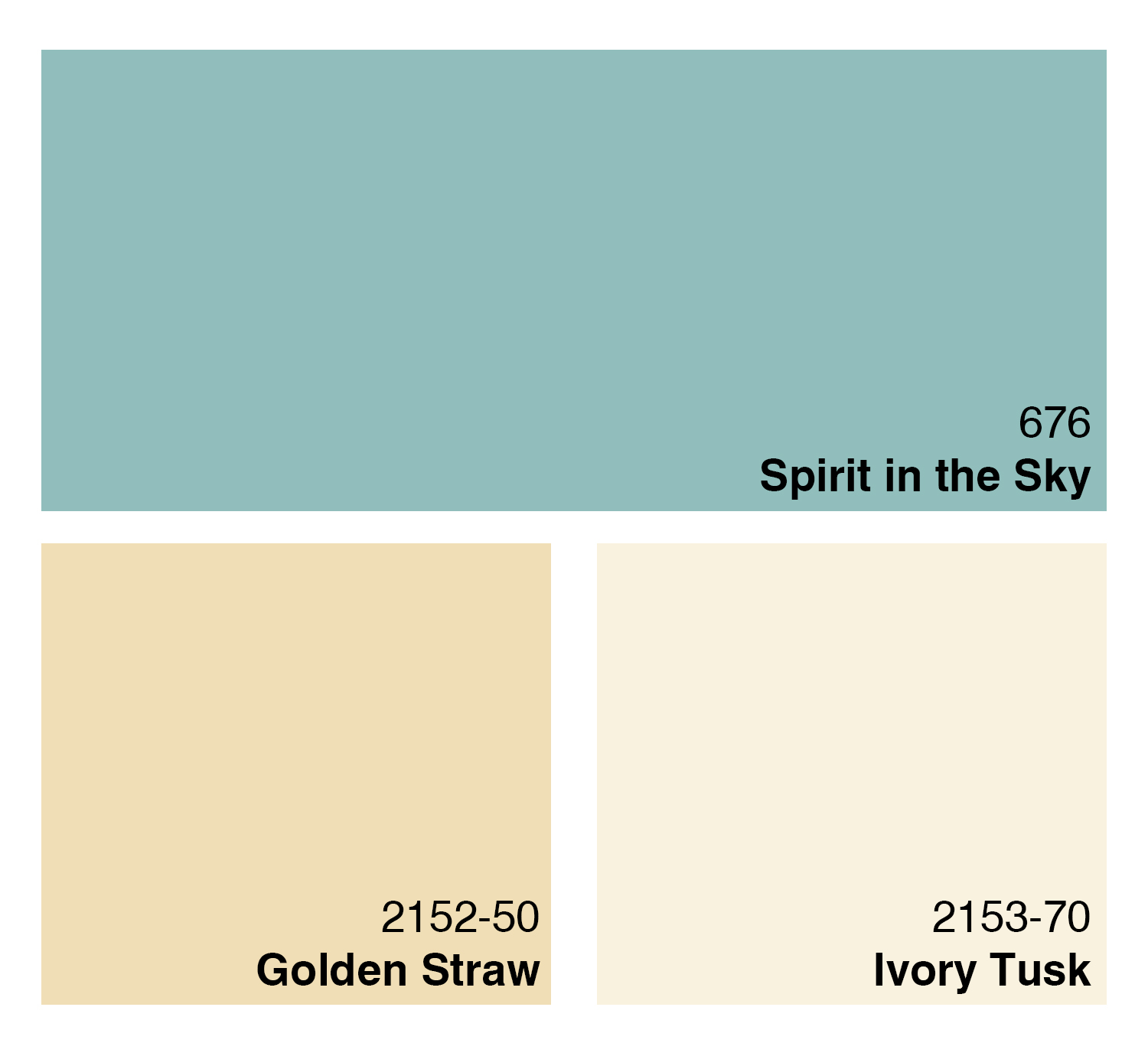
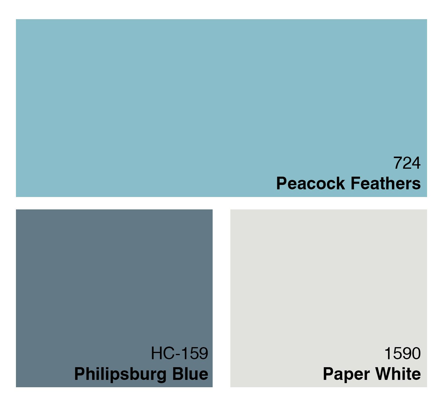
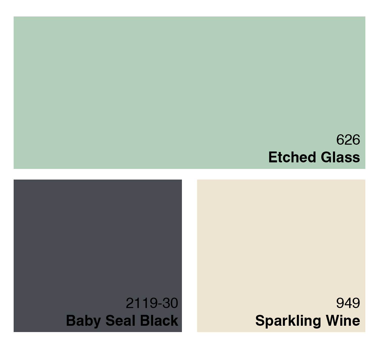
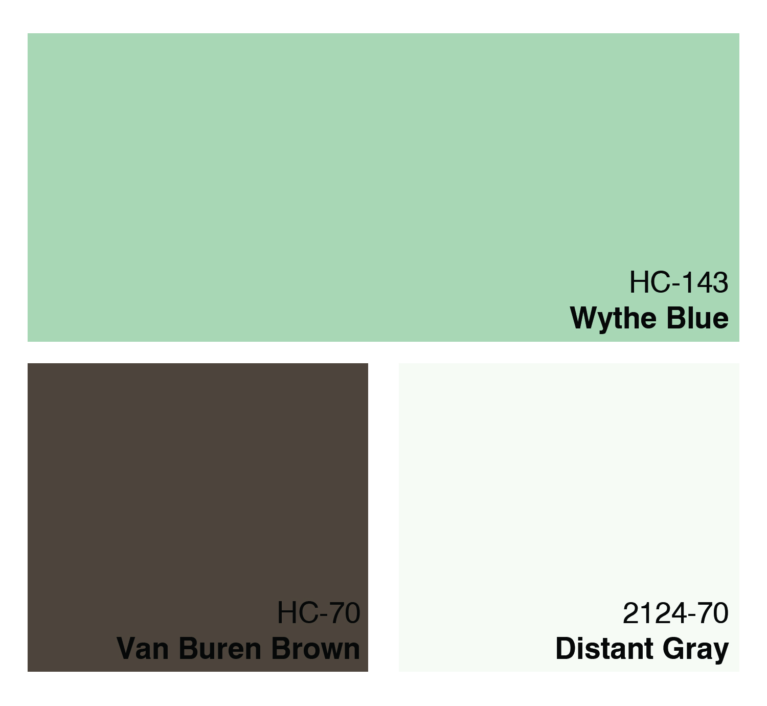
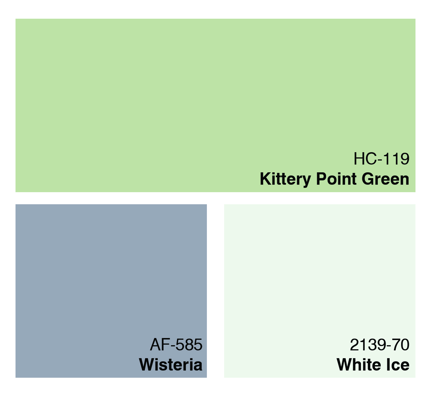
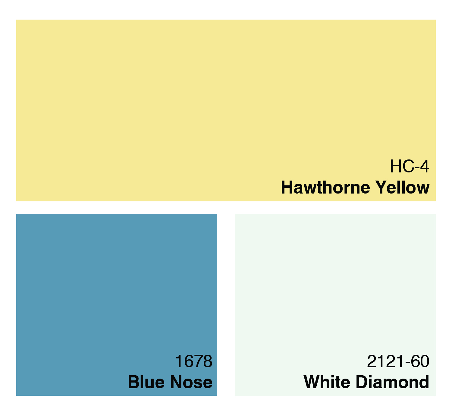
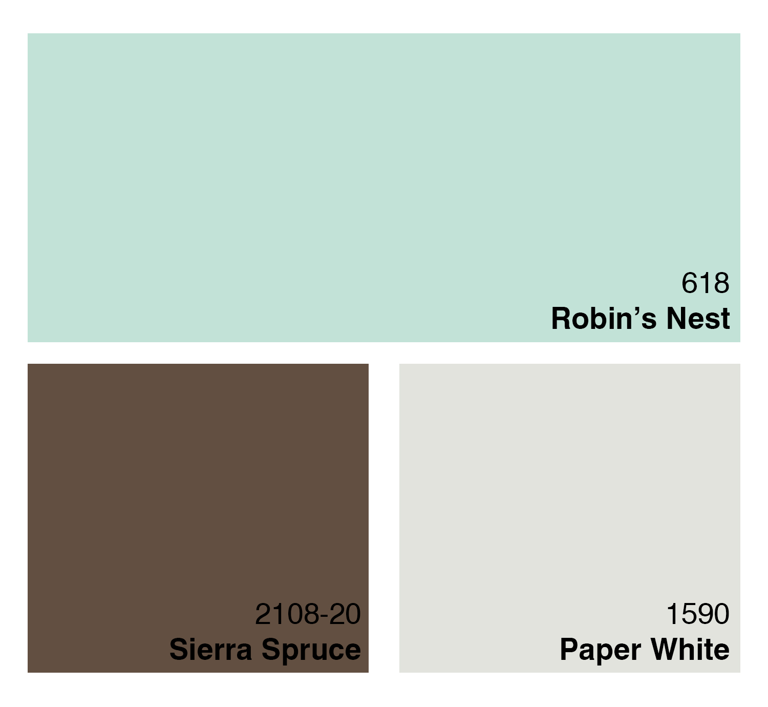
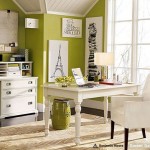
Betsy’s Color Recommendations
As we mentioned in the episode, Betsy pulled some Benjamin Moore colors that she thinks would be perfect in a laundry room. We’ve included each color with a combination of other colors recommended by Benjamin Moore. Use these for inspiration for your laundry room. And be sure, as Betsy mentioned in the episode, to come and see the colors in person–the actual chip will probably look quite a bit different from the color you see on the screen!

Decorating Made Easy: Decorating with the 60-30-10 Rule
The 60-30-10 rule is a tested concept used by interior decorators everywhere. It’s a simple proportion that spells out the ideal amounts of color to use in your decorating.
To keep it as simple as possible, 60% of your room should be composed of your dominant color, 30% should be composed of a secondary color and that final 10% should be reserved for accents. Now, maybe that sounds a little confusing . . . so here are some examples:

This room is a perfect example of the 60-30-10 rule in practice.
60% = Lavendar (walls and blanket)
30% = White (bed and fireplace)
10% = brown/tan (chairs, dresser, floor)

Another great example:
60% = Tan (walls, floors) 30% Brown (couch, tables)
10% Blue and White (pillows, vases, etc.)

A classic example showing that you don’t need a soft, muted color on your walls to make this work.
60% = Red (walls, accessories)
30% = Cream (furniture, rug)
10% = Tan (floor, accessories)

Another great example that clearly demonstrates that the main color doesn’t need to be calm, simple, neutral or BORING!
60% = Green (walls, accessories)
30% = White (furniture, art prints)
10% = Dark Brown (floors, chair legs)

An example that proves you can use the 60-30-10 rule to work incredibly vibrant and bold colors smoothly into your decorating.
60% = Blue (walls, light)
30% = Pink (bedspread, chair, painted leaves)
10% = White (trim, doors)
The color options are endless and it’s not difficult to see that using this rule helps you keep your color scheme under control and helps you produce an end result that’s very focused, very clean and very inviting!
Get Creative! Projected Images, Stencils, and Silhouettes
 By Guest Writer, Shannon VandenBosch
When it comes to creativity, I need some inspiration. So I go to a few decorating magazines and/or peruse my “Favorites” list of websites for design ideas. When I feel I have found a few pictures representing the style, image, or technique I would like to achieve, it becomes my muse. This is when I breathe a sigh of relief because the mental work is done and I can begin the process of tweaking the look I have found in order to make it my own style statement.
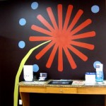
Recently, I was challenged to take a blank wall in our recently remodeled RepcoLite store in Jenison, Michigan, and create interest, and hopefully, inspiration. This empty wall space was located directly above the counter area where customers would sit and contemplate their own design decisions by beginning to choose a color or palette of coordinating colors.
Immediately, I liked the concept of stenciling or projecting an image on the wall to create a mural. I recalled seeing a large, abstract, flower in a Benjamin Moore color brochure. Aha!! The inspiration, my muse!
I began by taking measurements of the wall space and calculated the size of a single petal needed to make the flower, the length the stem needed to be, and the size of a single circle. Color choices were made to compliment the store’s interior decor. The single petal and circle were cut out of cardboard and then stenciled or traced onto the wall. The stem was drawn free-hand in proportion to the flower. Then the image was painted with interior wall paint. The whole process took about 6 hours. (See picture above–or, better yet, stop at our Jenison store and see it in person!)
As alluded to earlier, other ways to create murals is to use a projector to cast an image on a wall and either trace it and then paint or begin painting the image . Click here and here for more info. You can also check out this site for some more examples of graphic murals. Silhouettes are created by drawing and then painting a picture of something, say a headboard, on the wall instead of actually using a real headboard. This technique is not only creative, but inexpensive! Take a look at current decorating magazines for more information on this technique. Stencils not only can be made but bought at local stores that sell wallcoverings, crafts, or interior decorating items.
I hope you have been inspired to get creative and make the next space you choose to decorate even more uniquely yours.