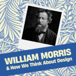
William Morris: Five Ways He Changed How We Think About Design

This post is adapted from an episode of Home in Progress, sponsored by RepcoLite Paints and Benjamin Moore. Check out the podcast here!

When you hear the name William Morris, you might picture bold wallpaper—vines, flowers, and patterns twining across entire walls. But Morris was more than a wallpaper designer. He was one of the founding voices of the Arts and Crafts movement, and his ideas about beauty, honesty, and craft still shape how we design our homes today.

Here are five ways William Morris changed the way we think about design:

1. He Rebelled Against Fakery

Victorian design often relied on illusion—pine painted to look like oak, wallpaper pretending to be velvet, fireplaces painted to resemble stone. Morris despised this kind of deception. In his own home, the Red House, he left brick exposed rather than covering it with stucco or paint. His wallpapers and textiles took inspiration from nature, but they didn’t try to mimic it. They were honest patterns on honest paper.

2. He Connected Beauty with Morality

For Morris, bad design wasn’t just ugly—it was immoral. Factory-made goods, he argued, robbed workers of dignity and dulled consumers’ moral senses. By contrast, hand-made, well-designed objects honored both maker and user. His famous maxim summed it up: “Have nothing in your houses that you do not know to be useful, or believe to be beautiful.”

3. He Elevated Wallpaper to Art

Before Morris, wallpaper was mostly background decoration. He transformed it into something worth studying. His hand-block printed designs drew directly from plants and animals he observed in nature. They were bold, rhythmic, and organic—wallpapers that invited you to pause and look closely.

4. He Planted the Seeds of Democratizing Art

Morris believed beauty belonged in every home, not just in elite galleries. That’s why he worked in media like furniture, textiles, and wallpaper—things people lived with every day. The contradiction, of course, was that his uncompromising standards made his work expensive. But the principle—that ordinary homes deserve art—was powerful. Later designers found ways to adapt his ideas for mass production, fulfilling his vision.

5. He Inspired a Movement

More than any one product, Morris gave us the Arts and Crafts movement. His vision of honest materials, beauty in daily life, and dignity in work rippled outward into furniture (Gustav Stickley), architecture (Frank Lloyd Wright), and even suburban housing (the Craftsman bungalow). His influence is still alive whenever we value the handmade, choose quality over quantity, or insist that useful things can also be beautiful.

The Takeaway

William Morris gave us more than beautiful wallpaper. He gave us a reminder: don’t just fill your home with things. Choose the objects that matter. Make them useful. Make them beautiful. And your home will be better for it. For a much deeper dive into all of these points, check out Episode 424 of Home in Progress.

How to Measure for Paint

When you’re planning a project, one of the first questions is simple: how to measure for paint. Without a good estimate, you risk buying too little and running out mid-project, or buying too much and overspending. Fortunately, the math is easy, and once you know the steps, you can use them on any surface—from siding to bedroom walls.

Step 1: Measure the walls
Grab a tape measure and find the length and height of each wall. Multiply those numbers to get the square footage of that wall. Repeat this for each wall in the space.

Step 2: Subtract windows and doors
Windows and doors don’t need paint, so subtract their square footage from your total. This gives you the actual paintable area.

Step 3: Do the paint math
On average, one gallon of paint covers about 400 square feet for a single coat on a sealed surface. Divide your total square footage by 400 to estimate how many gallons you’ll need.

And that’s it. How to measure for paint really comes down to length × height, minus doors and windows, divided by coverage. With this simple formula, you’ll know exactly how much paint to buy and save yourself a lot of stress on project day.

Painting Andersen Windows: The Real Story

Can you paint your 1990’s Andersen windows? At first glance, it sounds like a simple question. But once you dig into it, you realize the answer isn’t straightforward at all. The truth about painting Andersen windows depends on the material, the age, and even the color you choose.

Step One: Figure Out What You’ve Got

Andersen has made windows from all sorts of materials over the years—wood, vinyl, aluminum cladding, fiberglass, and their Fibrex composite. Each material behaves differently when it comes to paint, which is why identifying your window type is the very first step.

The easiest way is to use Andersen’s “find my window” tool on their website. Plug in a few details—style, approximate age, even serial numbers—and it will tell you what you’re working with.

No serial number? You can still play detective. Wood feels like wood, with visible grain. Vinyl is smooth and often has welded corners. Fiberglass feels harder and more rigid than vinyl. Aluminum, of course, feels like metal.

The Official Line vs. The Real World

So, once you’ve identified your window, can you paint it? Here’s Andersen’s official stance:

  • Wood interiors: Yes, absolutely. Clean, sand lightly, prime where needed, and paint.
  • Vinyl exteriors: No. Paint doesn’t naturally bond, and painting voids the warranty.
  • Aluminum cladding: A hard stop. Andersen says their aluminum-clad products cannot be painted. The factory-applied finish is designed to resist adhesion.

That’s the official line. But in the real world, 25–30 years of weather exposure changes things. Factory coatings that once resisted paint have broken down. The surface becomes rougher and more porous, which actually helps new paint adhere.

I spoke with a contractor who painted his own 1990’s Andersen vinyl windows 15 years ago and repainted them again recently. He’s had no major failures—proof that in practice, painting Andersen windows can work if the prep is done right.

How to Make It Work on Weathered Windows

If your Andersen windows are from the early 1990s, the warranty probably isn’t your biggest concern. You just want them to look good again. And the good news is, with the right prep, repainting can be successful.

Here’s what that looks like:

  • Start with a deep clean. Use TSP or a TSP substitute with water and scrub using a maroon scotchbrite pad. This cuts through oxidation and grime while scuffing the surface.
  • Rinse thoroughly with clean water, then lightly sand with 220-grit paper to give the paint something to grip.
  • Check for chalky residue by rubbing your hand across the surface. If you see white chalk on your palm, clean again before moving on.
  • Finish with a premium acrylic exterior paint like RepcoLite’s Endura Exterior, Benjamin Moore’s Regal Select or Aura, or Element Guard for extra protection.

Done correctly, this process will give old windows a refreshed look and years of new life.

The Dark Color Danger

There’s one more factor many people don’t realize: color matters—especially with vinyl.

Dark colors, particularly black, can actually destroy vinyl windows. Vinyl begins to soften around 160°F, and dark-painted vinyl frames in direct sun can hit over 220°F. That extreme heat causes frames to warp, seals to break, and locks to stop lining up.

There are documented cases of homes where white vinyl windows were painted black and warped in just a few months.

So if you’re painting vinyl, stick with white or very light colors. They reflect heat, keeping the surface stable. Black or deep tones may be trendy, but on vinyl windows they’re a recipe for disaster.

The Bottom Line

So, can you paint your 1990’s Andersen windows? The answer is yes—if they’re wood, vinyl, or aluminum that has been thoroughly weathered—and if you prep correctly. Just remember:

  • Use the right products.
  • Stay away from dark colors on vinyl.
  • Treat this as maintenance. You’ll likely need to repaint in 7–10 years.

At the end of the day, painting Andersen windows isn’t always simple, but for older units it can be a practical way to refresh your home’s look without full replacement.

The Craftsman Style Home–History, Features and Paint Colors

Introduction

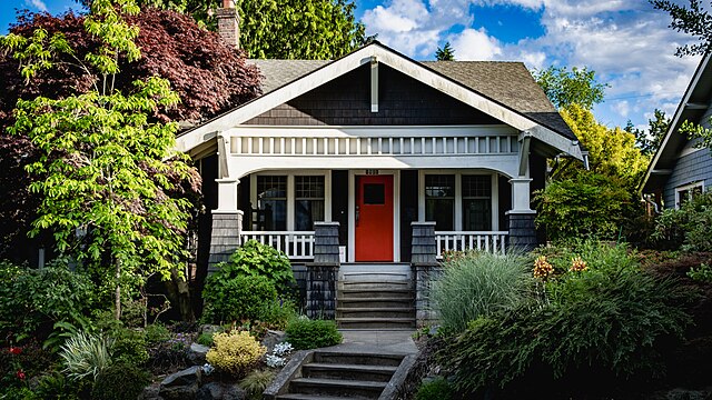
Walk through almost any older neighborhood in America and chances are you’ll spot a Craftsman style home. With its low, sloping roof, wide front porch, and earthy colors, the Craftsman has become one of the most beloved and recognizable American house styles.

But where did this style come from? Why did it become so popular in the early 20th century? And, as a paint company, we can’t ignore the obvious: what paint colors really bring out the best in a Craftsman home?

Let’s take a look at the history of the Craftsman style, how to identify one, and the timeless color palettes that make these homes come alive.

The Roots: Arts and Crafts in England

The story begins in England in the mid-1800s with the Arts and Crafts Movement. At the time, the Industrial Revolution was flooding homes with mass-produced goods. Furniture was heavily ornamented, machine-stamped, and often cheaply made to mimic luxury pieces.

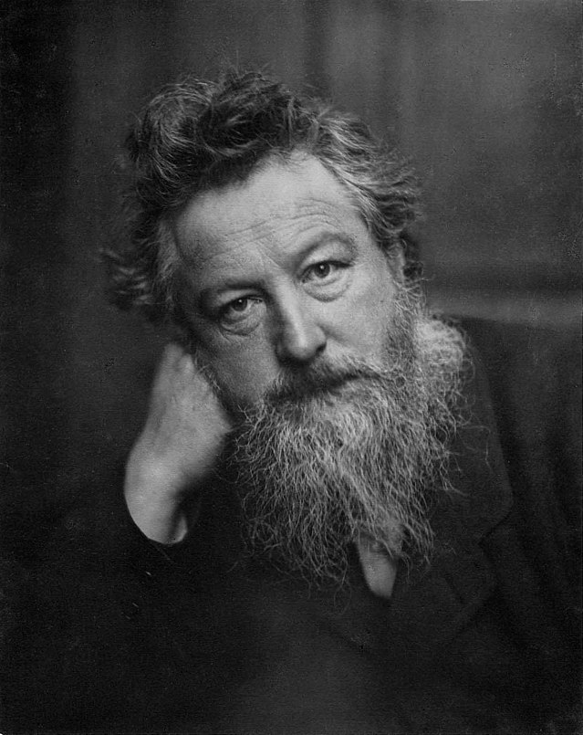
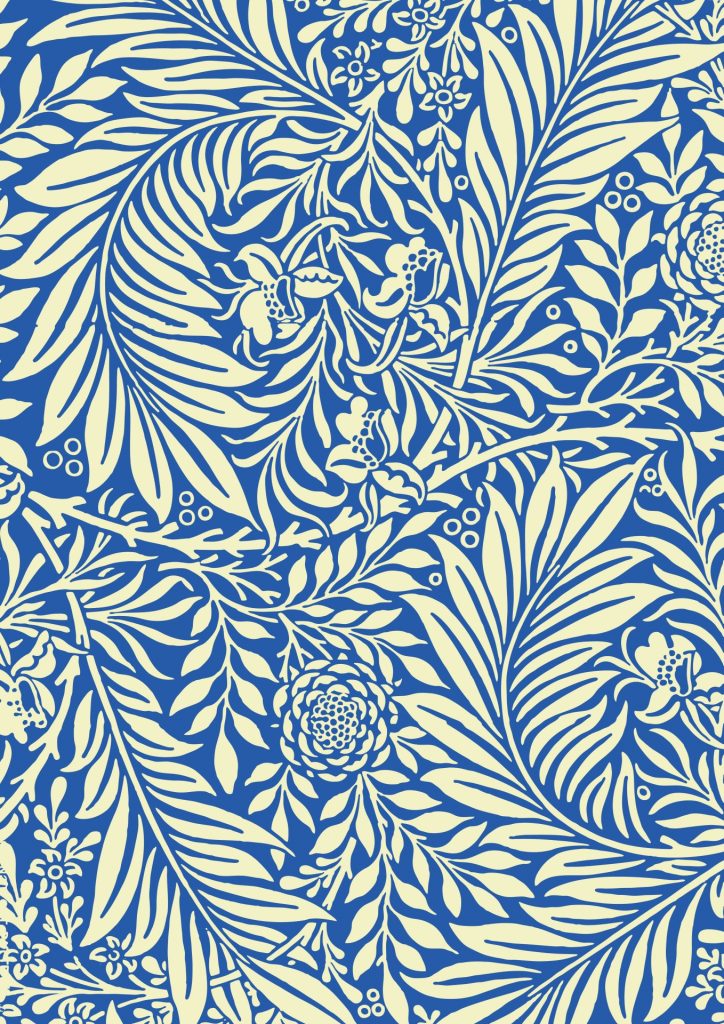
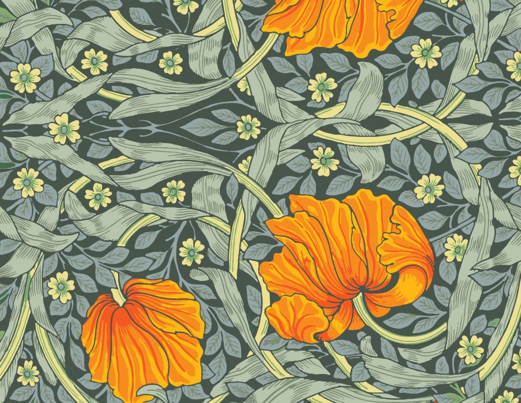
Not everyone loved that look. Designer William Morris and other reformers argued for a return to honest, handcrafted quality. They believed that the objects in our homes should be useful, beautiful, and connected to nature. Morris himself became famous for wallpaper and textile designs filled with flowing vines, flowers, and birds—patterns still made today.

By the late 19th century, the movement had crossed the Atlantic and was ready to reshape American homes.

The American Take: A Style for the People

In the United States, Arts and Crafts ideals evolved into what we call the Craftsman style.

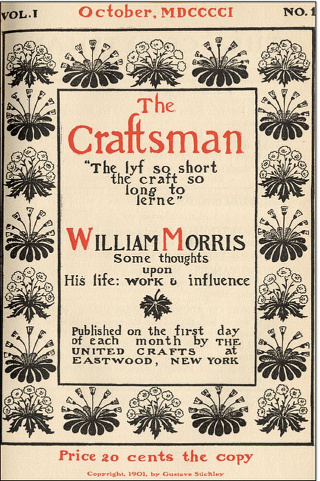
Furniture maker Gustav Stickley helped popularize the look through his magazine The Craftsman (1901–1916), which featured not just furniture but also house plans that ordinary families could build.

At the same time, Sears, Roebuck & Co. began selling kit homes (1908–1942). These “Modern Homes” came in many styles—Colonial, Tudor, Four Square—but the bungalow form, often with Craftsman details, was especially popular. Kits arrived by railcar with precut lumber, nails, shingles, and everything needed to build the house.

And here’s a quick aside: Sears also sold Craftsman tools, starting in 1927. But the name is just a coincidence—the tool line had nothing to do with Craftsman homes. Still, it’s a quirky bit of history that Sears sold both Craftsman-style houses and Craftsman-brand wrenches in the same catalog!

The result was accessibility. Craftsman homes weren’t just for the wealthy; they were practical, affordable, and within reach for the growing middle class.

The Range: From Bungalows to “Ultimate Bungalows”

Most Craftsman homes were modest bungalows—one or one-and-a-half stories, simple, and practical.

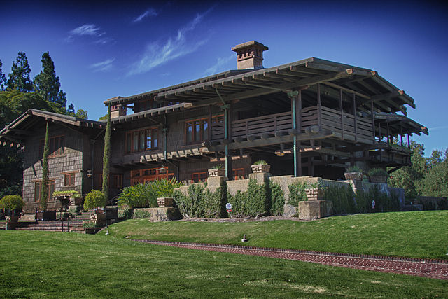
But architects Charles and Henry Greene in Pasadena, California, elevated the style to high art with what became known as the “Ultimate Bungalows.” The most famous example is the Gamble House (1908), built for the Gamble family of Procter & Gamble. It’s filled with rich wood interiors, Japanese-inspired details, and custom furniture designed to match the architecture.

The Greenes also designed the Blackburn House, the Thorsen House, and others. Each blended architecture, furniture, and landscape into a seamless work of art.

So on one end of the spectrum you had the affordable Sears kit bungalow, and on the other, the Ultimate Bungalows—bespoke masterpieces for wealthy clients. Both fall under the Craftsman umbrella, which is part of the style’s richness.


Listen to Our Podcast on Craftsman Homes


How to Spot a Craftsman Style Home

A few telltale features help you recognize a Craftsman style home:

  • Low-pitched gable roof with wide eaves
  • Exposed rafters and decorative brackets
  • Deep front porch supported by square or tapered columns on stone or brick bases
  • Natural materials—wood, stone, brick, sometimes stucco
  • Grouped windows, often double-hung with multiple panes on top
  • Built-in features like bookcases, benches, or cabinets
  • Central fireplace, usually stone or brick
  • Earthy color palette—browns, greens, muted golds, and grays

Together, these features give Craftsman homes their warm, grounded feel.

Why the Craftsman Style Home Caught On

Craftsman homes became wildly popular between 1905 and the 1930s for three main reasons:

  1. Practicality: The bungalow was affordable, comfortable, and well-suited to the middle class.
  2. Philosophy: In an increasingly industrial and impersonal world, Craftsman homes represented authenticity, family, community, and a connection to nature.
  3. Beauty: Natural materials, earthy colors, and handcrafted details gave these homes a warmth that Victorian houses sometimes lacked.

Decline and Legacy

By the 1930s, Craftsman homes had begun to fade in popularity. The Great Depression slowed building, and new styles like Colonial Revival, Tudor, and Art Deco began to dominate.

But Craftsman homes never truly disappeared. Today, neighborhoods filled with these bungalows are among the most sought-after in America. Their scale, warmth, and timeless appeal continue to resonate, and their philosophy—simplicity, honesty, and connection to nature—feels just as relevant in our own industrial, digital age.

Paint Colors in the Craftsman Style Home

Now let’s talk about paint—because color is a big part of what makes Craftsman homes so distinctive.

Traditionally, Craftsman homes were painted in earthy tones drawn from nature: greens, browns, russets, muted yellows, and soft grays. Trim often contrasted in a darker shade to highlight beams, brackets, and porch columns. Accent colors were used sparingly but dramatically on front doors or window sashes.

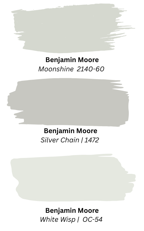
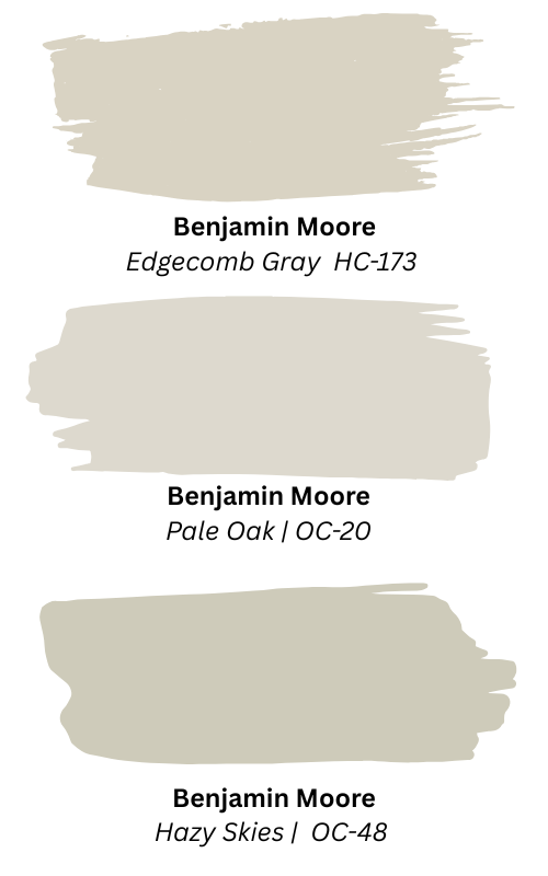
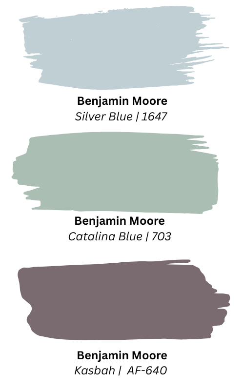
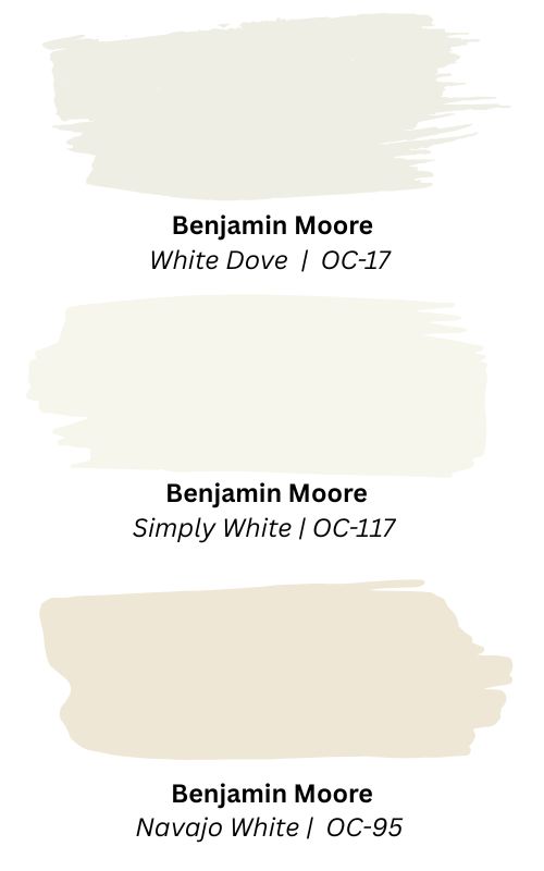
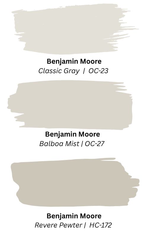
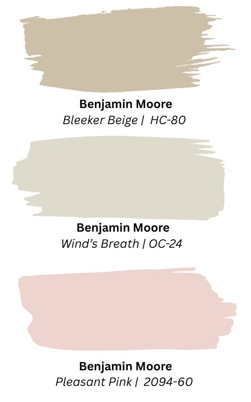
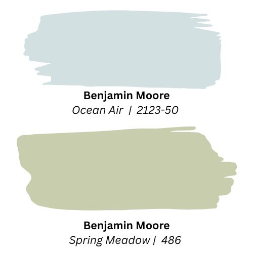
Here are some Benjamin Moore colors that echo the Craftsman palette:

Exteriors (body):

Trim:

Accents (doors, brackets):

Interiors:

Staying True—or Branching Out

Of course, color is always subjective. There’s no rule that says you must paint a Craftsman home in these shades. Bright whites, modern grays, or even unexpected pastels can work if handled thoughtfully. But here’s the challenge: choosing colors that fight against your home’s architecture can sometimes give you an uphill struggle. The space may never feel fully grounded or cohesive.

When you lean into your home’s architectural style—even loosely—you usually find the house feels “right.” Work against it, and sometimes the contrast sings… but other times, it just feels off.

That’s where we can help. At RepcoLite, our experts can guide you through choosing colors that not only look good on a chip but also make sense for your home’s design—whether you live in a Craftsman, Colonial, Ranch, or anything in between.

Conclusion

So the next time you walk down a street and see a house with a broad front porch, exposed rafters, and earthy colors, you’ll know you’re looking at a Craftsman style home. More than just architecture, it’s a piece of history—a design that spoke to America’s desire for authenticity, family, and a home that truly felt alive.

Choosing Paint for West-Facing Rooms

Learn how choosing paint for west-facing rooms can be tricky. Discover colors that work with changing light, not against it.

Over the last few weeks on our podcast, Home in Progress, we’ve been diving into one of the most overlooked aspects of color selection: the direction your room faces. And one of the most surprising lessons I’ve learned over the years—both on the radio and behind the counter at RepcoLite—is how often we forget to think about it.

I grew up in a house where painting was a regular event. My mom loved color, and it wasn’t uncommon to come home from school to find an entirely new color scheme in the living room—or the kitchen, or the hallway. But in all that time, I never once heard her talk about room exposure. It just wasn’t something most people thought about.

Even when I started helping customers at RepcoLite, I’d ask all kinds of important questions: What color is the floor? Is there carpet or hardwood? What’s your furniture like? How much natural light is in the room? But somehow, I rarely—if ever—asked what direction the room faced.

So over the last few episodes of the show—and now, here in this post—we’re making up for lost time. We’ve already covered north-facing rooms (with their cool, flat light), south-facing rooms (bright and sunny all day long), and east-facing rooms (which shift from warm morning light to cool shadows). And now, we’re wrapping things up by talking about the trickiest of them all: west-facing rooms.

If your wall color ever looks beautiful at noon and weirdly orange or pink by five o’clock, this post is for you. Choosing paint for west-facing rooms requires a different approach—but with the right strategy, you can work with the light instead of fighting it.


Western Light is a Shape-Shifter

Here’s what makes choosing paint for west-facing rooms such a challenge: the light changes dramatically throughout the day.

In the morning, the room can feel dim, flat, and even cold. The sun’s on the opposite side of the house, so shadows linger. But by late afternoon—especially during golden hour—the light pours in, and it’s full of rich, warm, peachy tones. Sometimes it’s beautiful. Other times, it makes your neutral beige look downright orange.

That soft gray you loved at breakfast? It might suddenly flash pink. That gentle taupe? Now it’s a rusty brown. It’s a lighting roller coaster—and your paint color rides it all day.


Morning People vs. Afternoon People

The first step in choosing paint for west-facing rooms is figuring out when you use the space most. Because honestly, you can’t always find a color that looks perfect in every lighting condition. So prioritize the part of the day that matters most to you.

If You Use the Room in the Morning…

In the morning, west-facing rooms are at their coolest and dimmest. If that’s when you’re sipping coffee or getting ready for the day, you may want to choose a color that warms things up.

That doesn’t mean going full terracotta. Instead, think soft taupes, gentle warm grays, or warm greiges. These tones can bring a little life to the space without clashing later in the day when the sun swings around.

If you prefer cooler colors, go for more saturated versions that still feel energetic—muted blues, greens, or violets with a bit of richness.

Also, your lighting matters. A soft white LED bulb (in the 2700K–3000K range) can fill the morning shadows with a cozy glow. Avoid daylight bulbs here—they can be too stark and make the room feel even colder in the early hours.

If You Use the Room in the Afternoon…

This is when west-facing rooms shine—literally. The sunlight is strong and full of warmth. If you’re relaxing, working, or entertaining in this space after 2 p.m., you’ll want to temper the intensity of that glow.

Cooler colors are a great counterbalance: think blues, soft greens, lavenders, and cool whites. They’ll help keep the room feeling fresh rather than overheated.

That doesn’t mean warm tones are off limits. But stick with earthier, muted versions—colors that lean warm but don’t scream “sunset.” Think putty, mauve, or dusty rose.


How to Work With the Light (Not Against It)

Choosing paint for west-facing rooms is all about embracing the light and working with it. You can’t control the sun, but you can control how your paint responds to it.

Here’s how:

  • In the morning, simulate warmth with lighting. Stick to bulbs in the 2700–3000K range.
  • In the afternoon, don’t block the sunlight—filter it. Use sheer curtains or light-filtering shades to soften the glow without plunging the room into darkness.
  • Always sample colors at different times of day. Look at them in both natural and artificial light. What looks gorgeous at 10 a.m. might look bizarre at 6 p.m.

And remember: It’s not about finding the “perfect” color—it’s about finding the color that looks best when you actually use the space.


Benjamin Moore Color Recommendations

Need some starting points? Here are some favorites that work beautifully in west-facing rooms, depending on your needs:

To Cool Down the Afternoon Glow:

  • Moonshine – A barely-there gray with cool undertones
  • Silver Chain – A medium gray that holds its own in strong light
  • White Wisp or White Heron – Crisp, cool whites that resist yellowing

To Warm Up a Morning Chill:

  • Edgecomb Gray – Soft and warm, but not too golden
  • Pale Oak – Creamy and gentle, great for shaded rooms
  • Hazy Skies – A complex neutral that walks the warm-cool line

For Bolder Statements:

  • Silvery Blue or Catalina Blue – Fresh and calming in afternoon light
  • Kasbah – A rich, grounded blue that absorbs warmth beautifully

And for trim and ceilings? Chantilly Lace is a crisp, clean white that plays nicely with just about any color.


Final Thoughts

West-facing rooms may be moody, but that’s part of their charm. With the right colors and a little bit of planning, they can become some of the most dramatic and dynamic spaces in your home.

So when it comes to choosing paint for west-facing rooms, remember this:

  • Pay attention to when you use the space.
  • Balance the natural light with your color choices.
  • Embrace the change—don’t fight it.

And if you need help, you know where to find us. RepcoLite’s team of experts is always here to help you turn your vision into reality. We’ll guide you through the lighting, the samples, and the final selection—so your west-facing room shines at any time of day.

Choosing Paint Colors for East Facing Rooms

When it comes to choosing paint colors for east-facing rooms, things can get a little tricky. These spaces change personality throughout the day, thanks to shifting sunlight—from warm and welcoming at dawn to cool and shadowed by late afternoon. Unlike north- or south-facing rooms, where light quality remains fairly consistent, east-facing rooms demand a little more planning. But don’t worry—we’ll walk you through how to find a color that stays beautiful from sunrise to sunset.


The Light in East-Facing Rooms: A Moving Target

East-facing windows welcome soft, fresh light in the morning. It’s a slightly warm glow—gentle and cheerful—that makes creamy whites, soft yellows, and delicate pastels come to life. But by mid-morning, that golden glow fades fast. The light shifts to a brighter, more neutral tone that can wash out delicate colors and leave your room feeling stark or flat.

And then there’s the afternoon. Once the sun moves to the opposite side of the house, your east-facing room loses direct light. Shadows deepen, and the space takes on a cooler, gray-blue cast. Colors that felt fresh in the morning can turn muddy or cold by dinnertime.

This shift is why choosing paint colors for east-facing rooms can be such a challenge. A color that looked perfect in one light might disappoint you just hours later.


When Do You Use the Room?

The first step in picking the right color is deciding when you actually use the room most. Morning people? Embrace that soft sunrise glow with creamy whites, warm neutrals, or even pale greens and blue-greens that feel fresh and balanced early in the day.

But if your time in the space is more afternoon or evening-based—say for a den or family room—you’ll need richer, more saturated colors to avoid the space feeling washed out or chilly. Look for colors that can hold their own in cooler, shadowy light.

Use the room throughout the day? Choose the color you love the most during your peak time—and make peace with how it shifts later. As long as it stays within your comfort zone, you’re on the right track.


Don’t Forget the Light Bulbs

When that afternoon light fades, your artificial lighting takes over. And it can make or break your paint color. A warm white bulb (around 2700–3000K) helps counteract that cool, shadowy light with a cozy, inviting tone. Daylight bulbs might sound good, but they often mimic harsh noonday sun—too stark for a room already leaning cool. So warm it up with soft bulbs, and consider layering light sources for the best effect.


Color Recommendations That Work

Let’s get specific. If you’re aiming for an airy, fresh feel, here are some Benjamin Moore colors that shine in an east-facing space:

  • White Dove (OC-17): A soft, creamy white with just enough warmth.
  • Simply White (OC-117): Cheerful, clean, and slightly yellow—perfect for mornings.
  • Navajo White (OC-95): Deeper warmth without getting muddy.

Prefer neutrals?

  • Classic Gray (OC-23): Soft and warm—nearly an off-white in strong light.
  • Balboa Mist (OC-27): A gentle violet-pink undertone keeps it elegant.
  • Revere Pewter (HC-172): A balanced greige that works with the room’s shifting tone.

Looking for dependable go-to’s?

  • Bleeker Beige (HC-80): Warm yellow undertones hold up from morning to evening.
  • Wind’s Breath (OC-24): Light, sandy, and never cold.
  • Pleasant Pink (2094-60): This one is a bit of a stretch, but it’s a subtle blush that feels warm, and won’t feel overly pink in an East-facing space.

Want a little color? Go for it!

  • Ocean Air (2123‑50): A pale blue-green that’s crisp in the morning, serene later.
  • Spring Meadow (486): Soft green that stays grounded and natural.

Avoid strong blues and purples—they tend to feel too cold by late afternoon.


Trim, Ceilings, and Finishing Touches

Trim and ceilings matter more than people realize. A crisp white like Chantilly Lace (OC‑65) on the ceiling and trim can help reflect light and lift the space, especially in the dimmer afternoon hours. Use a satin or semi-gloss finish to bounce that light around even more.


The Bottom Line

When it comes to choosing paint colors for east-facing rooms, the key is awareness. These spaces shift. There’s no one-size-fits-all color—but if you test your options in different lighting, consider your usage patterns, and lean slightly warm, you’ll land on a color that works.

And if you’re still not sure? Stop into any RepcoLite location and let us help you!