Well, in an earlier post, I spilled the “dirty little industry secret” when it comes to Deck Stains and Wood Protectors. I let you know that the truth of the matter when it comes to deck coatings is that you can usually expect to get 1-2, maybe (at most) 3 years out of your finish. After that length of time, it will need to be recoated.
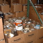
Sure, this probably isn’t groundbreaking news to many of you, but we still run into plenty of individuals stopping in at RepcoLite who are expressing surprise and disbelief and disappointment over their “national-brand, expensive, supposedly high-end” deck coatings that have only lasted a year or two.
And while I’d be the last person to try to give these national brands an easy out, I’d still, in the interest of honesty, like to point out that these national products aren’t failing quicker than other deck coatings. They’re just performing in the manner that all deck coatings usually perform.
So, I wrote all of that to let you know not to get too over-excited by fancy, slick advertising campaigns on TV. These products take a beating and no matter what the commercial leads you to believe, you’re usually going to get a couple years max out of the coating.
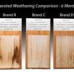
However, that’s not to say that some aren’t better than others. For example, there’s a well-known, national brand of wood sealer that absolutely works like a dream. For the first 6 months or so. After that, it’s all down hill. This is probably THE brand that everybody associates with deck cleaners–it’s the “Band-aid” of adhesive bandages–it’s the name everybody knows. And yet, it’s really, in all honesty, an inferior product. It’s all show and no “go.”
On the other hand, there’s a brand that may not be as well-known, but which is breaking all the rules when it comes to deck coatings. This brand is known as DEFY® and they make a full line of deck coatings and cleaners and strippers. And these products are absolutely at the top of the deck-coating heap when it comes to quality, durability and ease of use.
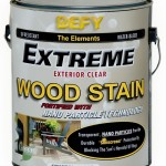
DEFY’S® Clear Extreme Wood Stain is the newest member of the DEFY® line of wood products and is easily their most innovative high performance product yet. See, when it comes to protecting their decks, many homeowners express a desire to “keep that natural look on the wood.”
After all the cleaning and surface prep, folks see the beauty of their natural wood and generally don’t want to put anything on it that’s going to change it. They don’t want to put a colored sealer on it because that will deepen the wood’s color too much. So many folks lean towards the application of a clear wood protector.
However, there’s a problem. The sun’s ultra-violet rays cause wood to turn gray and become susceptible to water penetration and decay. That’s the core problem that all untreated decks face. Unfortunately, almost all CLEAR wood protectors are simply water-repellants. They will cause rain to bead up, but they won’t do a thing about the sun’s damaging rays. As a result, it’s usually not long (quite often 6 months or less) before your once clean and beautiful deck starts to show signs of graying and weather damage.
But now, all that is changing because of DEFY’S® innovative new technology. DEFY® Extreme Wood Stain effectively protects the wood from the harmful effects of the sun and protects wood from graying using state of the art nano-technology.
DEFY® explains on their website: “Extreme Wood Stain contains zinc oxide particles that reflect the damaging Ultraviolet Rays from the sun. When you reduce the size of these zinc particles down to the nano level, they become invisible to the naked eye. These nano-particles are distributed at a rate of over 30 trillion per square inch of surface area to provide protection from the sun in much the same way as they do when used in sun blockers and sunscreen lotions. This results in a “Crystal Clear” finish that when dry, will give the longest lasting UV protection on the market for a clear deck finish!”
So basically, what we at RepcoLite are excited to offer for the first time ever is a truly clear–a crystal clear–wood sealer that will not only defend your wood against water and rain . . . but also the damaging effects of the sun.
That’s the teaser information. We’ll talk more about this great product and I’ll show you some stunning samples next time.


 There are few places in your home where you can really cut loose and have a good time with color as much as you can in a kids’ room. When it’s your bathroom or your living room or a dining room we all tend to be a little more cautious. We don’t want to go nuts and create something on the walls that will drive us crazy or overpower our other decorating.
 Every summer, we talk to a number of folks in our stores who are curious about the right way to paint an old, rusting metal roof. They want to know what types of products to use, they want to know the steps involved, they want to know what cleaners they should purchase (and also, at least a little bit, they’re wanting us to tell them that the surface is unpaintable and should just be left as is).