EP20 – August 19, 2017: Central Vacuums, Ceilings, Stress-Free Color Matching, and Buying a New House


Our ceilings are often like that one guy in the office. The quiet one who everyone forgets to invite to the party. Don’t let that happen in your home! Sure, your walls are having fun trying on new colors and looking good, but don’t leave your ceilings out! In this episode, we talk with Designer Kim Scott to talk about ceilings and some interesting ways to use them to make a statement!

Listen here:

Show notes for episode 020:

Many of us hate vacuuming. Especially if we have stairs! Just the thought of lugging that heavy, awkward vacuum up and down the stairs makes us groan. But we have a solution!

Tom Courtright from WalVac stops by to tell us about his amazing central vacuum system that will save our backs the next time we vacuum stairs. We've heard from many people who have this system, and they say they'll never go back to a regular vacuum. We think that speaks for itself!

When we ask customers if they are going to paint their ceilings, we often get a blank stare. It just seems like one more thing to do. But it's time to change your thinking! Your ceiling deserves just as much attention as your walls.

Kim Scott, of KJS Interiors, is an interior designer who loves to use color in her decorating. She gives us tips on how to use color on ceilings to create that "wow" factor!

No one likes to make multiple trips to the paint store for a color match. We want to help you make one trip by telling you everything we need to get your match done right the first time.

Shopping for a new house can be very overwhelming. There is so much to look at and consider. It is very easy to miss or overlook important things.

To help us know what to pay attention to, Rodger Nyhuis, of Keller Williams Holland Lakeshore Realty, stops by to discuss what he tells his clients. He has great information that will help us be more thorough the next time we walk through a house.

Color Me Home Episode 6: Decorating Kids’ Rooms

This week, Betsy and Dan talk about decorating kids’ rooms. These are great projects and can be a lot of fun: you’ll get to use colors you might not typically use and you really get to put your creativity on display! But how do you create something that the kids will love–with all their favorite colors–without having the whole thing turn into, quite literally, a circus? That’s what we talk about in this episode, so give it a listen!

View our Pinterest Board for Episode 6!

Episode Outline

  • Involve Your Kids With the Decorating! (0:30)
  • What Do We Do When the Kids Pick Crazy Colors? You Compromise! (4:32)
    • My Son Embarrasses Me In Public (5:00)
    • Pick a Lighter Version of the Color (8:02)
    • Pick a Muted or Muddier Version of the Color (10:11)
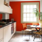
    • Paint an Accent Wall (13:43)
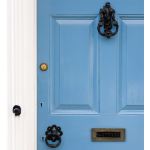
    • Doors, Window Frames, Ceilings . . . (15:0o)
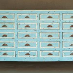
    • Accessories (16:30)
  • Choose the Right Paint and the Right Finish (17:30)
    • The Right Paint (17:57)
    • The Right Finish (21:46)
  • Our First Email Question! (23:06)

Benjamin Moore Waterborne Ceiling Paint56295-9030107

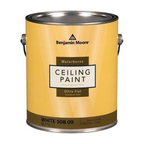
In the podcast, we mentioned ceilings as a potential area to bring in some color. If you’re going to give that a try (and you should, because it’s a very cool idea that’ll payoff with great results!) then you should definitely be using Benjamin Moore’s Waterborne Ceiling Paint. It’s specifically formulated for ceilings, and provides an ultra flat finish that easily hides common ceiling imperfections. It’s easy to work with, has minimal spatter and dries very quickly for fast recoats.

  • Superior hide for a flawless finish
  • Flattest finish offered by Benjamin Moore
  • Conceals common surface imperfections
  • Easy application with fantastic results
  • Formulated for minimal spatter

Recommended Paints for Kids’ Rooms

We covered 4 different products that would be perfect. Here’s a quick summary in case you didn’t have a note pad to jot all the good ideas down while the podcast was playing:

Hallmark Ceramic Paint by RepcoLite

Hallmark is our Premium interior paint. It’s created with Ceramic microspheres and provides exceptional washability and durability even in our matte finish. Hallmark is available in a Matte, Eggshell, Satin Sheen, and Semi-Gloss.

Aura by Benjamin Moore

Aura delivers remarkable durability and offers the most advanced way to bring color to life. Using Benjamin Moore’s exclusive Color Lock® technology, Aura paint brings you discernibly richer, truer color. Aura is ideal for kids’ rooms whenever you’re using colors with poor coverage or if you’re covering over other bright and bold colors. The reason? Aura’s specifically formulated to cover and hide better than any other paint out there. If you don’t want to fuss with 3 or 4 coats, choose Aura!

Regal by Benjamin Moore

Regal paint stands up to today’s active lifestyles in colors and finishes that create the home you’ve always imagined. A premium quality coating featuring Advanced Particle Technology® which includes our proprietary 100% acrylic resin. This makes the finish itself more durable, providing for superior uniform coverage as well as easier touch-ups. Additional benefits include spatter resistance for easier clean-up, and superior coverage for a flawless finish in fewer coats.

Natura by Benjamin Moore

Natura Waterborne Interior Paint continues Benjamin Moore’s commitment to providing the most environmentally friendly paint. Natura goes beyond zero VOC* to offer zero emissions** and no harsh fumes***, making it a safer paint for your family and the environment, all without compromise to performance or color selection. Natura is truly “Green Without Compromise®.”

Carefree by RepcoLite

While we didn’t mention Carefree in the podcast, we certainly should have! Carefree is a tremendous product for walls, will give you great washability and durability, and will price out below all of the other products here! If you’re working on a budget, Carefree might be a great option to consider.

Recommended Finishes for Kids’ Rooms

When it came to finishes, we strongly recommend either Satin Sheen or Semi-Gloss for your trim, doors, and furniture. Semi-Gloss finishes hold up well and wash up readily.

For your walls, however, our favorite choice is an Eggshell Finish. It’s dull enough to hide wall imperfections (Betsy kept referring to the dings and dents made by someone bouncing a ball of the wall . . . perhaps something she was guilty of long ago) but it also has enough of a finish to be washable.

Further Reading

We drew from a lot of articles and posts when we gathered info for this podcast. Here are just a few of them if you’d like to read further!


4 Tips to Help You Decorate With Color!

14b_kitchen_tomatotangoCSP1145_harborgrayAC25_smallerHave you tried bringing color into your home only to find that it didn’t work?  That the colors didn’t look good together?  That they were too bold or too overpowering?  And then, when that happened, did you simply go back to painting in soft whites and neutrals?

This happens to a lot of people we run into at RepcoLite–they branch out into the world of “color” only to find that the colors they chose didn’t look very good.  Typically, many of those folks then assume that “color’s not for them” or that “they’re just not cut out to decorate in color” and they return to the safety of neutral.

If that’s you, then hold on for a second:  color adds interest and visual appeal to our decorating.  It can take a boring room and turn it into something that turns heads and starts conversations.  The trick is to use the right colors in the right quantities.

And here are 4 quick ideas to help you do that:

CHECK OUT YOUR COLOR IN ALL LIGHTING SITUATIONS

Many folks come into the store, pick out some color samples, scrutinize them, and then order a gallon or two of paint.  Then they go home and paint their walls only to find that when night comes and the room darkens the color’s way too dark on their walls.  Avoid this mistake by taking your color chips home and examining them in YOUR lighting and in all lighting situations.  Look at the colors at night in the rooms in which they’ll be well before you start rolling them out!

CHOOSE YOUR PAINT LAST

In the decorating process, many folks start with the paint.  They’ll come to the paint store and try to establish their paint colors before they step into the furniture stores or the carpet stores.  This is a mistake.  Folks will come in, pick a bold, bright color for their walls, and then later discover they can’t find a couch or carpet that looks good with those colors.  They then, mistakenly, assume that bold colors are just not their thing.  The problem isn’t bold colors, it’s the timing of the color choice.  Remember:  Paint is the most adjustable aspect of any home decorating project and should therefore, be selected after everything else is chosen.  First find your couch, your carpet, your wall hangings, etc. and then have the paint made to pull colors from those items.  Doing it this way makes decorating with color easy.  Doing it backwards makes decorating with color seem impossible!

PLAN AHEAD

Another thing to think about applies especially to those folks who are working their way through their house.  They start with one room, get it finished and then move on to the next one.  If this is you, plan your steps and your decorating with an eye on your next move.  Don’t find a beautiful, bold color for your living room, make everything work together beautifully only to discover that you have no idea what color will go with it when you move to your hallway.  Plan your living room with your hallway in mind.  Make sure the colors will harmonize as you work your way through the house.

DON’T BE FOOLED BY COLOR CHIPS

This last tip is important!  When you look at a standard color chip, you’ll see a light color at the top and a darker version of that color at the bottom with five or six variations in between.  The typical response many of us have to this way of displaying color is to assume that the top color is an off white.  From there, we gauge the depth of the subsequent colors on the chip.  The mistake comes in our initial assumption:  often, the colors on the top of the chips are already significantly darker than off whites.  So, while the third color on the chip may look–by comparison to the other colors–to be a “medium-toned” color, we are often surprised to see how dark it actually is on our walls.  So all that to say, one of the best things you can do is take that color swatch you like and hold it up to some standard whites or off whites to give yourself a good perception of the true depth of the colors–that way you won’t be too surprised when you get them on your wall.

Painting a Steel Door

bigstock-Blue-Doors-7834138

Yes. This is probably a wooden door. But we bought the picture, so we’re going to use it! Just use your imagination…

Painting a steel door is one of those projects that can make a big impact on the exterior appearance of your home.  And if you do the project the right way, you’ll be enjoying that color for years to come.

If you’re thinking about sprucing up your front door any time soon, follow these tips and steps to make sure the project goes as easily as possible:

  • REMOVE THE DOOR and THE WEATHER STRIPPING:  If possible, you’ll have your best success if you can completely remove the door from the frame and set it in your garage or your basement on saw horses.  If you can’t remove the door, don’t sweat it–you can still do a good job, though you’ll need to be a little more cautious with paint runs, etc.  Also, many doors allow you to remove the weather stripping.  This is ideal.  Remove it (paying attention to how it will go back on) and store it somewhere safe.
  • REMOVE THE HARDWARE:  Whether or not you can remove the door from the frame, the next step is to remove the hardware.  Remove the hinges, the door knobs, and the kick plates.  You can paint around them or tape them off, but leaving them on makes all the subsequent steps more complicated and more time consuming.  So, remove them if at all possible!
  • SURFACE PREP:  As with any painting project, failure or success is usually determined before you even open a can of paint.  If you’re painting over a previously painted door, you need to make sure that you sand and scrape at all the paint to ensure that what remains on the door is stuck down well.  Sand the door with 120 grit paper (you’re lightly sanding it–not trying to leave visible grooves).  And then, after sanding and scraping, wash the door down well with a solution of TSP (TriSodium Phosphate).  Quick Tip:  When using the TSP, scrub the door down with a 3M Scotchbrite pad (a little green scrubby pad you might use on dishes).  This will serve to dull and etch your previously painted surface and will aid with the bonding of the new paint!
  • PRIME (if necessary):  After you’ve sanded and washed the surface, you should prime any bare metal spots with RepcoLite’s 449 Grey Metal Primer.  This is an oil-based, rust-inhibitive primer, that’s perfectly suited for these situations.
  • BRUSH or ROLL YOUR DOOR:  Either using a high-quality brush or a small, quality 4″ or 7″ roller, apply your paint to the door.  We recommend applying RepcoLite’s Endura Acrylic Latex Paint for the most durable, longest lasting finish.  Work evenly and quickly, starting with the inserts and then finishing up with the remaining flat surfaces of the door.  Apply coats as needed.
  • LET IT DRY and RE-INSTALL:  Let the door dry at least 8 – 12 hours (longer if possible) and carefully re-install it.  UNDERSTAND:  Latex paint will dry to the touch in a matter of hours, but it doesn’t reach it’s full hardness for about 30 days.  You don’t need to leave the door off the hinges for 30 days, but keep in mind that just because it’s “dry” that doesn’t mean it’s as strong or durable as it’s going to be . . . so go easy!
  • RE-INSTALL WEATHER STRIPPING LATER:  If you can leave the weather stripping off for 10 – 30 days, that’d be in your best interests!  As mentioned earlier, the latex paints will dry quickly, but if you close the door and press it against the weather stripping too soon, it’s entirely possible that the paint will peel around the edges when you next open the door!  If you can leave that stripping off for a couple weeks or so before re-installing it, you’ll minimize your risks.

FINAL TIPS and PARTING THOUGHTS

  • COLOR MATTERS:  Dark colors fade quickly.  Red can be especially bad.  Also, reds can cover poorly.
  • NO SHORTCUTS:  One of the worst things you could do when painting a door is try to make a coat of paint cover in 1 coat when it probably needs 2 or 3.  The best advice we can give you on this one is to apply EVEN coats.  If you’re color needs 2 – 3 coats of paint, then resign yourself to applying 2 – 3 coats of paint.  If you try to make it cover by applying it too heavily, you will have all sorts of problems on your hands.  The paint will run and sag; it won’t cure or dry well and you’ll find it sticking to your weather stripping and causing all sorts of other problems!  So, don’t rush it.
  • GIVE IT TIME TO DRY:  Latex paints dry to the touch very quickly, but don’t let that fool you into applying too many coats too soon.  Apply a coat and let it dry for an hour or two before trying the second one.  Sometimes you could apply those coats as quickly as 15 – 20 minutes after each other (it dries that fast), but in the end, you’ll only run into problems.  So give it the dry time the can recommends.
  • LATEX IS BETTER THAN OIL:  Latex Acrylics (like RepcoLite’s Endura) will outperform oil based products.  They’ll hold their color better and they’ll endure the constant expansion and contraction a steel door experiences much better as well.
  • PAINT IN THE SHADE:  Paint when the sun isn’t directly on the door.  And ideally, paint before or long after the door’s been exposed to the sun.  Steel doors will heat up significantly on a summer day and if you get on it and start painting too soon, or when it’s too hot, you’ll have trouble with your latex paint.  It will dry much too quickly and you’ll end up with streaks and roller marks.

I could go on and on, but you get the idea.  This is a project that usually can be accomplished in just a few hours.  It’s not complicated–and if you take the steps we’ve outlined (and check with any RepcoLite store for more information if you have questions) you’ll be fine!

Little Changes, Big Impact: Wall Shapes

If you’re looking for simple ways to give a room in your home some appeal, what about painting some shapes onto the walls?  Now, you could accomplish this by painting just a few geometrical shapes all over the walls, randomly placing squares and circles, but don’t limit yourself to that.

For example, think about your laundry room.  What if you’d paint the walls a sky blue color and then paint a clothesline on one wall?  And don’t quit there, go ahead and paint some “cartoony” clothes on that line.  You could use bright colors in the clothes you “hang” on that line and those bright colors would infuse your room with a sense of fun and interest without overpowering it.

If you’re looking for a twist on this idea, go ahead and hang a “real” clothesline on your wall and fill it with “clothes” that you cut out of extra wallpaper that you may have lying around.

This is a simple project and a fun way to use up excess wallpaper.  Just glue two sheets of wallpaper together (same pattern on the front and back or different patterns–it doesn’t matter).  Glue the two sheets together and, when they’re dry, cut shirt, dress and pants shapes out.  Then, using real clothes pins, hang these items on your line.

Whether you paint the clothes shapes onto the wall or cut them out of wallpaper, this is a great way to infuse your room with color and interest (and a sense of whimsical fun) without having to completely overhaul the entire space.

Little Changes, Big Impact: Paint Some Second Hand Furniture

bigstock-Classic-Wooden-Dresser-6102291_smallerContinuing in our series about small paint projects that will have a big payoff, we’re going to talk today about painting furniture. But before we start by throwing out some examples, I want to first take a second and acquaint (or reacquaint) you with the creative home decorator’s greatest friend: the junk shop.

Lining the shelves in countless junk shops and mission stores throughout the country are treasures: unique dressers, end tables, lamps, flower stands . . . you name it. Sure, they’re not in the best condition all the time, but that’s the beauty of paint: it doesn’t matter what it looks like now; it only matters what it WILL look like with a coat of paint.

So, find the junk shops, the flea markets, the mission stores in your area and make a habit of swinging through them from time to time. Look for bargains and look with a vision for what’s possible. Remember that the piece doesn’t need to be flawless. Paint will cover over a multitude of sins. Look for interesting pieces, unique pieces, unusual pieces. And look for bargains.

And once you find them . . . snatch them up and start getting creative. To give you some food for thought, consider the following examples:

DISTRESSED TABLE

Here’s little table that’s easy to duplicate. It’s just a matter of stripping and staining the table top with a standard wood stain. After that, just apply a water based paint in your color of choice to the rest of the piece. Once it’s dry, do a little scuff-sanding to distress it and bring out the wood beneath the paint and you’re set. It’s easy to do and you end up with a furniture piece that could be a highlight in any room.

OLD DESK

Finding a piece like this at a junk shop is exciting as it gets. But putting the right colors on it and turning it into an interesting, exciting piece in your home is even better.  The desk in this example illustrates the point that you don’t need bold, bright colors to make an impact. The colors used on this are very neutral, very natural tones. The highlights on the rings of the legs are simply a slightly darker paint than the rest. Remember: it’s not always about being bold and daring. It’s about choosing the right piece and the right colors–whether they’re bold . . . or muted and neutral.

BOLD, CRAZY FLOWER STANDS

Now, while bold, bright colors aren’t always necessary to make an impact, they sure do get the job done!

Maybe these are too bright for your particular taste . . . but don’t write the idea immediately off. The value of painting bright colors on something like this is that it gives you an easy way to bring a certain color into your decorating that you’d otherwise struggle to use. For example, look at the reddish orange on the stands. It’s not an easy color to work with. It’s hard to paint an entire wall that color and get away with it. But if the rest of the room is painted in a washed-out yellow or a chalky blue . . . introducing that orange in small doses–as is the case with these pedestals–can be a great way to use it in the room without overpowering the room.

The basic point is this: look for ways to bring some color and interest into your rooms via furniture you may have purchased at a discount or at a mission store or junk shop. It’s the perfect way to infuse your home with color, without going overboard or biting off too big a project. And, when you need a change, it’s as easy as a quick repaint . . . or moving the piece to your basement!