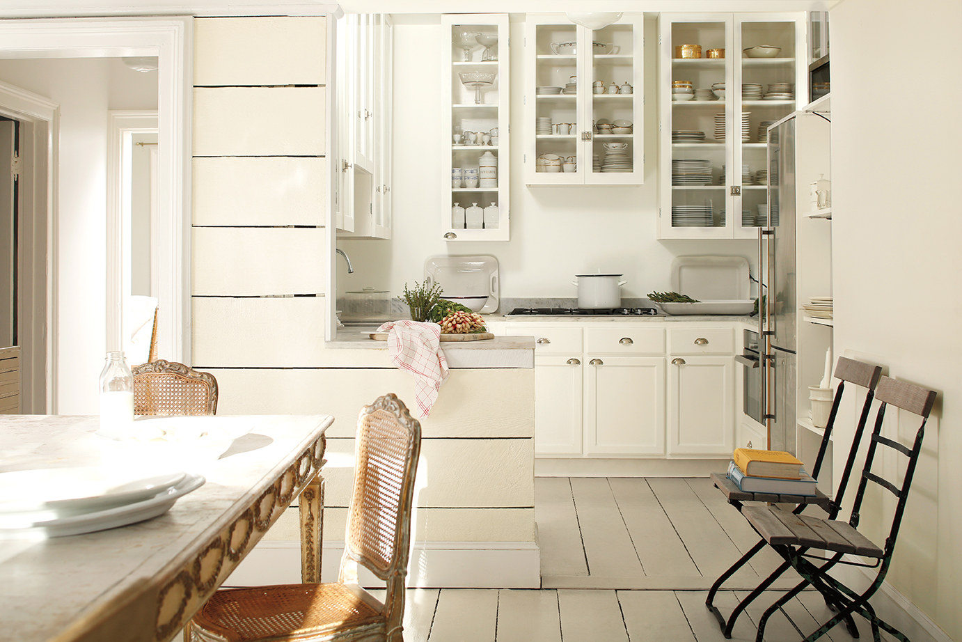
Photo by Bessler_2014
It’s old news, I know, but the color of 2016 is white. Yeah. White. Oh, technically it’s #OC-117 Simply White from Benjamin Moore, but, for all practical purposes, it’s white.
And that seems so profoundly . . . boring. White? The Benjamin Moore color system is home to over 3,500 bright, soft, wild, calming, deep, muted colors and the best they could come up with for 2016 was white?
A few months ago when the news came out, I thought it was crazy. The bold joke of some group of color professionals at Benjamin Moore who just didn’t care anymore. A group of people who, while sitting around sipping designer drinks, decided collectively: “let’s go into that meeting tomorrow and tell them white and see what happens! It’ll be hilarious!”
Yet, instead of being laughed out of whatever official color meeting took place, nobody got the joke and white was officially enshrined as the color of the year.
White?
That’s what I thought, anyway.
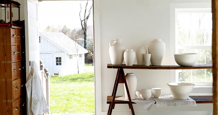
And then I saw some of the photos Benjamin Moore was using in their promotions. I read some of the explanations, the stories, the Narrative (with a capital “N”). And it started to make sense. Here are 3 reasons why I’ve changed my mind on Simply White.
Simplification
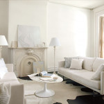
White simplifies. It declutters. It breathes a sense of calm, of peace, of cleanliness into a room. In this day and age of overwhelming visual stimulation, what’s needed most is often a simplification. A harbor. A space where visual overload isn’t allowed. A space where we can sit with a cup of coffee and the only distractions are the swirling snow outside the window and the gentle creaking of the hardwood when the furnace runs. White conveys that sense of calm, that sense of peace that is lacking in so much of our lives.
The Perfect Backdrop
White provides the perfect backdrop for all the other colors we use in our homes. As Ellen O’Neill, Benjamin Moore’s Creative Director, states in an interview with Architectural Digest: “When we were redesigning the showroom in the D&D Building, I said, ‘Just paint it all white because the story here is about all of our colors. And the best way to see those colors is in a white space.'”
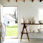
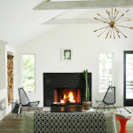
What she’s getting at is this: white doesn’t compete for primacy. White’s content to take the backseat, to highlight another color, to direct all attention that way. In a space with white walls, any other color will gain strength, will stand out, can become the accent tone that gives a room it’s personality. And the beauty of it is that that color doesn’t need to be a vibrant orange, a deep blue, a dark red in order to do this. In a white room, that accent color can be as simple as a honey-hued stain on a couple of wood stools in a kitchen. Or the wooden beams on a ceiling. Or a slate gray countertop. Or a denim blue wall. Or a mossy green dresser. A white backdrop infuses each of these simple tones with a strength and a power in our decorating that they don’t have when surrounded by other colors.
Accommodating
Finally, white is imminently easy to work with. Working in a paint store and knowing the struggles many folks have when they try to find colors for their home, this is a very important point for me. Sure, design and style are important, but so is practicality. And Simply White is imminently practical. Why? Because it works in any decor. It adapts easily, fluidly, to whatever style you prefer. It can look rustic and it can look modern. It can work in a home where the desire is to create a lived-in, comfortable setting and it can work in a space where the goal is to create a pristine, almost clinical cleanliness. Few other colors are this accommodating. Few will look this good in so many settings with so little effort.
Making Home Feel Like Home
Benjamin Moore’s decision to make Simply White the color of the year was a bit of a surprise. And while at first it seemed like a choice devoid of serious thought, I’ve changed my mind. And on this particularly blustery winter day, I find myself drawn into the rooms in the photos. The simplicity, the clean lines, the natural tones…they make every one of those rooms feel, in a strange sense, like home. And that’s the point and power of paint, isn’t it? To take a space that’s wrapped in something as impersonal and cold as drywall and plaster and turn it into something that feels like home.

THANK you, Dan Hansen
Ellen O’Neill