3 Reasons Why Simply White Simply Works

Bessler_2014

Photo by Bessler_2014

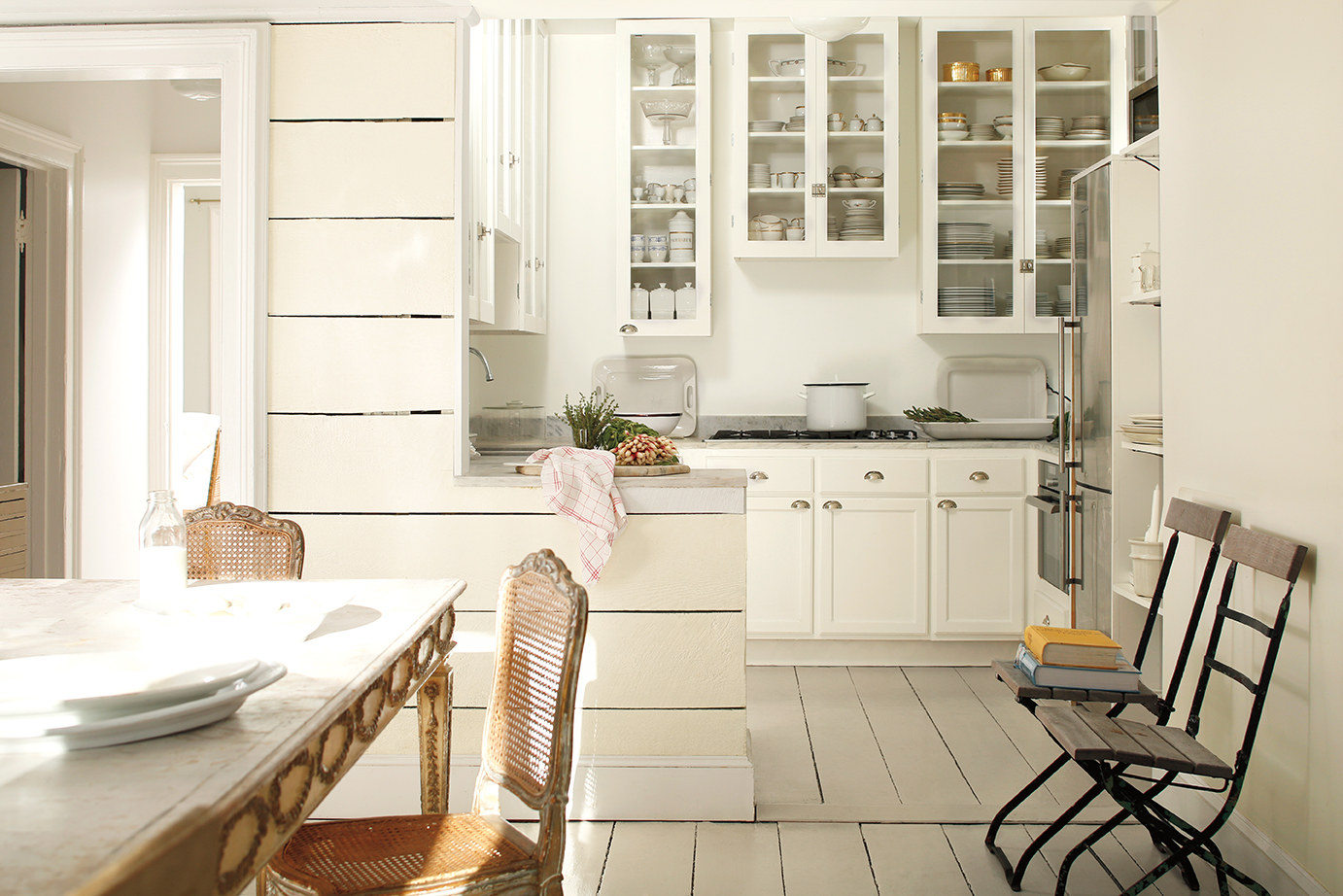
It’s old news, I know, but the color of 2016 is white. Yeah. White. Oh, technically it’s #OC-117 Simply White from Benjamin Moore, but, for all practical purposes, it’s white.

And that seems so profoundly . . . boring. White? The Benjamin Moore color system is home to over 3,500 bright, soft, wild, calming, deep, muted colors and the best they could come up with for 2016 was white?

A few months ago when the news came out, I thought it was crazy. The bold joke of some group of color professionals at Benjamin Moore who just didn’t care anymore. A group of people who, while sitting around sipping designer drinks, decided collectively: “let’s go into that meeting tomorrow and tell them white and see what happens! It’ll be hilarious!”

Yet, instead of being laughed out of whatever official color meeting took place, nobody got the joke and white was officially enshrined as the color of the year.

White?

That’s what I thought, anyway.

And then I saw some of the photos Benjamin Moore was using in their promotions. I read some of the explanations, the stories, the Narrative (with a capital “N”). And it started to make sense. Here are 3 reasons why I’ve changed my mind on Simply White.

Simplification

White simplifies. It declutters. It breathes a sense of calm, of peace, of cleanliness into a room. In this day and age of overwhelming visual stimulation, what’s needed most is often a simplification. A harbor. A space where visual overload isn’t allowed. A space where we can sit with a cup of coffee and the only distractions are the swirling snow outside the window and the gentle creaking of the hardwood when the furnace runs. White conveys that sense of calm, that sense of peace that is lacking in so much of our lives.

The Perfect Backdrop

White provides the perfect backdrop for all the other colors we use in our homes. As Ellen O’Neill, Benjamin Moore’s Creative Director, states in an interview with Architectural Digest: “When we were redesigning the showroom in the D&D Building, I said, ‘Just paint it all white because the story here is about all of our colors. And the best way to see those colors is in a white space.'”

What she’s getting at is this: white doesn’t compete for primacy. White’s content to take the backseat, to highlight another color, to direct all attention that way. In a space with white walls, any other color will gain strength, will stand out, can become the accent tone that gives a room it’s personality. And the beauty of it is that that color doesn’t need to be a vibrant orange, a deep blue, a dark red in order to do this. In a white room, that accent color can be as simple as a honey-hued stain on a couple of wood stools in a kitchen. Or the wooden beams on a ceiling. Or a slate gray countertop. Or a denim blue wall. Or a mossy green dresser. A white backdrop infuses each of these simple tones with a strength and a power in our decorating that they don’t have when surrounded by other colors.

Accommodating

Finally, white is imminently easy to work with. Working in a paint store and knowing the struggles many folks have when they try to find colors for their home, this is a very important point for me. Sure, design and style are important, but so is practicality. And Simply White is imminently practical. Why? Because it works in any decor. It adapts easily, fluidly, to whatever style you prefer. It can look rustic and it can look modern. It can work in a home where the desire is to create a lived-in, comfortable setting and it can work in a space where the goal is to create a pristine, almost clinical cleanliness. Few other colors are this accommodating. Few will look this good in so many settings with so little effort.

Making Home Feel Like Home

Benjamin Moore’s decision to make Simply White the color of the year was a bit of a surprise. And while at first it seemed like a choice devoid of serious thought, I’ve changed my mind. And on this particularly blustery winter day, I find myself drawn into the rooms in the photos. The simplicity, the clean lines, the natural tones…they make every one of those rooms feel, in a strange sense, like home. And that’s the point and power of paint, isn’t it?  To take a space that’s wrapped in something as impersonal and cold as drywall and plaster and turn it into something that feels like home.


Basketball and Decorating

caleb2Not too long ago, we purchased a portable basketball hoop for the kids. We figured we’d all have fun shooting hoops and doing all that “basketball stuff” in our driveway. I assumed it would be a great bonding time, would provide some excercise, and, above all, give us something to do outside.

Well, shortly after we installed the hoop in its place, I realized that it was very likely one of the greatest gifts anybody has ever given to his or her neighbors.  In the history of mankind.  Allow me to explain:

See, I’m short.  Let’s just get that out on the table.  And it’s not just me.  It’s my whole family.  We’re all short.  And when we set up that basketball hoop and extended the rim of the basket until it was regulation height, I realized just how short we really were.  We just stood there and watched it go up and up and up until it finally clicked into place.  I wish I had a snapshot of that moment–all of us looking straight up from our humble little positions on earth, some of us squinting.  You would have thought we were watching a comet.  Nope.  Just trying to see the basketball hoop.

Well, the insane height of the basket only frightened me for a minute or two before I steeled my nerves, grabbed the ball and started dribbling it.  It made a satisfying “thump” on the cement.  Made me feel like a man.

Bouncing the ball, feeling cool, I stepped back a ways, gave myself some space for a good running start, and I took off. My tongue was hanging out in concentration, the ball was thumping against the concrete, my child-like hands were slapping it down, perfectly in-sync with each pattering footstep.  It felt just like what I’ve seen on TV:  real basketball players, running down the court getting ready to impress.

My little heart was pounding as I reached that point when I had to jump.  My muscles tensed, my legs coiled and I launched myself into the air.  Flight:  it’s a truly amazing thing.  I felt the air whipping through my thinning hair.  My ears popped as I reached heights heretofore never reached.  I felt like superman.  Unstoppable.  And, best of all, it happened in slow-mo.

Well, in what felt like a long instant replay, I felt myself going up, up, up and I saw the basket get closer and closer and closer.  I reached up with the ball, prepared for the “slam”, prepared for the cheering, prepared for the moment of release… and then, suddenly, I was back on the ground again.  The basket was barely visible way up in the sky.  The ball was still in my hand.  My right leg hurt and I had drool on my shirt.  I was sweating.

Standing there, unsure what to do, I threw the ball as hard as I could into the air and pulled a muscle in my side as I did so.  The ball sailed skyward until it hit the bottom of the net–nuzzling it like a soft breeze–and then it fell back to earth, making an eery, hollow thump on the cement.

And then the kids started laughing.  I was told that in my amazing moment of jumping and “slamming”, I had never once been more than 3 inches off the ground. Never once.  I thought I had been soaring, but I’d actually only been skidding along.

Needless to say, the laughter went on for a while–until they started playing.  Then it quit abruptly because they realized they were no better.

And from that point on, we’ve spent many a day running beneath that insanely high (regulation-height) basket, dribbling big basketballs that look oversized in our small, child-like hands.  We run and jump and not a single one of us gets more than 3 inches off the ground.  It’s as if we’ve got invisible rubber bands strapped around our ankles and anchored into the ground.

And that’s why I say this was one of the greatest gifts a neighbor has given another neighbor ever.  It’s comic relief.  Whenever my neighbors are feeling down or are having a bad day, they just need to look out the window and watch the Hansen family running around the 10 foot tall basket, leaping and jumping and for all that hard work, never once getting more than a few inches off the ground.  It’s absolutely hilarious.  We’re that bad.

And it’s all because we’re not basketball people.  We’re just not cut out for it.  But even though we stink at it and even though we don’t have very many skills and even though we’re physically not capable of playing the sport competitively (or even casually) . . . we still do it and we still have fun.

And that’s the decorating point today.  So many times, I’ve talked to customers at RepcoLite who are picking out a color to go on their walls that’s the same color as the color already there.  It’s just a new coat–a clean coat–but it’s nothing different.

And they’re bored with it–I can tell that–it’s the same old thing they’ve always done.  But when you ask them and try to get them to step out and try something new, we often hear the same old excuse:  I’m no good at decorating. It’s not my thing.  I don’t know how to do it.

Well, I’m not good at basketball.  I stink.  And so does my entire family.  And yet, we’ve already made some great memories running around the hoop trying to throw a ball high enough that it has a chance to go in.

Just because you don’t think you’re good at decorating, don’t let that stop you from trying.  When you step outside of your comfort zone and start trying new things, you’ll discover how much fun it can be to take those plain walls in your home and start turning them into something that reflects who you are, who your family is.  So get going and give it a try.  And if you don’t know where to start, stop out at RepcoLite and let our decorators give you some advice.  You’ll be amazed how much fun the process can be.

Let Them Help: Decorating With Your Kids’ Input!

paint_handsEvery now and then I hit upon something that I know is a good idea. And, though this doesn’t happen very often, this is one of those times. There’s no way around it: decorating your kids’ rooms with their help is a great opportunity for you and for them. Oh, I know there are lots of little bugs in the idea and potential complications–but that doesn’t change the fact that it’s a good thing to do.

Taking a room that was decorated with younger kids in mind and turning it into “hip, way cool pad” is a great way to let your kids know that YOU know that they’re growing up. Taking down the wallpaper borders of stuffed bears and turtles and replacing it with something more age-appropriate will make your kids feel important. And involving them in that process, seeking their input and listening to their suggestions will make them feel that they are on the path to growing up–they’re actually an active force in the creation of their new room.

Surprise Makeovers are Cool on TV, But Not So Much In Real Life

If you still need convincing that it’s a good idea to involve your kids in the process, then think about it this way: on TV, surprise makeovers are cool. They really are. But that’s because we don’t normally watch the recipient of the new room beyond their initial reaction. We see them when they first whip off a blindfold and stand blinking and squinting in the bright lights as they try to take in their new surroundings. Everybody’s happy and giggly and the show ends. We don’t see the couple standing there 12 hours later, now that the cameras and energetic TV personalities are gone, staring at the new walls and wondering what happened and how anybody ever thought that bright orange was a good look.

Your kids feel the same way about their room as you would about your home. Their room is their space–their world away from the world, especially as they get older. Just as you wouldn’t likely appreciate it if your husband or your neighbor just dropped by one afternoon and repainted your living room in colors of their choosing, neither will your kids necessarily be receptive to the changes you bring about one day while they’re off at school. Your vision for their room isn’t necessarily their vision for the room. You’ve got to make it your goal to discover a mutually acceptable vision.

Involve Them, But Remember Their Limitations

To that end, involve them in every aspect of the process. Take them to the store and let them look at colors. Let them flip through wallpaper books and mural books. Let them explore the world of Faux Painting. However, make sure that you keep the outings short and sweet–no marathon shopping trips that will frustrate and wear your kids out. Remember that their attention spans are not like yours–keeping the trips to a limited amount of time will make sure both of you enjoy the outings. And don’t forget to think bigger than just a trip to the paint store or the furniture store: try to tie your decorating trips in with a nice dinner out or something like that.

Taking the kids to the paint store and listening to their suggestions and then taking them out to dinner will be one of those special moments kids remember. If you treat their opinions as valid options and listen to their thoughts and take the time to discuss things with them over dinner, they will start to feel like an intricate part in the decision process. And trust me, I may have young kids and I may not have had much experience in the world of psychology, but I know this is a good thing. You don’t have to be a genius to see that by involving your kids in something so small as decorating their rooms, you’re basically telling them that their opinions matter and that you value their thoughts.

What If . . ?

Alright, now you’re probably thinking that I’m living in a world where everything is puppy dogs and lollipops. Sure it sounds good to involve the kids in the decorating process, but what’s going to happen when they pick out Sponge-Bob Yellow and Bright Red for their walls?  We’ll cover that in the next post.

Easy DIY Stenciled Headboards

headboard5Here’s a great idea from a blog we follow called Simply Sjostedt.  It’s a simple way to create an entirely unique, interesting, headboard using only some planks, a stencil and some paint.

Here you can read about how it was done and see pictures that chronicle every step.  But before you click the link, remember the Cardinal Rule of any project:  don’t be afraid to tinker with the idea.

What I mean is this:  the plank background here is a great “blank canvas”.  Sure, you could stencil it–as we see in the picture at the left–but don’t be afraid to make this project your own.

For example, you could paint the boards a solid color and distress them.  Or, you could go a different route and stain and varnish the planks.  The stain job could be done with an eye toward a rustic finish or, if you prefer, a fine wood finish.  Both results would be easily achievable–you just need to figure out which would work better for you.  Really, the possibilities are endless.  Use your imagination and your creativity and see what you can come up with!  (And, if you come up with something really cool, let us know in the comments!)

Decorating Made Easy: Decorating with the 60-30-10 Rule

The 60-30-10 rule is a tested concept used by interior decorators everywhere.  It’s a simple proportion that spells out the ideal amounts of color to use in your decorating.

To keep it as simple as possible, 60% of your room should be composed of your dominant color, 30% should be composed of a secondary color and that final 10% should be reserved for accents.  Now, maybe that sounds a little confusing . . . so here are some examples:

This room is a perfect example of the 60-30-10 rule in practice. 60% = Lavendar (walls and blanket) 30% = White (bed and fireplace) 10% = brown/tan (chairs, dresser, floor)

This room is a perfect example of the 60-30-10 rule in practice.
60% = Lavendar (walls and blanket)
30% = White (bed and fireplace)
10% = brown/tan (chairs, dresser, floor)


Another great example: 60% = Tan (walls, floors) 30% Brown (couch, tables) 10% Blue and White (pillows, vases, etc.)

Another great example:
60% = Tan (walls, floors) 30% Brown (couch, tables)
10% Blue and White (pillows, vases, etc.)


A classic example showing that you don't need a soft, muted color on your walls to make this work. 60% = Red (walls, accessories) 30% = Cream (furniture, rug) 10% = Tan (floor, accessories)

A classic example showing that you don’t need a soft, muted color on your walls to make this work.
60% = Red (walls, accessories)
30% = Cream (furniture, rug)
10% = Tan (floor, accessories)


Another great example that clearly demonstrates that the main color doesn't need to be calm, simple, neutral or BORING! 60% = Green (walls, accessories) 30% = White (furniture, art prints) 10% = Dark Brown (floors, chair legs)

Another great example that clearly demonstrates that the main color doesn’t need to be calm, simple, neutral or BORING!
60% = Green (walls, accessories)
30% = White (furniture, art prints)
10% = Dark Brown (floors, chair legs)

 An example that proves you can use the 60-30-10 rule to work incredibly vibrant and bold colors smoothly into your decorating. 60% = Blue (walls, light) 30% = Pink (bedspread, chair, painted leaves) 10% = White (trim, doors)

An example that proves you can use the 60-30-10 rule to work incredibly vibrant and bold colors smoothly into your decorating.
60% = Blue (walls, light)
30% = Pink (bedspread, chair, painted leaves)
10% = White (trim, doors)

The color options are endless and it’s not difficult to see that using this rule helps you keep your color scheme under control and helps you produce an end result that’s very focused, very clean and very inviting!

Bad Uniforms and What They Teach Us About Paint

white_sox_shortsThe year was 1976.  The team was the Chicago White Sox.  The Sport?  Major League Baseball.  Yes.  Major League Baseball.

Maybe some of you remember this, maybe this is new to many of you, but for 3 games in 1976, the White Sox sent their players out on the field wearing…yes, shorts.  And not cool, baggy shorts. No.  Tight, clingy shorts.  With their socks pulled up all the way to their knees.

This alone would have been bad–a fashion faux-pas of epic proportions–but the designers of this sleek little number weren’t done.  They added to the shorts what would have been a boring white shirt were it not for the GI-NORMOUS 1970’s black collar.

Together, the whole outfit was so horrible, I’m pretty sure opposing teams refused to even take the field against the White Sox.  White Sox players themselves likely spent hours in counseling and therapy sessions after being ridiculed and laughed into oblivion by former fans.

And yet, what’s interesting to me is that underneath that ridiculous outfit, these men were still Major League Baseball players.  They are/were more successful than me by a long shot and yet, looking at the pictures, it’s almost impossible to think of them that way.

It’s a perfect example of that old saying about how the clothes make the man (or, of course, woman).  When we say that, we know that clothes don’t CHANGE who we are, but they certainly affect how we are perceived.

For example, think of the manliest man playing the game today–I’m not going to whitesox1976aname names, you just get somebody in your mind.  Picture that player and then dress him–in your mind–in this bozo outfit from the 1970s.  Give him shorts and white socks with black stripes pulled up to his ankles.  Put that little shirt on him with the big fluffy disco collar.  I guarantee if you do that, you’ll be unable to take him seriously.  The goofy get-up doesn’t change who he is, but it certainly changes who we think him to be.

Now let’s shift gears and talk about paint.

Your home–your living room, your kitchen, the exterior of your home itself–can be in great shape.  It can be solid, well-built, brand-new.  It can be composed of the highest quality materials and consist of the best workmanship known to mankind.  It can be all of those things, but if the paint colors are boring or were poorly chosen, all of the quality underneath remains hidden.

Look again at the pitcher in the top picture.  He may be a tremendous athlete (and even if he wasn’t, he’s still likely 20X more fit than most of us).  And yet, even though that may all be true, he looks so silly in his little shorts and his big collar and pulled-up socks that I look more manly sitting here typing this story about paint colors than he does throwing curveballs and 4-seam fastballs.

As I said earlier, clothes MAKE the man–they alter our perceptions–and the same is true with your home.  You can take the best, highest quality workmanship and hide all that quality beneath poor paint jobs and lousy color choices.

It’s a remarkable concept:  an athlete takes years and years of sweat and work and effort to hone him or herself to be the best he or she can be in their sport.  Just like those White Sox players.  And yet, all that work can be tossed out in a minute when you cover them over with a stupid-looking uniform.  You can spend hours and hours and tons of money making your home exactly the way you want it, but if you choose the wrong paint color–something that simple and that superficial–the rest of the work is cheapened.

So all that to say, choose wisely.  Color matters.  The right colors can make your home look like something out of a magazine and the wrong colors can make it look like kids built it.  Choose the right colors!