Easy Mantel Decor or Table Centerpiece (You Decide!)

IMG_6824Another post from our Super-Hero Decorator guest writer, The Purple Stiletto!

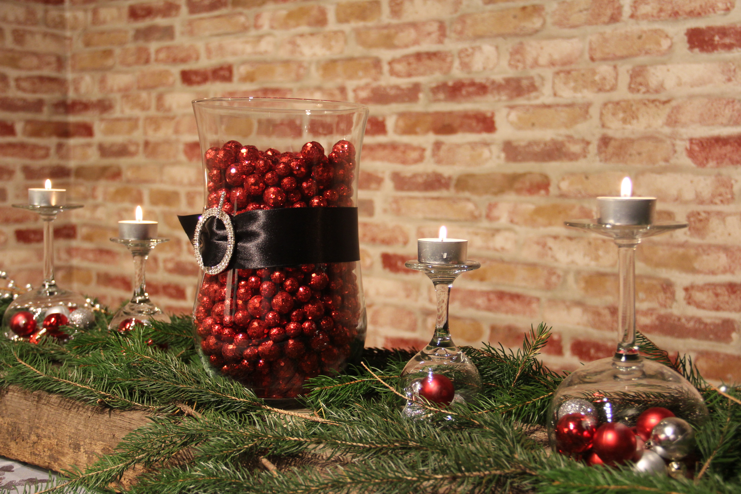
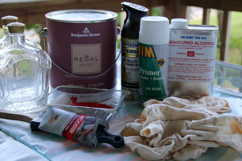
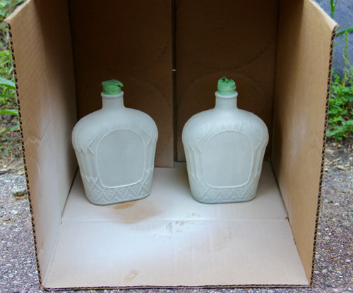
Now, the most obvious basic item was the leftover branches from the bottom of my Christmas tree. They were going to add color and texture to the top of the mantel. I also collected together tea lights, small red and silver Christmas bulbs, unused wine glasses, an empty vase, ribbon, a rhinestone buckle and some sparkly red balls.

I started by laying the branches from my Christmas tree on the mantel. I let them drape over the edge just slightly. Next, I filled the vase with red balls, wrapped black ribbon around the middle and secured with a rhinestone buckle. I placed the vase in the center of the greens, then grabbed the wine glasses. I filled the glasses with red and silver Christmas bulbs and then turned upside down. I arranged the glasses among the branches on either side of the vase. I set tea lights on the bases of the wine glasses and stepped back to admire my handiwork. Fabulous! Now THAT was a mantel worthy of my new stocking!

OK, so I know most people would have stopped there, but I still had ideas that were begging to be used. The Purple Stiletto dreams in glitter and color all the time! So what to do with the remaining mantel idea…

I know! The Red Ranger needs a little holiday cheer! Yes, he has a tree (an artificial one with a pine scented car freshener to make it “smell real”) and lights and some Christmas tidbits here and there but he could really use an amazing mantel too!

I loaded some supplies in my car and dashed through the thickening snow. Under the cover of night, while Red Ranger slept with visions of sugar plums and glitter dancing in his head, I snuck in and worked my magic on his exceptionally dull fireplace.

I, again, began with branches from my Christmas tree. I put a beautiful pillar tree candle in the middle of the branches and began working my way along the mantel. I added large wine glasses with pale blue and silver ornaments, flipped them over on either side of the center candle and added tea lights to the base of the glasses. I followed this with medium, white pillar candles along the length of the mantel, alternated with small glass votives. I scattered the remaining blue and silver ornaments among the greens and candles for a little sparkle. I lit the candles and the effect was breathtaking! It was beautiful! Now, the Red Ranger’s house was dressed for the holidays.

I snuck out, grinning to myself and wondering what the Red Ranger was going to think when he woke up…

As the Purple Stiletto settled into her armchair next to the fire with a glass of wine (in a Christmas glass, of course!), she reflected on how amazing it was that such simple objects could completely transform a mantel. The same items could also be used down the center of a table or buffet, but that was for another day. It was time for the Purple Stiletto to kick off her shoes, put her feet up and relax as the scents and scenes of the season washed over her. How was she ever going to make it better next year…

Color Me Home Episode 12: The Keys to a Happier Laundry Room

Did you know that on average, a mom can spend up to 5 months of her life doing laundry per child! On today’s episode, Betsy and Dan talk about how the right color–used in the right spots–can help you make your laundry room a better–possibly even happier–place to be.

Check out all the laundry room ideas we discussed on the episode!


  • The Thrilling (Depressing) News Article about Laundry! (0:48)
  • The Importance of Color in Decorating (4:00)
  • A Brief Overview of the Psychology of Color (4:24)
  • Choose Color Based on Your Goals for the Room: (6:17)
  • Great Colors for Laundry Rooms (6:50)
  • How To Bring Color Into Your Room
    • Put the Color on the Walls (7:30)
      • Tips for Working With Yellow in Your Decorating: (9:32)
    • Put the Color on the Cabinets (12:11)
    • Bring in Unexpected “Pops” of Color (16:22)

Betsy’s Color Recommendations

As we mentioned in the episode, Betsy pulled some Benjamin Moore colors that she thinks would be perfect in a laundry room. We’ve included each color with a combination of other colors recommended by Benjamin Moore. Use these for inspiration for your laundry room. And be sure, as Betsy mentioned in the episode, to come and see the colors in person–the actual chip will probably look quite a bit different from the color you see on the screen!

How to Paint and Distress Crown Royal Bottles

So, what does The Purple Stiletto do with things that most people would throw away? Get creative, of course!

I was presented with some clear glass bottles, the contents having long since been enjoyed. The texture was exactly what I was looking for! This made things interesting and, in some way, made my job easier.

I started by gathering the supplies that I would need for a day of creativity….and waiting for paint to dry.

  • Empty bottles … check!
  • X-I-M primer (because it sticks to glass) … check!
  • Metallic spray (bronze because I’m currently on a dark metallic kick) … check!
  • Latex paint for topcoat (way more than I needed but it was a mistint gallon I changed to suit my mood) … check!
  • Denatured alcohol & rags for distressing … also check!

IMG_6523_web

With my supplies gathered together, I was ready to prime my glass. Now, I should mention that all adhesive residue and grease had been cleaned from the bottles before I started this project. Also, I realized that the lids may not screw back on correctly if the threads had been painted over, so I decided to tape the opening of the bottles to be on the safe side.

IMG_6528_web

While I waited for the primer on the glass to dry, I painted the caps with a very small artist brush and practiced walking around in my stilettos.

IMG_6526_web
After letting the primer COMPLETELY dry on both the bottles and lids (and with aching feet!), I sprayed a couple basecoats of the bronze metallic according to the can instructions. This one specifically said to spray multiple light coats in a one hour window. And, being that it was quite humid when I did this project, it took all of my patience to let the paint dry all the way before moving on to the topcoat.

IMG_6539_web

After some lunch and a short walk with the dog (not in stilettos), my paint was FINALLY dry! I decided to try rolling the latex topcoat. I have done other projects that I brushed out and was not really happy with the brush strokes. This is nothing but a game of trial and error. As I found out, I did not like the rolling any better. Next time, I think I will try spraying.

IMG_6541_web

Two coats of latex (and more waiting) later, it was finally time to see what I could create!

Now, I will say I was going to just use a rag to wipe on the denatured alcohol but too much dry time gives one plenty of time to think of other ways to distress.

In the end, I began with a gray scuff pad lightly dipped in the alcohol. I did not want to put too much on, for fear it would eat away more paint in certain areas than I would like. I alternated between the scuff pad and rags, taking off paint only on the raised areas.

When I was happy with the raised areas, I moved on to the center of the bottle. For this, I tried a couple different techniques. The one I liked the best was cutting through certain areas with a piece of sandpaper. Just as I was getting to the metallic layer, I switched to denatured alcohol and a rag. From there, I was able to “buff out” the rough edges made by the sandpaper and reveal just the right amount of bronze. I could plan the “wear spots.”

IMG_6543_web

The other technique I tried was just continuously wiping the whole center section with alcohol until the bronze wore through. I did not like this as well because I felt it looked a little splotchy when it was done. I much prefer the “planned aging” look!

IMG_6544_web
I left one bottle center plain. I think it could be used for a monogram or initial. The jury is still out on what to use the blank space for. Perhaps the Purple Stiletto symbol (which I have yet to create)? These are the two completed bottles. Just another day’s work. The Purple Stiletto crafts again!

IMG_6545_web

Color Me Home Episode 6: Decorating Kids’ Rooms

This week, Betsy and Dan talk about decorating kids’ rooms. These are great projects and can be a lot of fun: you’ll get to use colors you might not typically use and you really get to put your creativity on display! But how do you create something that the kids will love–with all their favorite colors–without having the whole thing turn into, quite literally, a circus? That’s what we talk about in this episode, so give it a listen!

View our Pinterest Board for Episode 6!

Episode Outline

  • Involve Your Kids With the Decorating! (0:30)
  • What Do We Do When the Kids Pick Crazy Colors? You Compromise! (4:32)
    • My Son Embarrasses Me In Public (5:00)
    • Pick a Lighter Version of the Color (8:02)
    • Pick a Muted or Muddier Version of the Color (10:11)
    • Paint an Accent Wall (13:43)
    • Doors, Window Frames, Ceilings . . . (15:0o)
    • Accessories (16:30)
  • Choose the Right Paint and the Right Finish (17:30)
    • The Right Paint (17:57)
    • The Right Finish (21:46)
  • Our First Email Question! (23:06)

Benjamin Moore Waterborne Ceiling Paint56295-9030107

In the podcast, we mentioned ceilings as a potential area to bring in some color. If you’re going to give that a try (and you should, because it’s a very cool idea that’ll payoff with great results!) then you should definitely be using Benjamin Moore’s Waterborne Ceiling Paint. It’s specifically formulated for ceilings, and provides an ultra flat finish that easily hides common ceiling imperfections. It’s easy to work with, has minimal spatter and dries very quickly for fast recoats.

  • Superior hide for a flawless finish
  • Flattest finish offered by Benjamin Moore
  • Conceals common surface imperfections
  • Easy application with fantastic results
  • Formulated for minimal spatter

Recommended Paints for Kids’ Rooms

We covered 4 different products that would be perfect. Here’s a quick summary in case you didn’t have a note pad to jot all the good ideas down while the podcast was playing:

Hallmark Ceramic Paint by RepcoLite

Hallmark is our Premium interior paint. It’s created with Ceramic microspheres and provides exceptional washability and durability even in our matte finish. Hallmark is available in a Matte, Eggshell, Satin Sheen, and Semi-Gloss.

Aura by Benjamin Moore

Aura delivers remarkable durability and offers the most advanced way to bring color to life. Using Benjamin Moore’s exclusive Color Lock® technology, Aura paint brings you discernibly richer, truer color. Aura is ideal for kids’ rooms whenever you’re using colors with poor coverage or if you’re covering over other bright and bold colors. The reason? Aura’s specifically formulated to cover and hide better than any other paint out there. If you don’t want to fuss with 3 or 4 coats, choose Aura!

Regal by Benjamin Moore

Regal paint stands up to today’s active lifestyles in colors and finishes that create the home you’ve always imagined. A premium quality coating featuring Advanced Particle Technology® which includes our proprietary 100% acrylic resin. This makes the finish itself more durable, providing for superior uniform coverage as well as easier touch-ups. Additional benefits include spatter resistance for easier clean-up, and superior coverage for a flawless finish in fewer coats.

Natura by Benjamin Moore

Natura Waterborne Interior Paint continues Benjamin Moore’s commitment to providing the most environmentally friendly paint. Natura goes beyond zero VOC* to offer zero emissions** and no harsh fumes***, making it a safer paint for your family and the environment, all without compromise to performance or color selection. Natura is truly “Green Without Compromise®.”

Carefree by RepcoLite

While we didn’t mention Carefree in the podcast, we certainly should have! Carefree is a tremendous product for walls, will give you great washability and durability, and will price out below all of the other products here! If you’re working on a budget, Carefree might be a great option to consider.

Recommended Finishes for Kids’ Rooms

When it came to finishes, we strongly recommend either Satin Sheen or Semi-Gloss for your trim, doors, and furniture. Semi-Gloss finishes hold up well and wash up readily.

For your walls, however, our favorite choice is an Eggshell Finish. It’s dull enough to hide wall imperfections (Betsy kept referring to the dings and dents made by someone bouncing a ball of the wall . . . perhaps something she was guilty of long ago) but it also has enough of a finish to be washable.

Further Reading

We drew from a lot of articles and posts when we gathered info for this podcast. Here are just a few of them if you’d like to read further!


Color Me Home Episode 2: Choosing Colors You’ll Love

Welcome to Color Me Home! This week Betsy and Dan discuss how you can make sure that the next colors you choose are colors you love! See, in our first episode we talked about ways to find inspiration for your next color scheme. That’s all well and good, but finding interesting, intriguing color schemes is one thing . . . finding colors you LOVE is a little different. Today, we’re going to discuss some concepts that you can use to make sure that the next gallon of paint you purchase looks perfect in your home.

Episode Outline

  • The Color Folder/Portfolio (0:50)
  • Online Tools  (7:00)
  • Schedule Yourself Time so You Don’t Have to Rush! (10:40)
  • Brush Out Some Larger Samples (16:24)
  • Don’t Forget About Your Lighting! (24:46)
  • The Danger (and Importance) of Asking for Opinions (35:30)

Some Great Blog Posts That Delve Into the Topics Discussed Today!

Start With a Color Folder
Paint Colors and Lighting
A Little Color Here...
The Eyebrow Incident


Color Me Home Episode 1: Finding Inspiration

Welcome to Color Me Home! As a quick introduction, Color Me Home is a podcast about painting, decorating, creative projects, and whatever else happens to come up in the conversation. It’s hosted by Betsy Thompson and Dan Hansen from RepcoLite Paints.

This week Betsy and Dan discuss how to find the inspiration for your next color scheme. It often seems overwhelming to pick colors when you find yourself standing in front of a color display that offers over 3,000 varying tones and shades! But the good news is that finding inspiration is much easier than you might think!

Episode Outline

  • Nature (1:24)
  • Our Expanded Neighborhoods (3:24)
  • Our Existing Decor and Furniture (12:20)
  • Our Closets (15:54)
  • Magazines (19:07)
  • Your Own Photos (21:43)
  • Online Tools and Sources of Inspiration (25:15)
  • The Unusual and Unexpected (35:30)

Links for Online Tools and Sources of Inspiration

We spoke about a number of sites that we recommend for finding inspiration. Here are the links for everything we mentioned!

  • Design Seeds (browse 1000’s of photos/color schemes)
  • Houzz (browse 100’s of 1000’s of photos for inspiration)
  • Pictaculous (upload your own photos to create color schemes)
  • Easy RGB (to convert web-specific colors into Benjamin Moore color numbers!)

And here’s one more site we strongly, strongly recommend:

Palette Generator.com

palettegenerator
This site completely replaces Pictaculous (mentioned above). If we’d known about this one before we recorded our podcast, we’d have included it and left out Pictaculous. And here’s why: it’s way easier, it provides much better information, and, best of all, you can mark off a section of the photo you uploaded and only draw colors from that location! It is easily one of the best online sources for finding inspiration you’ll ever use–especially when you use it in conjunction with the EasyRGB site mentioned above. Below are just a few examples of color schemes Betsy put together based on her own photos and the color recommendations from palettegenerator.com!

The colors above came together quickly! And it was fun to do. Sure, the colors recommended by PaletteGenerator.com needed to be adjusted and toned down somewhat, but it still gave us some direction to get started. In fact, we both agreed that using the website was much quicker than even taking the photo to the store and trying to find colors to match. It’s a powerful tool to help you go from 1000’s of options down to just a few in literally seconds!