Color Me Home Episode 13: 3 Surefire Decorating Fails

In this episode, Betsy and Dan discuss 3 Surefire Decorating Fails (and, of course, how to avoid them!). In every decorating project there are certain things that can trip us up, wreak havoc with our plans, or just complicate everything we’re trying to accomplish. These are common pitfalls. But the good news is that they’re remarkably easy to avoid!

Check out all the projects we discussed on this episode!

Episode Outline

  • Mistake 1: Choose Your Paint First! (0:50)
  • Mistake 2: Go All “Matchy-Matchy” With Your Colors (6:06)
  • Mistake 3: Keep Something That Doesn’t Fit With Your Style! (13:40)
    • Fix 1: Paint It! (16:03)
    • Fix 2: Strip It! (19:54)
      • Tip: Use a Heat Gun (23:33)
      • Tip: Strip Painted Hardware in a Crock Pot! (23:58)
    • Fix 3: Repurpose It! (27:16)

Choose Your Paint Last!

We were pretty clear about the importance of choosing your paint last. Still, we have a number of resources on our blog that speak to this point. And here they are for your reading pleasure!

The Crockpot Solution!

At one point, Betsy referenced a Crockpot solution for removing paint from painted hardware. And, of course, there was a bit of a discussion as to the right methods to use: is it plain water brought to a boil? Or do you add vinegar. Dan thought vinegar made sense. Betsy thought just water. Turns out, Betsy was more right (which, by contract, Dan is forced to admit).

Anyway, the process is simple:

  • Get an OLD Crockpot that you intend NEVER to use again for food!!!
  • Put water and a little liquid laundry detergent in along with the hardware and set the Crockpot to medium.
  • Let it “cook” overnight.
  • In the morning, you should be able to peel the layers of paint off with your fingers.


Color Me Home Episode 12: The Keys to a Happier Laundry Room

Did you know that on average, a mom can spend up to 5 months of her life doing laundry per child! On today’s episode, Betsy and Dan talk about how the right color–used in the right spots–can help you make your laundry room a better–possibly even happier–place to be.

Check out all the laundry room ideas we discussed on the episode!


  • The Thrilling (Depressing) News Article about Laundry! (0:48)
  • The Importance of Color in Decorating (4:00)
  • A Brief Overview of the Psychology of Color (4:24)
  • Choose Color Based on Your Goals for the Room: (6:17)
  • Great Colors for Laundry Rooms (6:50)
  • How To Bring Color Into Your Room
    • Put the Color on the Walls (7:30)
      • Tips for Working With Yellow in Your Decorating: (9:32)
    • Put the Color on the Cabinets (12:11)
    • Bring in Unexpected “Pops” of Color (16:22)

Betsy’s Color Recommendations

As we mentioned in the episode, Betsy pulled some Benjamin Moore colors that she thinks would be perfect in a laundry room. We’ve included each color with a combination of other colors recommended by Benjamin Moore. Use these for inspiration for your laundry room. And be sure, as Betsy mentioned in the episode, to come and see the colors in person–the actual chip will probably look quite a bit different from the color you see on the screen!

Color Me Home Episode 2: Choosing Colors You’ll Love

Welcome to Color Me Home! This week Betsy and Dan discuss how you can make sure that the next colors you choose are colors you love! See, in our first episode we talked about ways to find inspiration for your next color scheme. That’s all well and good, but finding interesting, intriguing color schemes is one thing . . . finding colors you LOVE is a little different. Today, we’re going to discuss some concepts that you can use to make sure that the next gallon of paint you purchase looks perfect in your home.

Episode Outline

  • The Color Folder/Portfolio (0:50)
  • Online Tools  (7:00)
  • Schedule Yourself Time so You Don’t Have to Rush! (10:40)
  • Brush Out Some Larger Samples (16:24)
  • Don’t Forget About Your Lighting! (24:46)
  • The Danger (and Importance) of Asking for Opinions (35:30)

Some Great Blog Posts That Delve Into the Topics Discussed Today!

Start With a Color Folder
Paint Colors and Lighting
A Little Color Here...
The Eyebrow Incident


Color Me Home Episode 1: Finding Inspiration

Welcome to Color Me Home! As a quick introduction, Color Me Home is a podcast about painting, decorating, creative projects, and whatever else happens to come up in the conversation. It’s hosted by Betsy Thompson and Dan Hansen from RepcoLite Paints.

This week Betsy and Dan discuss how to find the inspiration for your next color scheme. It often seems overwhelming to pick colors when you find yourself standing in front of a color display that offers over 3,000 varying tones and shades! But the good news is that finding inspiration is much easier than you might think!

Episode Outline

  • Nature (1:24)
  • Our Expanded Neighborhoods (3:24)
  • Our Existing Decor and Furniture (12:20)
  • Our Closets (15:54)
  • Magazines (19:07)
  • Your Own Photos (21:43)
  • Online Tools and Sources of Inspiration (25:15)
  • The Unusual and Unexpected (35:30)

Links for Online Tools and Sources of Inspiration

We spoke about a number of sites that we recommend for finding inspiration. Here are the links for everything we mentioned!

  • Design Seeds (browse 1000’s of photos/color schemes)
  • Houzz (browse 100’s of 1000’s of photos for inspiration)
  • Pictaculous (upload your own photos to create color schemes)
  • Easy RGB (to convert web-specific colors into Benjamin Moore color numbers!)

And here’s one more site we strongly, strongly recommend:

Palette Generator.com

palettegenerator
This site completely replaces Pictaculous (mentioned above). If we’d known about this one before we recorded our podcast, we’d have included it and left out Pictaculous. And here’s why: it’s way easier, it provides much better information, and, best of all, you can mark off a section of the photo you uploaded and only draw colors from that location! It is easily one of the best online sources for finding inspiration you’ll ever use–especially when you use it in conjunction with the EasyRGB site mentioned above. Below are just a few examples of color schemes Betsy put together based on her own photos and the color recommendations from palettegenerator.com!

The colors above came together quickly! And it was fun to do. Sure, the colors recommended by PaletteGenerator.com needed to be adjusted and toned down somewhat, but it still gave us some direction to get started. In fact, we both agreed that using the website was much quicker than even taking the photo to the store and trying to find colors to match. It’s a powerful tool to help you go from 1000’s of options down to just a few in literally seconds!

3 Reasons Why Simply White Simply Works

Bessler_2014

Photo by Bessler_2014

It’s old news, I know, but the color of 2016 is white. Yeah. White. Oh, technically it’s #OC-117 Simply White from Benjamin Moore, but, for all practical purposes, it’s white.

And that seems so profoundly . . . boring. White? The Benjamin Moore color system is home to over 3,500 bright, soft, wild, calming, deep, muted colors and the best they could come up with for 2016 was white?

A few months ago when the news came out, I thought it was crazy. The bold joke of some group of color professionals at Benjamin Moore who just didn’t care anymore. A group of people who, while sitting around sipping designer drinks, decided collectively: “let’s go into that meeting tomorrow and tell them white and see what happens! It’ll be hilarious!”

Yet, instead of being laughed out of whatever official color meeting took place, nobody got the joke and white was officially enshrined as the color of the year.

White?

That’s what I thought, anyway.

And then I saw some of the photos Benjamin Moore was using in their promotions. I read some of the explanations, the stories, the Narrative (with a capital “N”). And it started to make sense. Here are 3 reasons why I’ve changed my mind on Simply White.

Simplification

White simplifies. It declutters. It breathes a sense of calm, of peace, of cleanliness into a room. In this day and age of overwhelming visual stimulation, what’s needed most is often a simplification. A harbor. A space where visual overload isn’t allowed. A space where we can sit with a cup of coffee and the only distractions are the swirling snow outside the window and the gentle creaking of the hardwood when the furnace runs. White conveys that sense of calm, that sense of peace that is lacking in so much of our lives.

The Perfect Backdrop

White provides the perfect backdrop for all the other colors we use in our homes. As Ellen O’Neill, Benjamin Moore’s Creative Director, states in an interview with Architectural Digest: “When we were redesigning the showroom in the D&D Building, I said, ‘Just paint it all white because the story here is about all of our colors. And the best way to see those colors is in a white space.'”

What she’s getting at is this: white doesn’t compete for primacy. White’s content to take the backseat, to highlight another color, to direct all attention that way. In a space with white walls, any other color will gain strength, will stand out, can become the accent tone that gives a room it’s personality. And the beauty of it is that that color doesn’t need to be a vibrant orange, a deep blue, a dark red in order to do this. In a white room, that accent color can be as simple as a honey-hued stain on a couple of wood stools in a kitchen. Or the wooden beams on a ceiling. Or a slate gray countertop. Or a denim blue wall. Or a mossy green dresser. A white backdrop infuses each of these simple tones with a strength and a power in our decorating that they don’t have when surrounded by other colors.

Accommodating

Finally, white is imminently easy to work with. Working in a paint store and knowing the struggles many folks have when they try to find colors for their home, this is a very important point for me. Sure, design and style are important, but so is practicality. And Simply White is imminently practical. Why? Because it works in any decor. It adapts easily, fluidly, to whatever style you prefer. It can look rustic and it can look modern. It can work in a home where the desire is to create a lived-in, comfortable setting and it can work in a space where the goal is to create a pristine, almost clinical cleanliness. Few other colors are this accommodating. Few will look this good in so many settings with so little effort.

Making Home Feel Like Home

Benjamin Moore’s decision to make Simply White the color of the year was a bit of a surprise. And while at first it seemed like a choice devoid of serious thought, I’ve changed my mind. And on this particularly blustery winter day, I find myself drawn into the rooms in the photos. The simplicity, the clean lines, the natural tones…they make every one of those rooms feel, in a strange sense, like home. And that’s the point and power of paint, isn’t it?  To take a space that’s wrapped in something as impersonal and cold as drywall and plaster and turn it into something that feels like home.


3 Reasons to Go Neutral When Selling Your Home!

bedroom-1006526_1920My wife and I just bought a new home. And while everything ended well, the process of searching was not without its fair share of stress. However, despite all that, I discovered that touring many different homes and asking questions like “can we live here” was also very interesting and very eye-opening to me.

See, usually, I think and talk about paint and colors and decorating from the perspective of a homeowner who plans on staying in his or her home indefinitely. I generally talk about the importance of decorating with color, about putting your personality into your choices and all that. However, as I toured many of these homes, looking for one to purchase and move my family into, I kept thinking–over and over–how I wished the sellers had potentially put just a little bit less of themselves and their personality into the paint jobs.

As I said earlier, it was a bit of an eye-opener for me–and something that I failed to do myself in my own home–but it made me realize that when it comes to selling your home, neutral beats color almost every time. Here are just a few reasons:

1.  Color Often Requires a Repaint

Neutrals never do. Bold, interesting color schemes built around your furniture and decor are tremendously effective ways to infuse a home with life and personality. And if you’re staying there, that’s great. However, if you’re selling your home think about it: the colors are built around your furniture and your personality. New buyers look at them and think: “Wow, almost everything here will need to be repainted before we can put our stuff in here.”

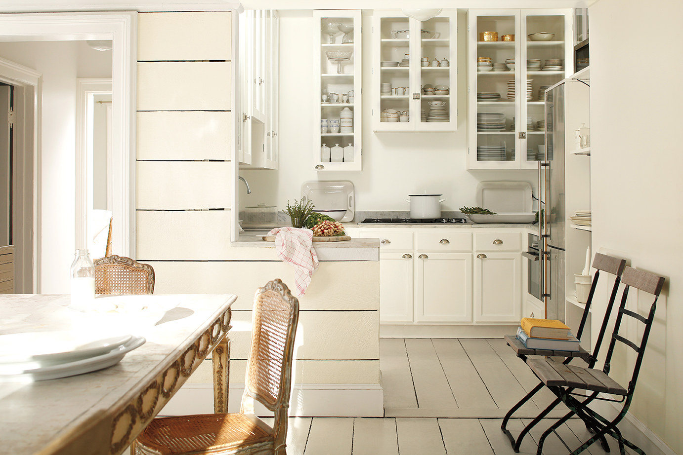
Neutral colors, on the other hand, may not pop with personality or excitement, but neither do they leave a prospective buyer thinking “repaint, repaint, repaint” as she walks from room to room to room.

On the other hand, touring homes with neutral colors, I found myself saying:  “We could put some color in this room down the line, but,” (and here’s the money-line), “but, we can move in with it just like it is.”

Repainting a room, in reality, is not a big project, but that doesn’t stop many people from thinking of it has a huge undertaking. When you fill your “For Sale” home with color, many prospective buyers walk out with an idea that a lot of work and expense is required before the home will be ready for their stuff. When you paint with neutrals, the home is move-in ready.

2.  Color Is Personal

Neutral, on the other hand, allows for multiple personalities (in a good way). Color reflects our personality, our moods. Colors on the wall of a room help to determine the atmosphere of that room–how we feel about it and how we feel in it. When you decorate your “For Sale” home in colors, you are setting the tone for a given space based on how you feel about it, on your personality.

Decorating in neutrals, however, gives the prospective buyers the complete freedom to customize that room to fit their family, their moods, their personality. Remember:  when people go through your home, you want them to feel as if it could be theirs. When you’ve got your personal favorite color combinations spread thickly on every wall, it becomes a little harder for folks to picture themselves in your home. Neutrals on the walls allows the many folks with many different personalities who tour your home to each potentially picture it as theirs.

3.  Colors On the Wall Present a Finished Work

Neutrals provide a blank canvas to work on. Don’t assume that neutral colors are boring and that using them means your home won’t have any appeal. You can still introduce color and flair to your decorating through the use of accessories. This is perfect because it shows that your home provides an interesting setting, full of color and life. However, prospective buyers immediately realize that when those items are removed, they’ve got a blank canvas to put their own mark on.

My wife and I saw this over and over. Certain homes we toured had neutral walls and colorful accessories–and while we maybe weren’t interested in the colors used, we spent many nights dreaming about how we could bring our colors into that home in accessories and furniture we bought, painted, or brought with us.

We weren’t thinking about the work of repainting rooms. We were thinking instead about moving in and buying new decor that would help us spread our colors and personality through the home should we buy it. There is a night-and-day difference between those two modes of thinking. If you, as a seller, have people leave your home after a walk-through dreaming about the new decor they can purchase or bring with them, you’re way ahead of the seller who’s prospective buyers leave wondering how much it’s going to cost to cover the lime green bathroom walls.

Of course, color works when selling homes.  Of course, neutrals aren’t the only way to go.  However, I bring up these points because I was struck over and over by the ease with which I could picture my family and I living in the homes that were largely neutral.  Conversely, I was surprised how often we left the homes full of trendy colors and said things like “that house looked cool, but it definitely didn’t fit our personality.”

It’s color–it can be covered over.  And I know that.  Still, I found it hard to overcome the natural tendency to see someone else’s color scheme as theirs, not mine.

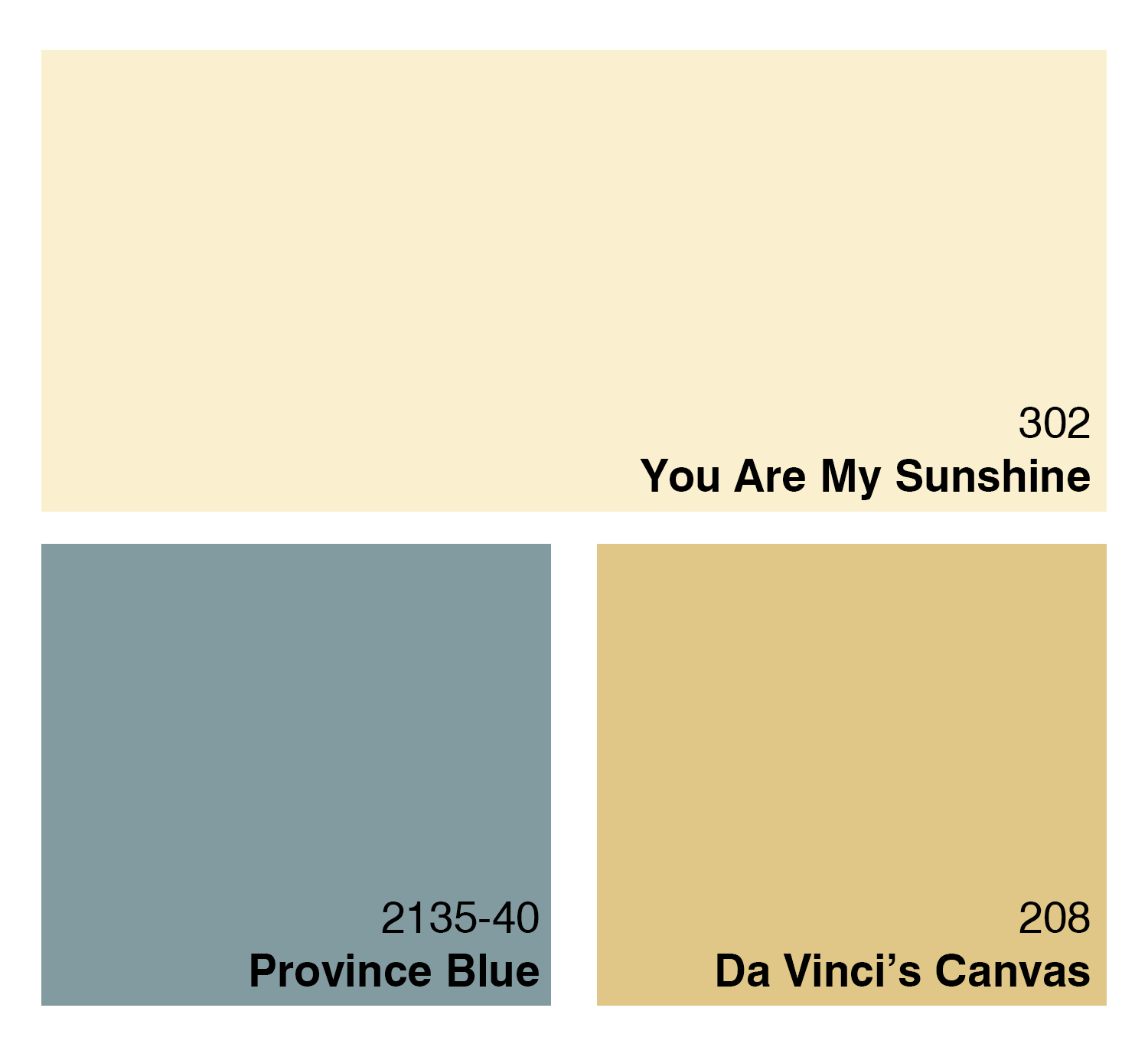
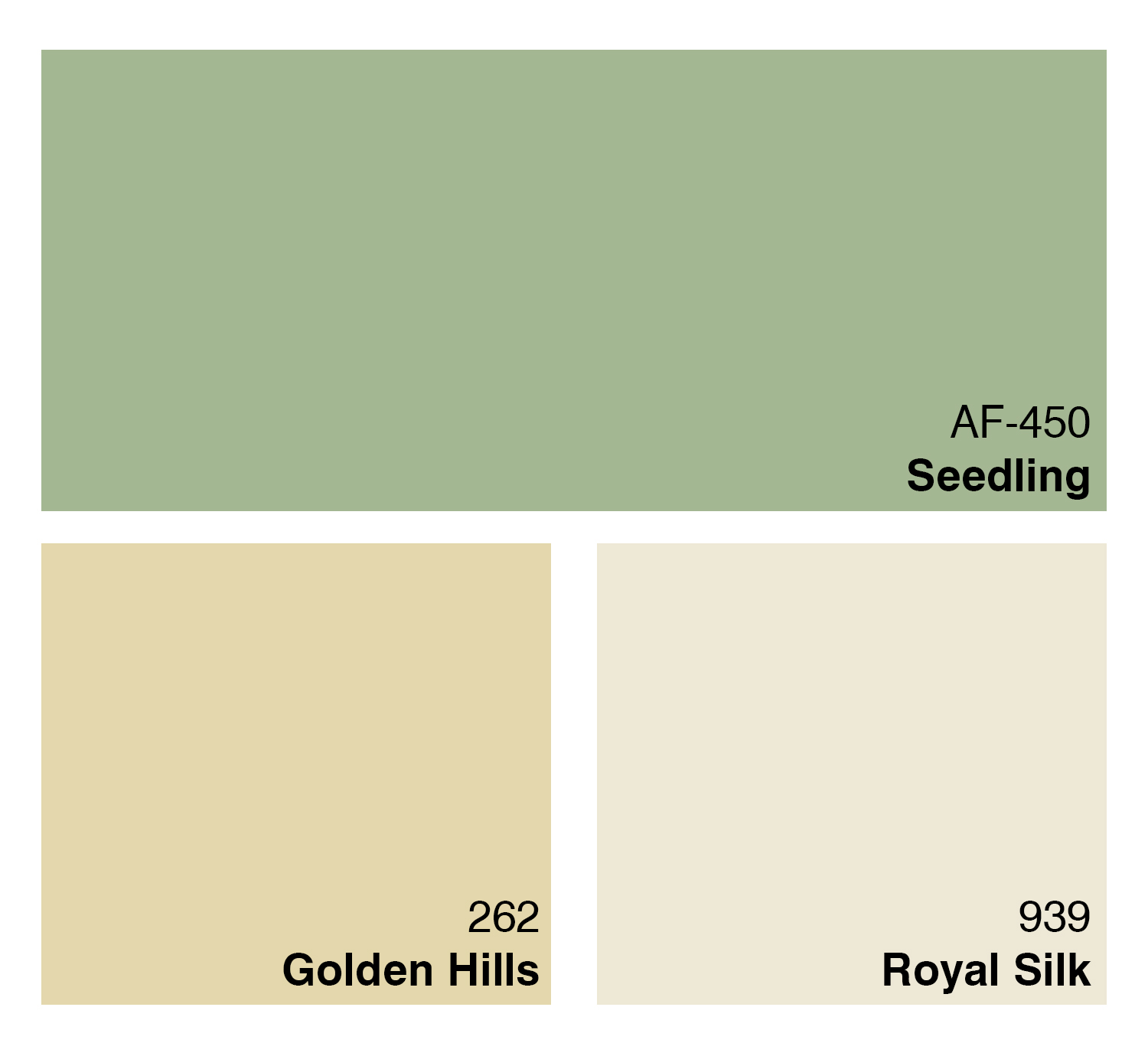
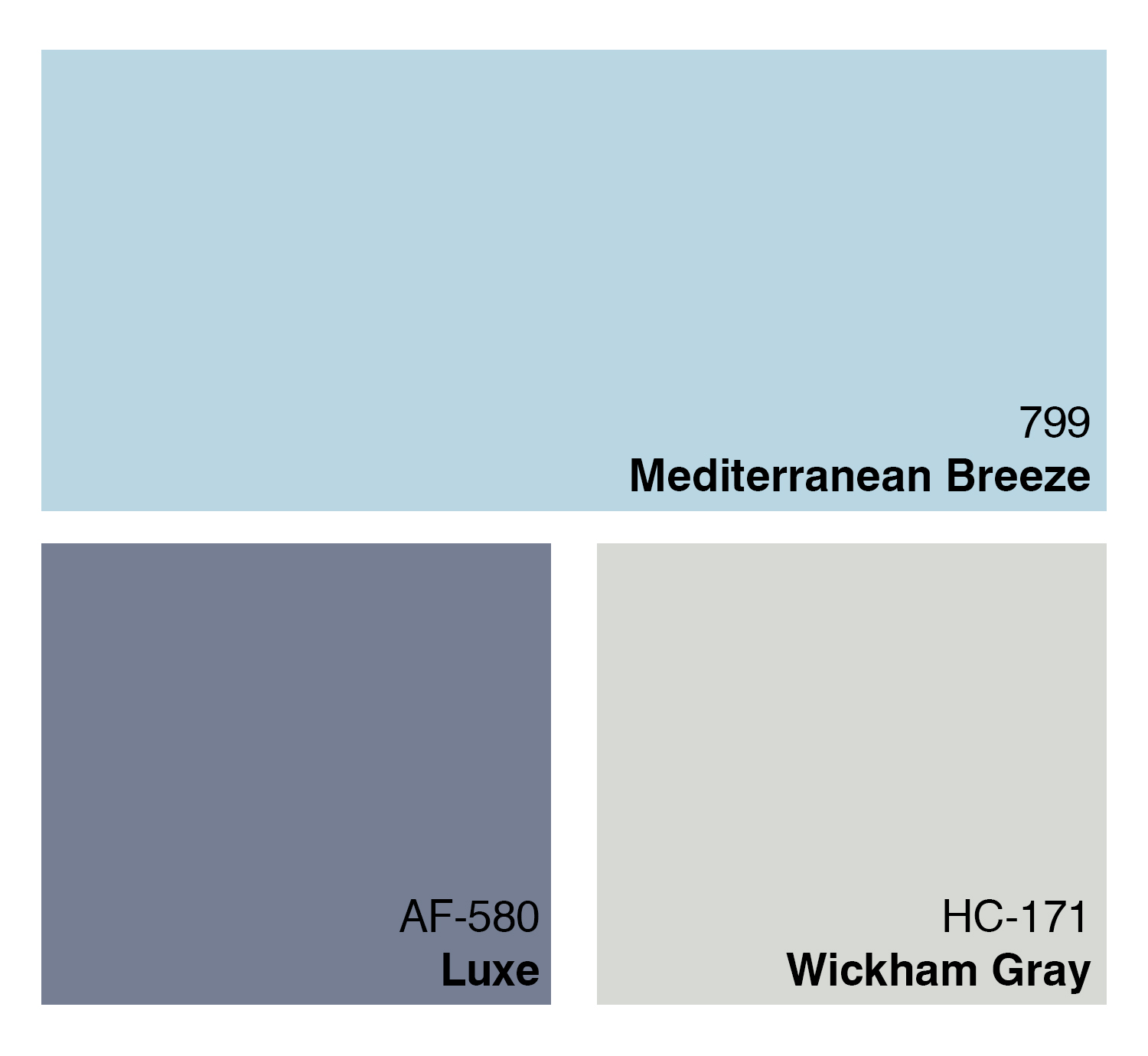
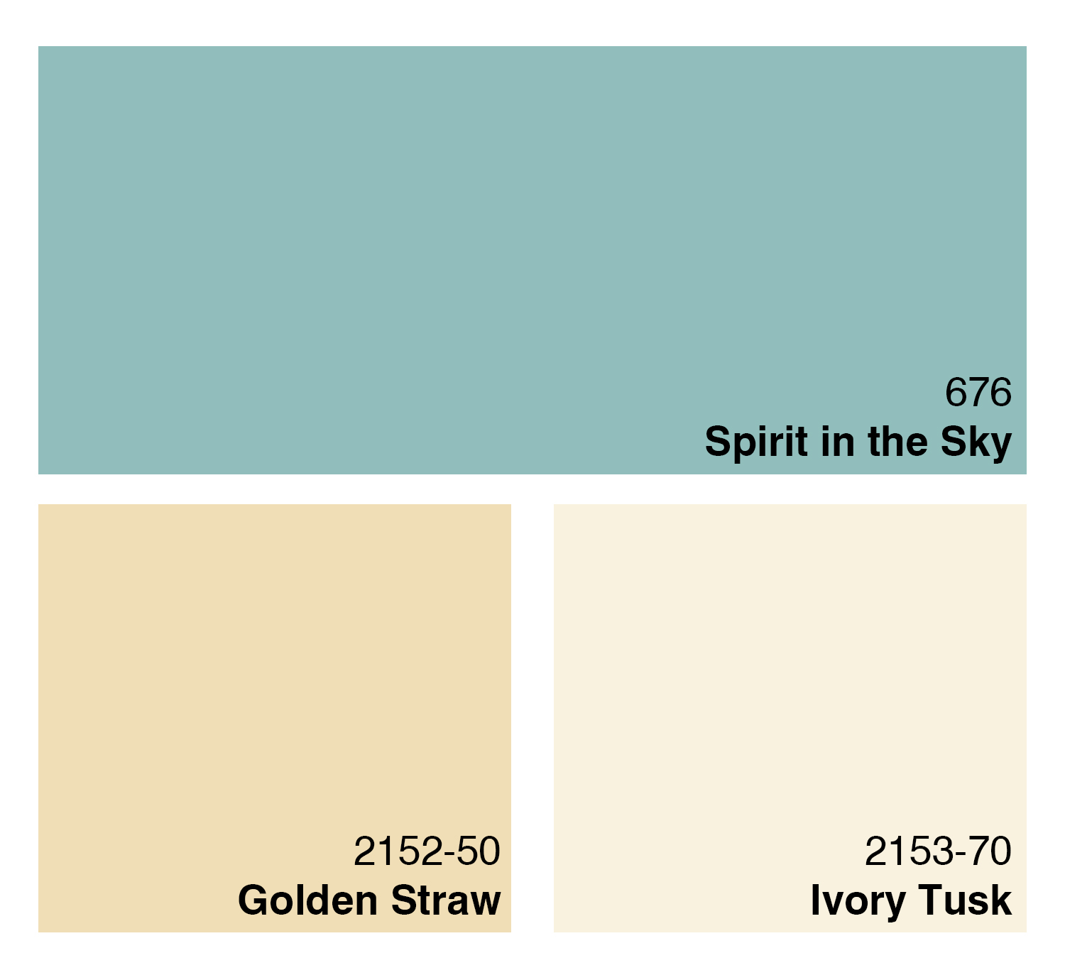
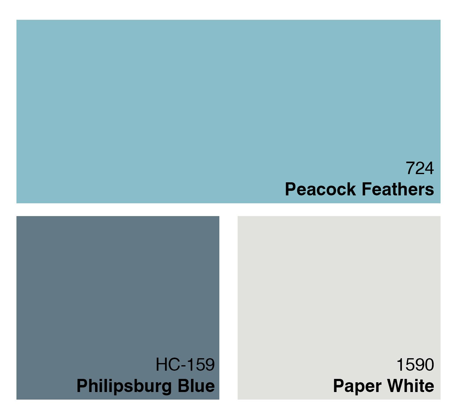
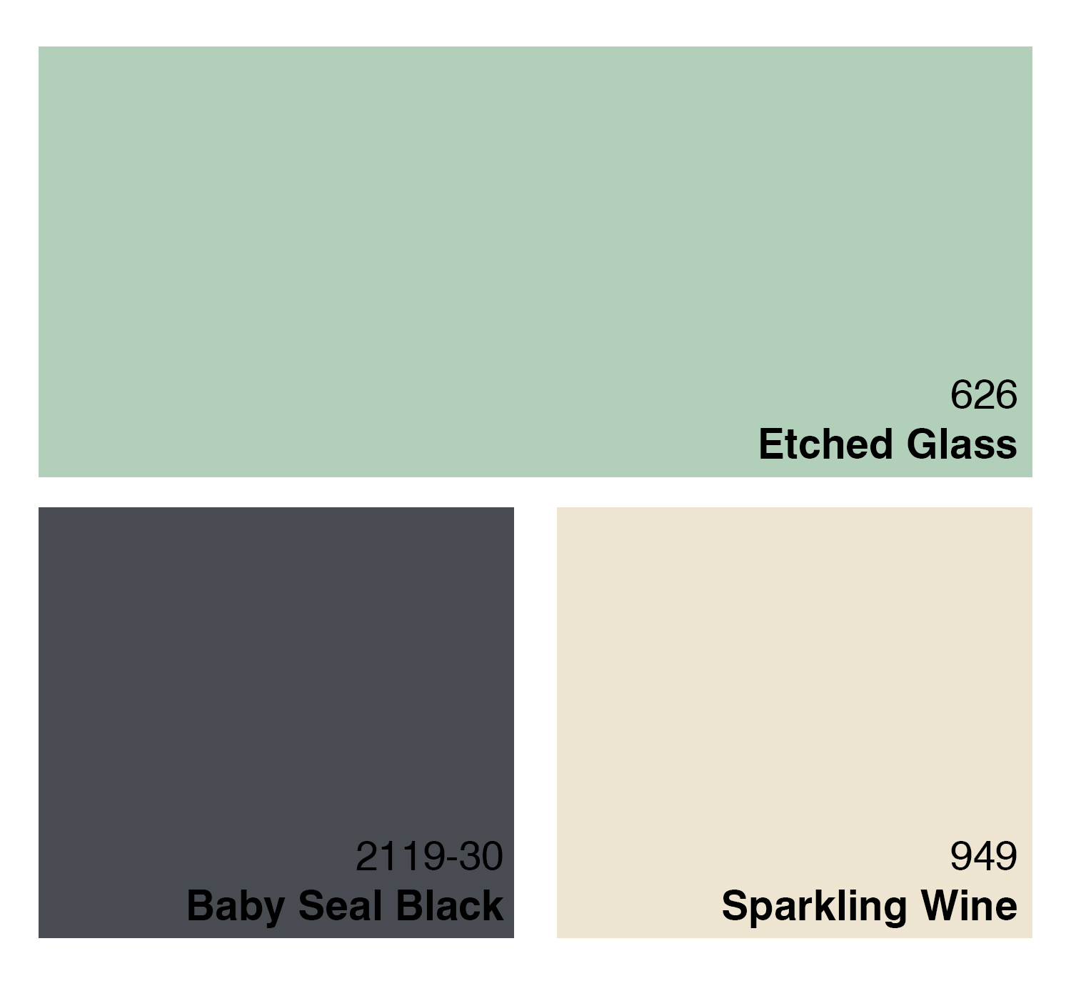
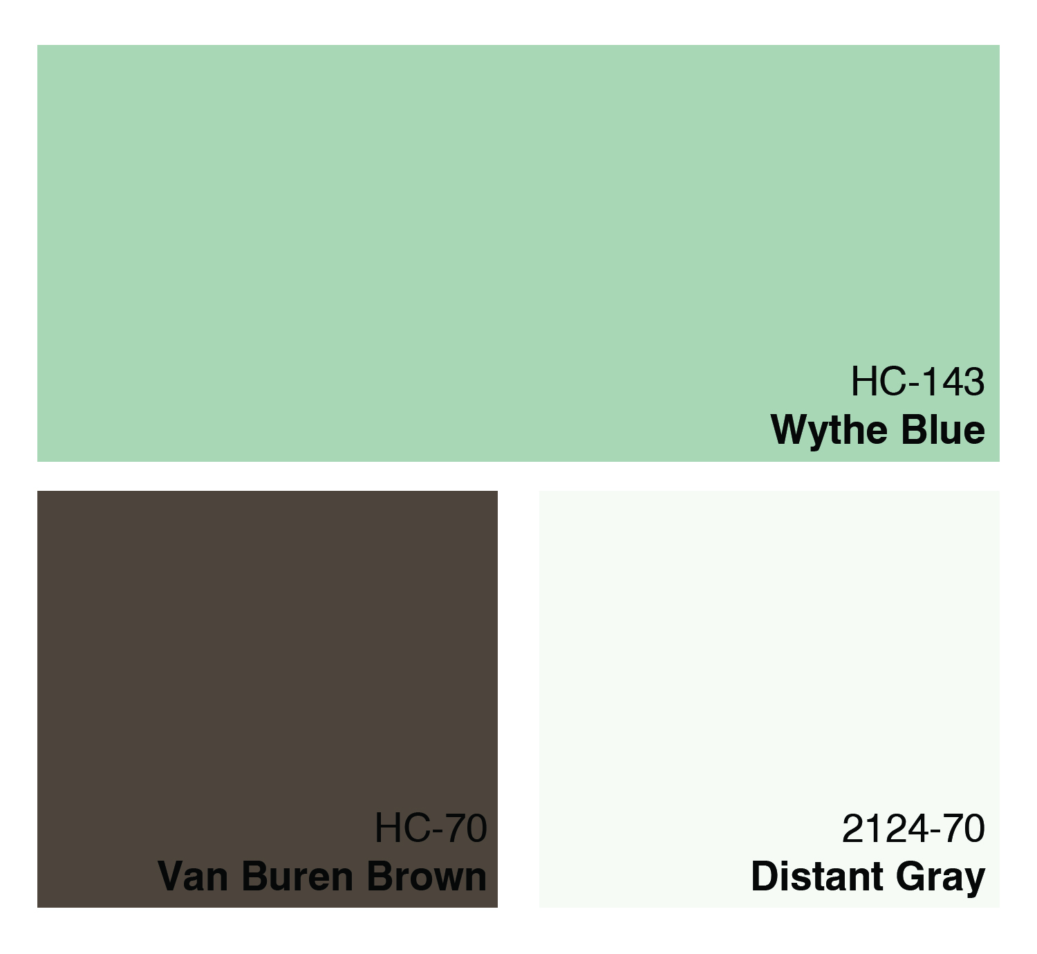
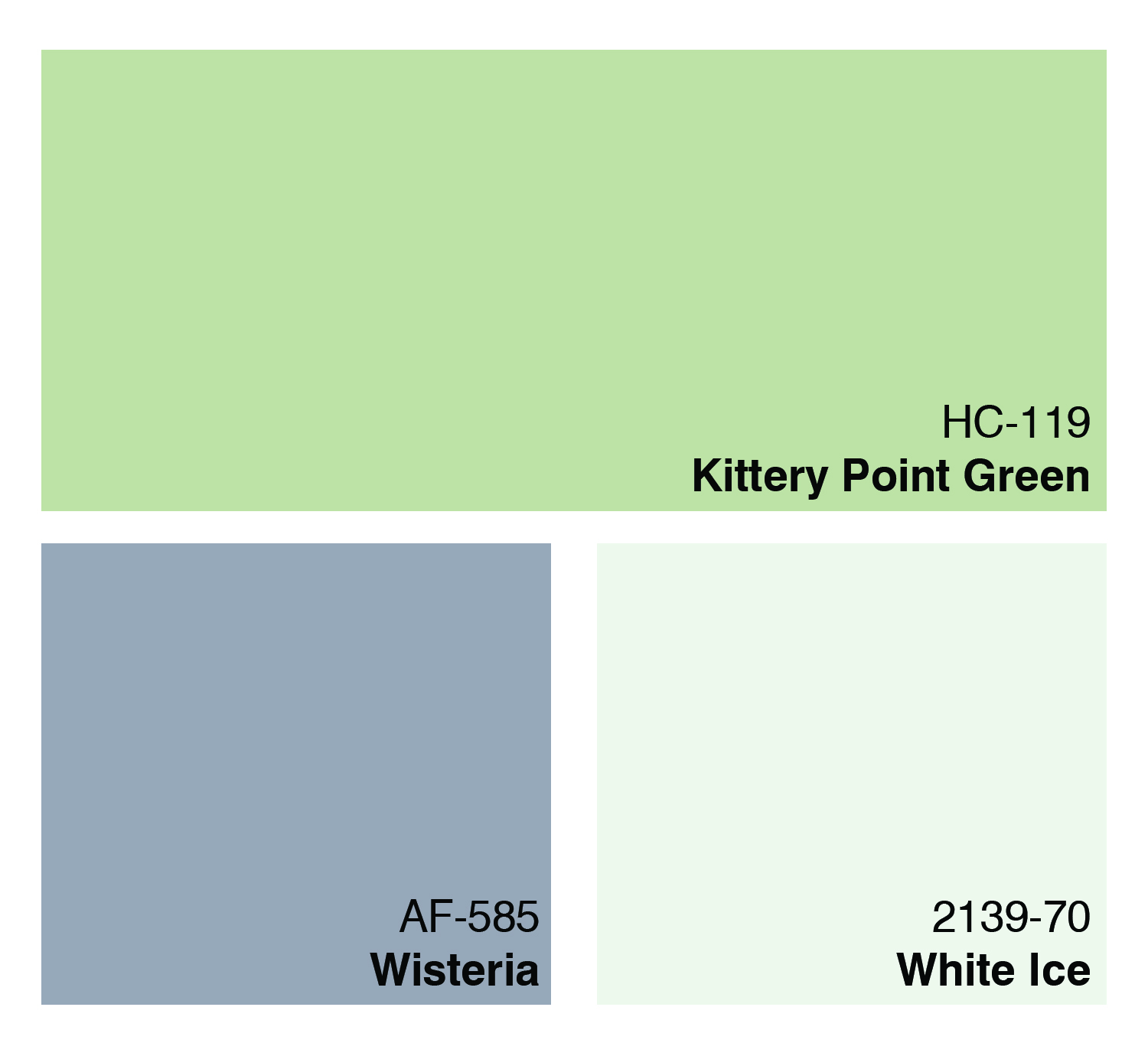
Bottom line?  Think about it!  If you’re selling your home and you’re repainting, why not opt for some neutral tones? It might help you get your house off the market quicker!
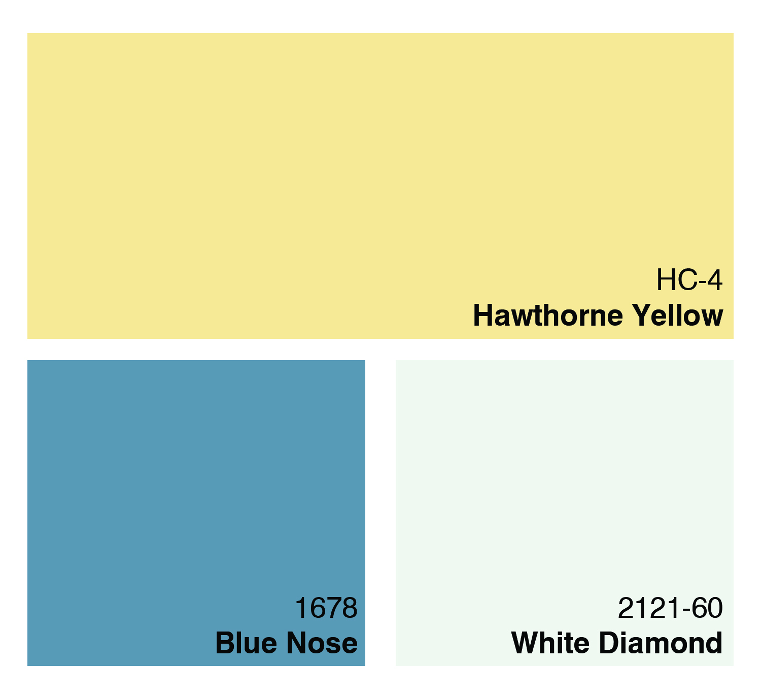
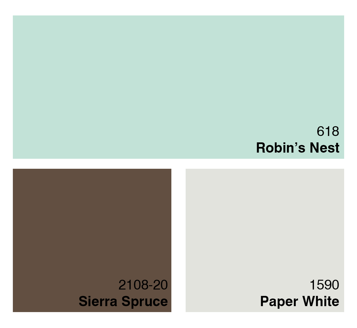