Making New Wood Look Old

If you spend any time at all on Pinterest, you’ve definitely seen any number of home projects involving reclaimed wood. We see old barn wood boards being used as accent walls and headboards, backsplashes and even light fixtures. It’s everywhere. And there’s good reason! It’s a beautiful look that works in almost any setting. Even a sleek, modern kitchen can benefit from the gray, natural tones and textures of a barn wood light fixture.

Unfortunately, finding old, weathered wood (at a decent price) isn’t always easy. But the good news is you can make your own! And it’s an incredibly fun project!

Not Just Color!

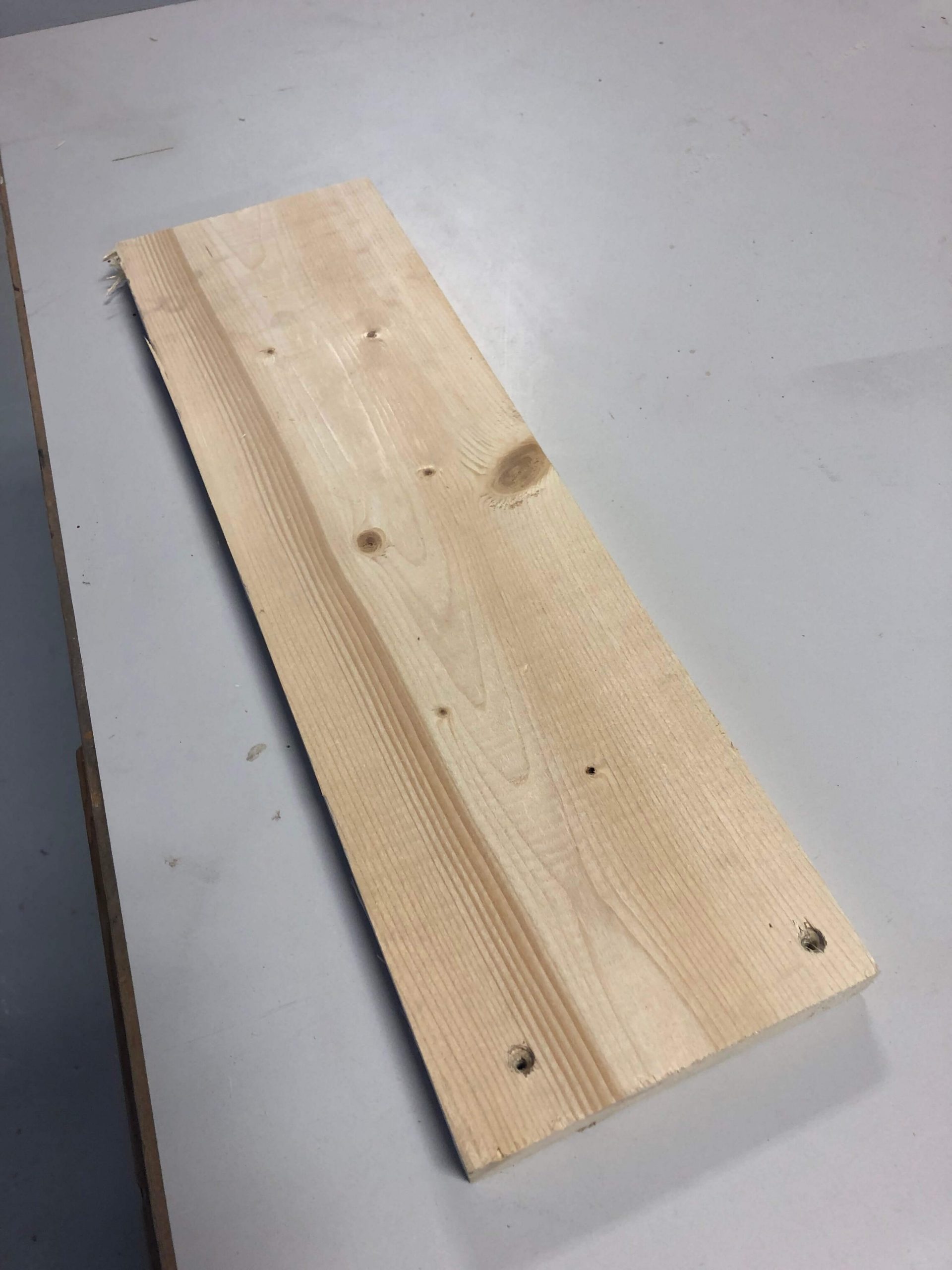
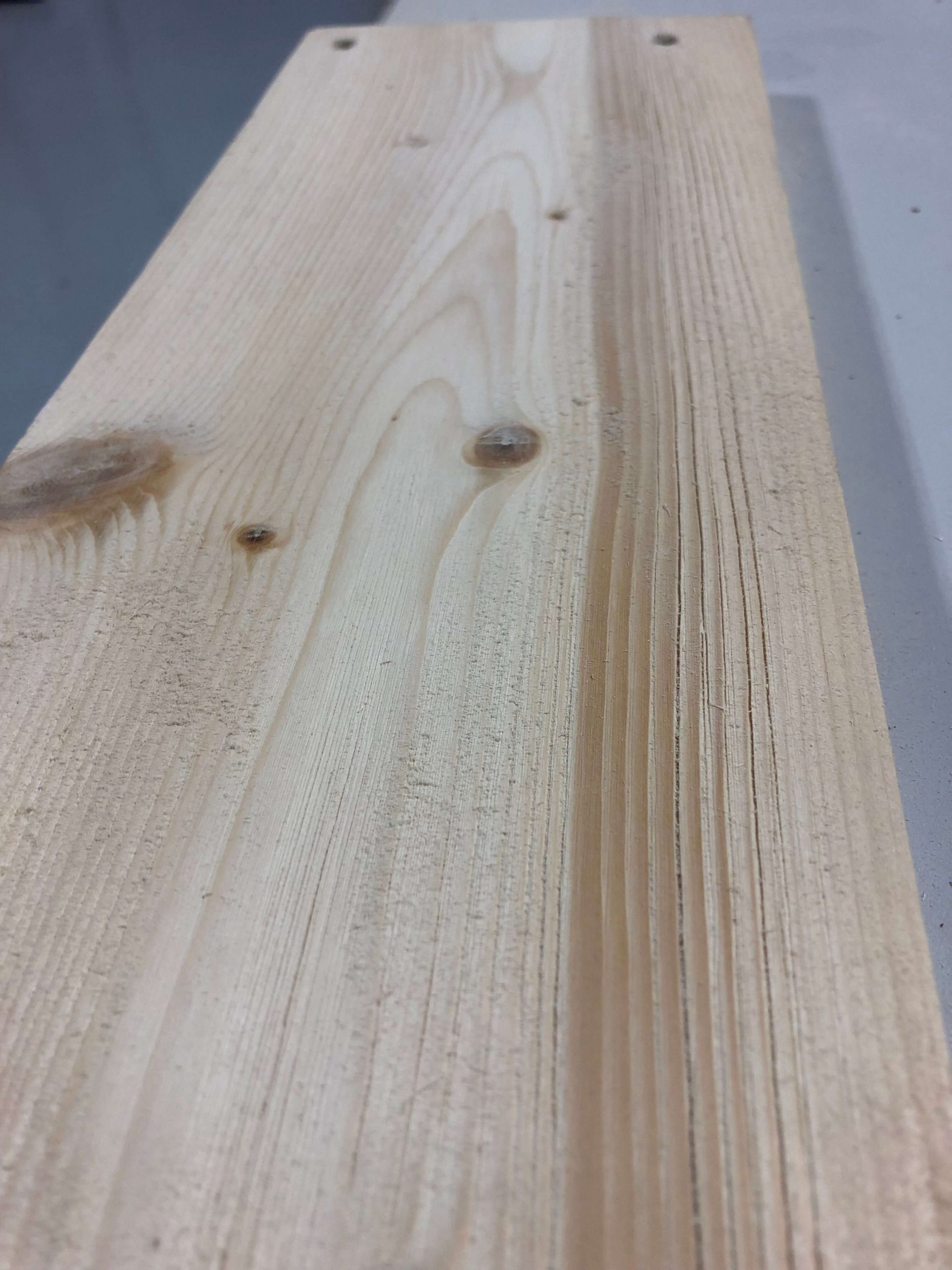
If you look at a piece of authentic barn wood that’s naturally aged outside, you’ll notice a couple of things: the wood usually has a gray, weathered color and the wood has a weathered texture. When aging wood–if you truly want an authentic barn wood look–this physical texture is integral. You can certainly gray or “age” any piece of smooth, pristine wood. But generally, it just ends up looking like a new board that’s been stained. It’s the physical distressing of the wood that gives it character.

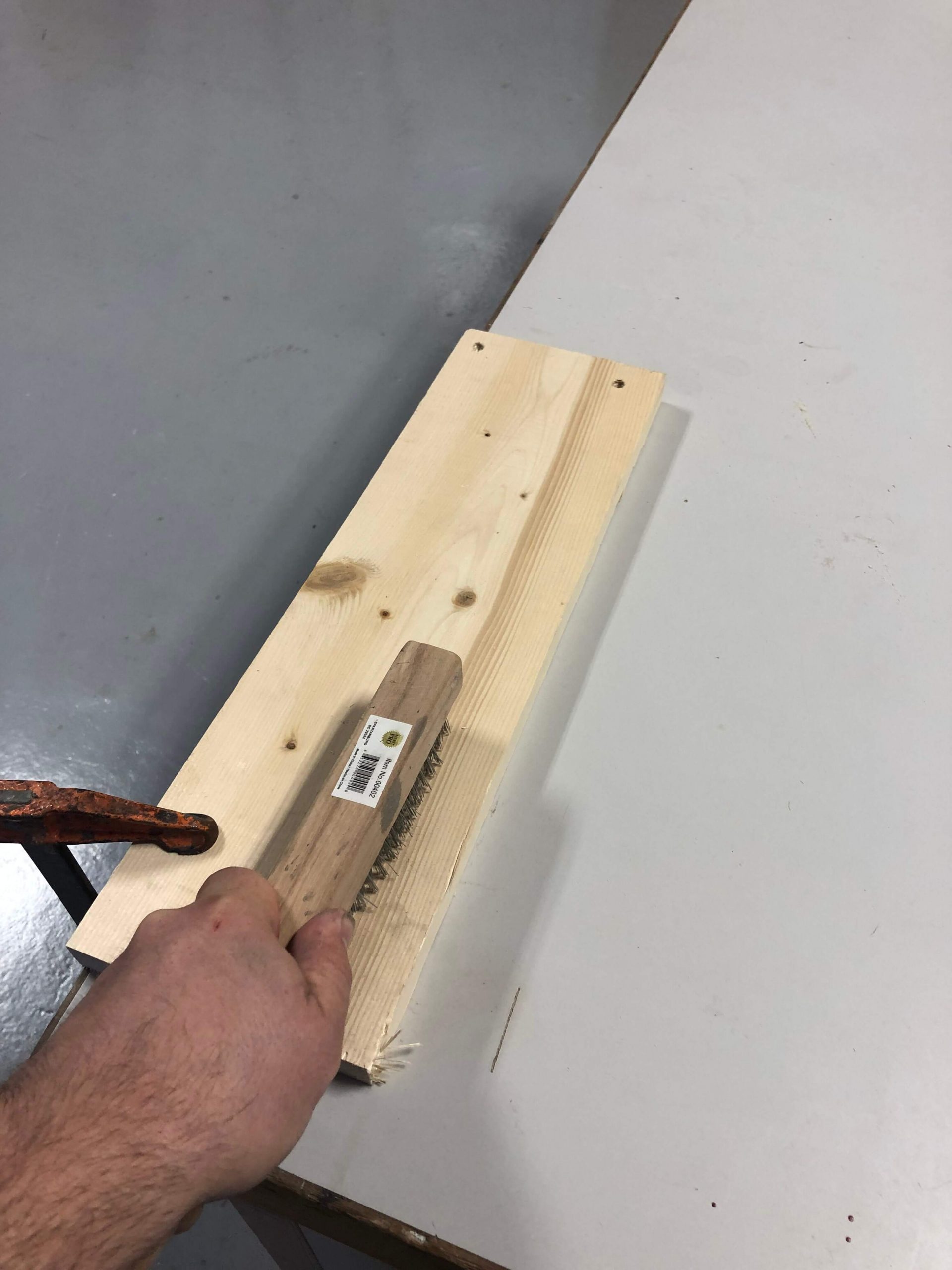
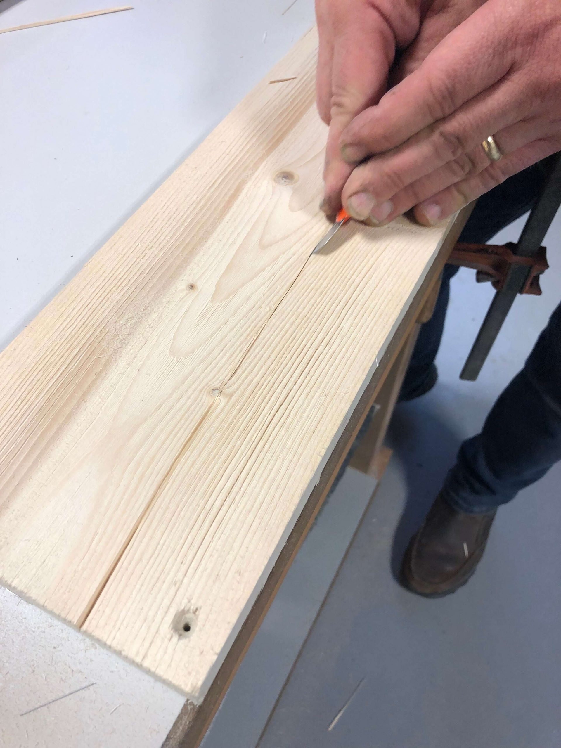
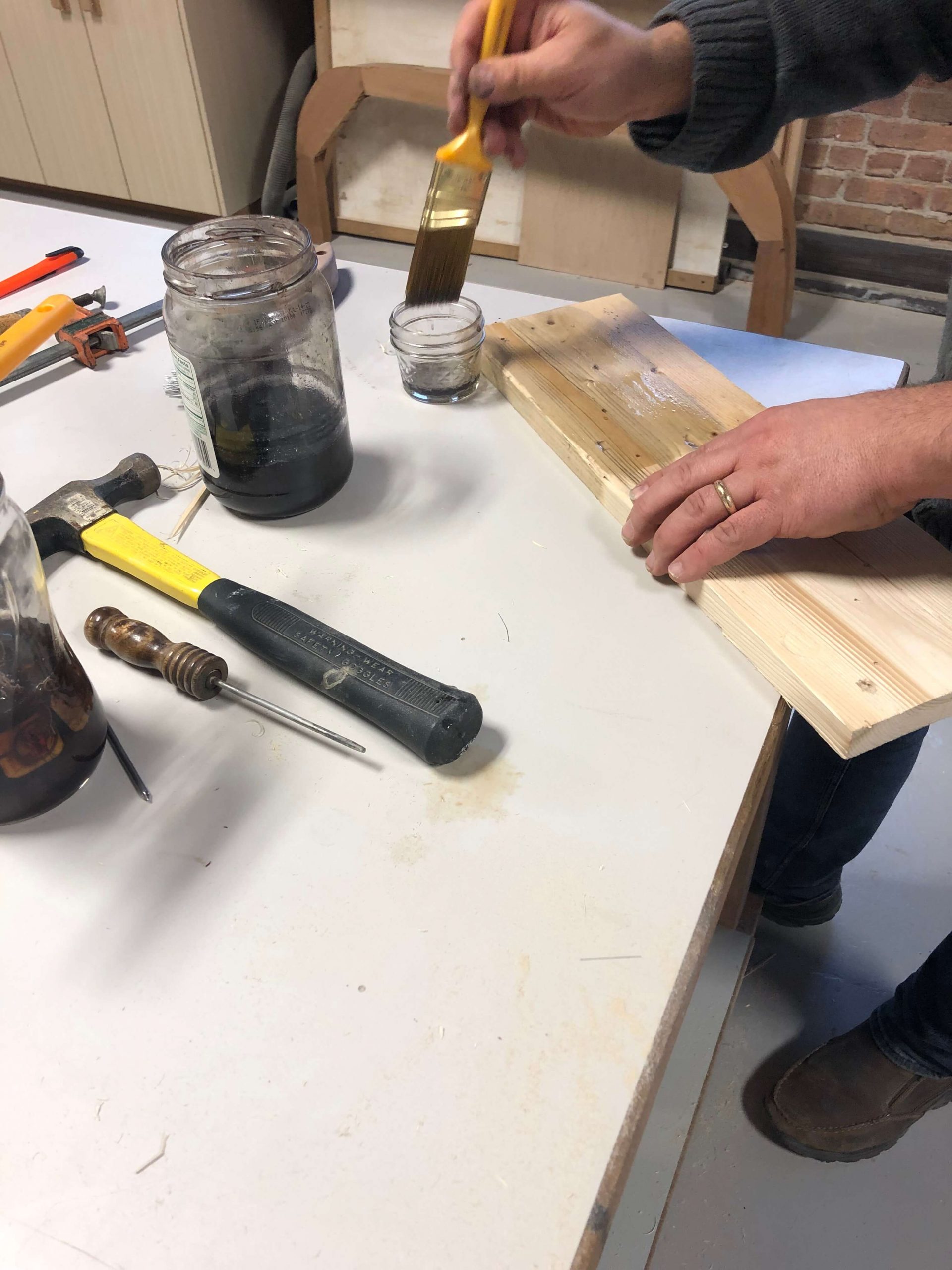
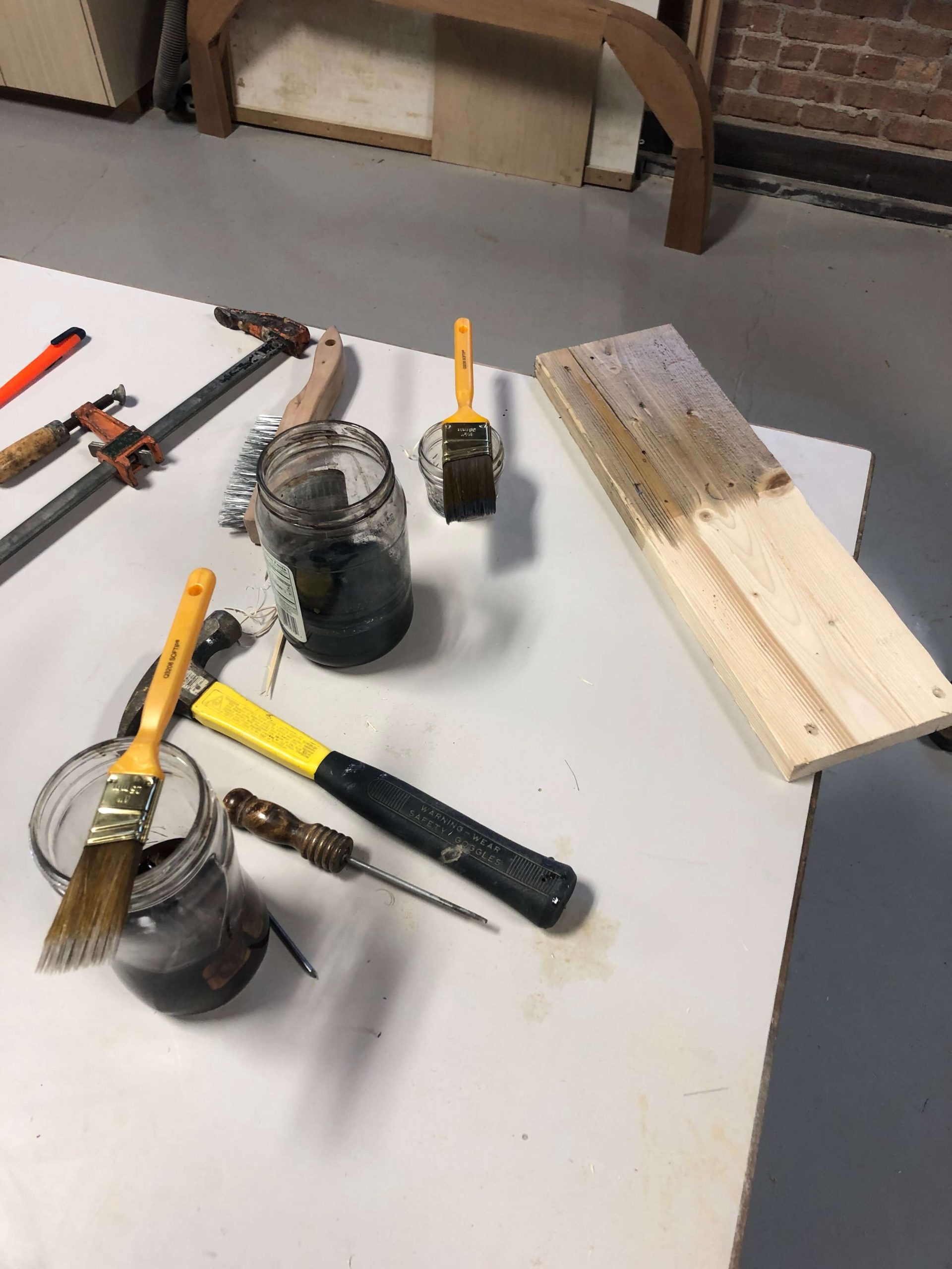
So we recommend starting with a quick distressing of the wood. It’s not a labor intensive process and it can be a lot of fun. You can do everything from putting a wire wheel on a drill or grinder to simply sticking with hand tools. It’s up to you. We found that for our tastes, a simple stiff-bristled wire brush was ideal. We worked on pine planks and found that by running the wire brush over the wood in the direction of the grain, we very quickly were able to produce a worn and weathered look.

A SIMPLE TIP:

  • Use a clamp to secure the board to your work bench. Then you can put both hands on the brush and get a little more leverage. And, even if the clamp leaves a dent in the wood, it’s no big deal! You’re distressing it anyway.

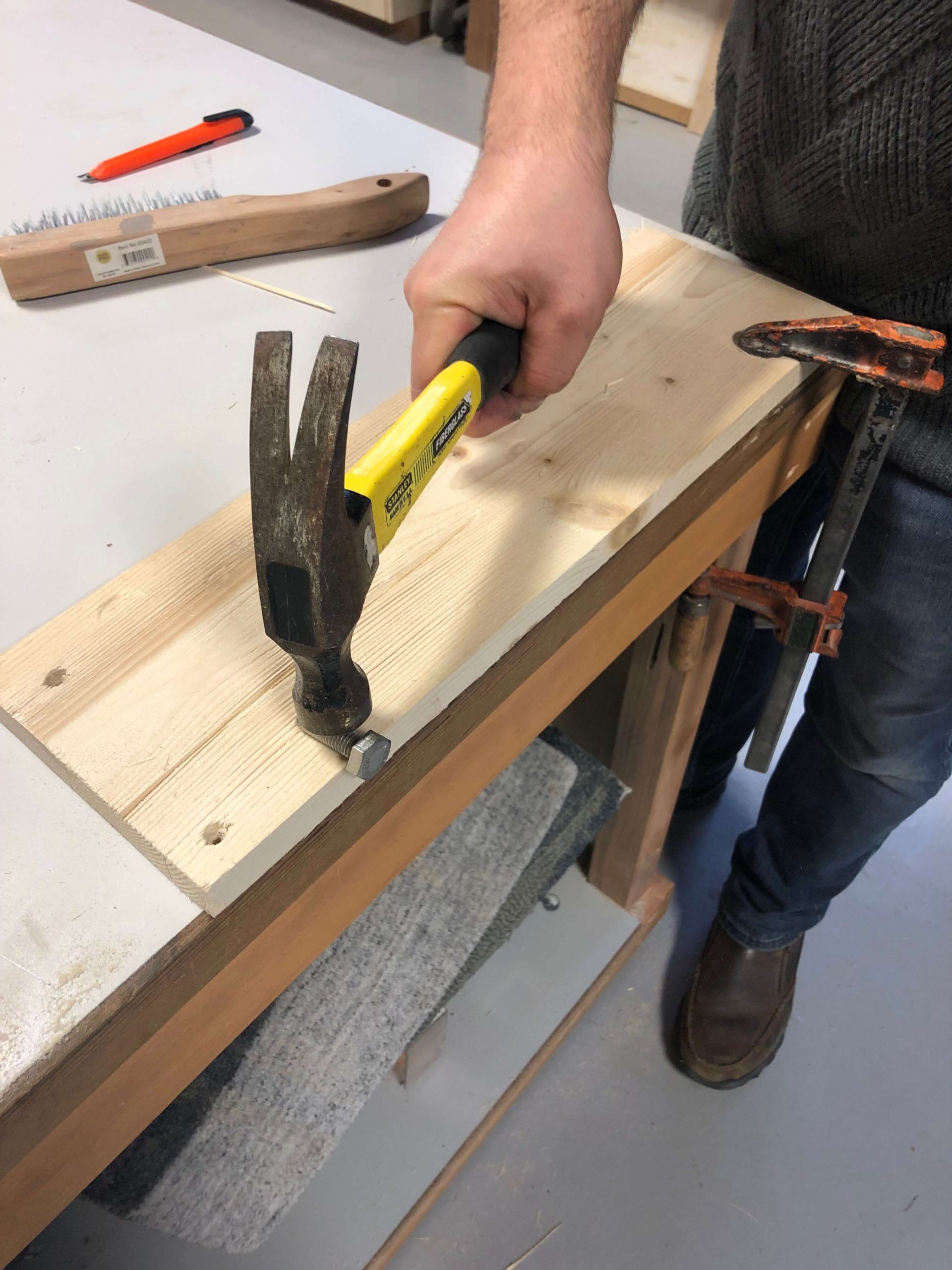
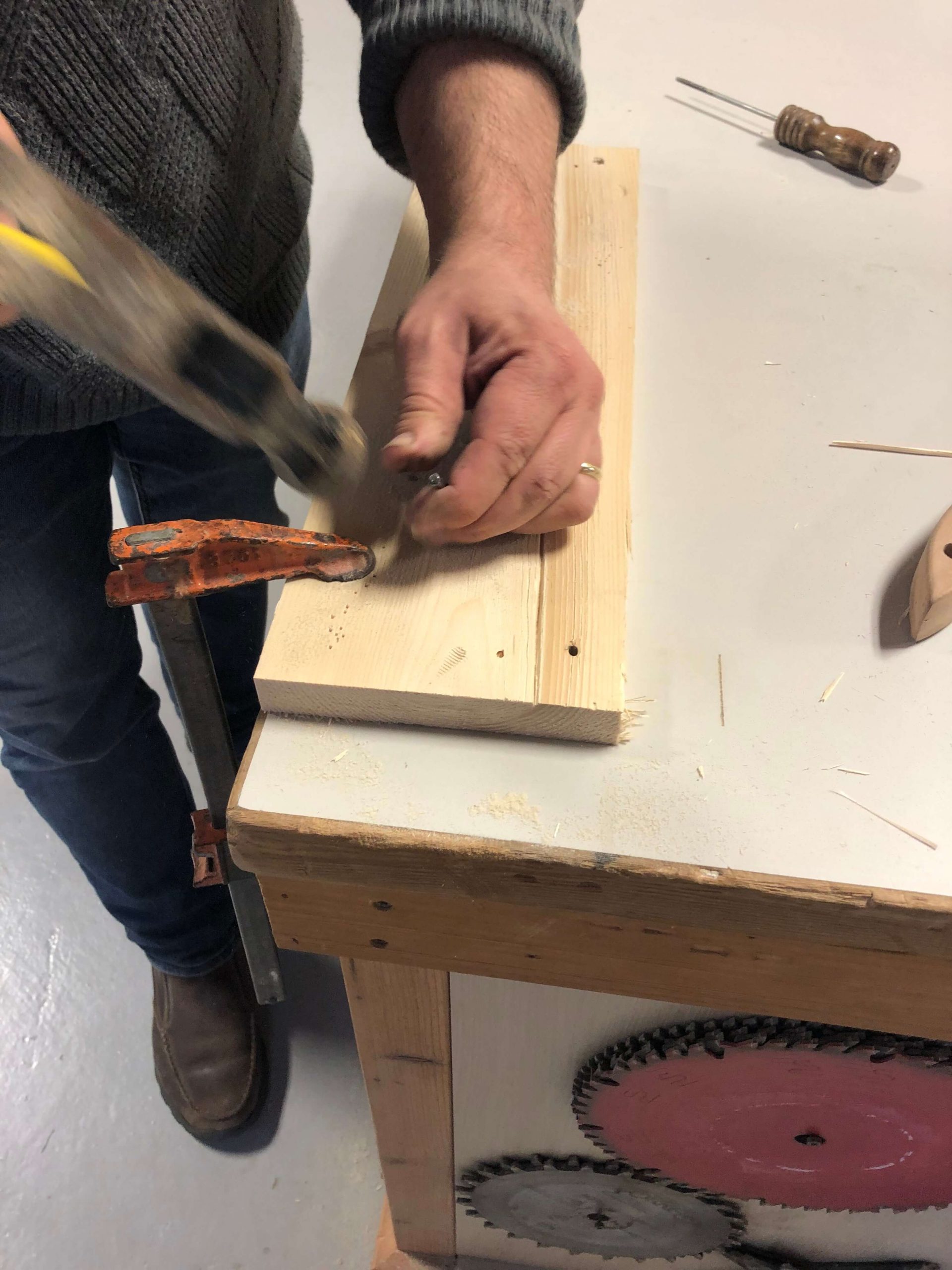
Once we wire brushed the wood, we dinged it up in a number of different ways. Hit it with a hammer, pounded the threads of a bolt into the grain, drove a few nails and pulled them out, and finally poked a few holes to look like worm holes.

Get creative. There are no rules here! Well. That’s not true. There is one rule: Know When To Quit! This is so important. When the wood looks good, quit. Sometimes we keep going thinking that we will make it look older and older with all our different distressing methods. However, what actually happens is that the piece begins to look fake! So quit when you’re ahead.

Aging Solution 1: Stain

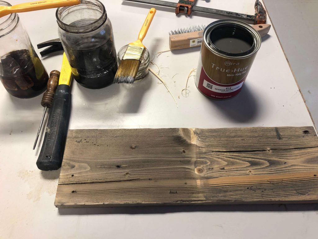
Once you’ve got the wood distressed, it’s time to add color and give it that “I’ve-been-out-in-the-weather-for-50-years” look! And there are a number of different ways to do this. The first we’ll look at is to use regular wood stain. We’ve got a formula for a darker and a lighter “weathered gray”. It’s something that looked good on the pine we were staining and it gave the wood a bit of that gray, washed out look. It’s simply a typical wood stain that you brush or rag onto the wood and then  rag off, depending on the color you want to achieve.

It’s definitely a bit of a trial and error process, so use some scrap pieces of wood and sample away! If you are coming to a RepcoLite for the stain, bring some samples of the wood you’ll be working on and we can mix up your quart, sample the wood, and adjust the color if necessary! And always remember to sample the stain if you’re going to switch to another type of wood. A stain that looks one way on one species of wood can look entirely different on another!

When you’re all done and the wood has dried (unless you’re going to add paint or other effects), we recommend top coating with a polyurethane. The number of coats and the finish you choose depends on the overall look you want to achieve.

BENEFITS OF THIS METHOD: 

  • A generally even color on all planks
  • Consistent color on planks even if one is stained 4 days before another
  • No waiting! You get your color instantly and you don’t have to wait several days until your solution (see below) is ready.

DOWNSIDE TO USING THIS METHOD:

  • A generally even color on all planks (some of the natural variations of weathered wood isn’t present)
  • The harder grain in the wood resists the stain to some extent and you get more contrast in the finished product.

Aging Solution 2: Vinegar and Steel Wool

The second aging method is popular all over the internet: steel wool and vinegar. We spent some time testing this method and here’s what we found works best (and will hopefully help you avoid some of the poor results other people have had). First thing, is to start with #0000 steel wool. Wash it with dish soap to remove any oils that might slow down the chemical reaction when you mix it with the vinegar. After you’ve cleaned it and wrung the water out of it, cut it up into smaller pieces and toss them in a container. Then half-fill (or so) the container with vinegar. We used white distilled vinegar, but apple cider vinegar seems to work as well (though possibly producing slightly different color results).

Anyway, once you’ve filled the container with steel wool and vinegar, put the lid on it (after popping some holes in the lid so gasses can escape), and let it sit for a day, two days, three days, or more. The longer it sits the stronger it becomes.

When you’re ready to try the process, brew a cup of strong tea (8-10 bags of cheap tea in a cup). Take the tea and brush it onto your distressed wood. You can let it dry (which seems to produce darker end results), or you can brush the vinegar/steel wool solution over the wet tea. Either way works–the important thing to understand is that the tea and the vinegar solution must be applied in different steps! Once you’ve done that, you will not have immediate results. Over the next 5-20 minutes, the wood will dramatically age right before your eyes!

One quick note about the tea: It’s not mentioned or recommended in every post about this project, but we found that it was essential if you really want a darker, weathered gray end product. The people who’ve tried the process online and didn’t like the results generally used ONLY the vinegar and steel wool solution. That certainly works, but it’s not as dark or rich as they were hoping. Here’s why: The vinegar and steel wool mixture reacts with tannins in the wood. However, by adding the tea you infuse the wood with even more tannins.

SOME TIPS

  • Be sure to strain your vinegar and steel wool mixture by running it through a coffee filter or a paint strainer to remove the small pieces of steel wool
  • Be sure to TEST, TEST, TEST! Try different methods, mix the tea stronger and weaker. Brush it on and let it dry. Apply the vinegar solution immediately. Try different methods until you produce results you like!

BENEFITS OF THIS METHOD: 

  • Very random, very natural aging results
  • Looks incredibly authentic

DOWNSIDE TO USING THIS METHOD:

  • Slower process because of the wait time necessary for the solution to become ready
  • Much more difficult to produce even and consistent results. The longer the mix sits, the darker it becomes when you use it.
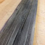
The Comparison

Here’s a look at what we came up with using both methods side by side. The stain is on the right, the vinegar/steel wool and tea is on the left. Each side has it’s pros and cons. And largely, it depends on personal preference and what look you’re going for.

Just the Beginning, Young Grasshopper…

Try this project! Try it! We know that if you do, it will get your creative juices flowing. Once you see brand new, pristine boards become old and weathered, you’ll be thinking of ways to use them in your home. Or, if you’re like us, you’ll be brainstorming about other things you can do: you’ll be brushing paint on and sanding it off to create that look of reclaimed wood. Or maybe you’ll come up with something entirely different. We found that using a putty knife to apply simple spackling into all the grooves and the scraping most of it off produced the look of boards holding tenaciously to old layers of white paint. (We’ll cover this in a future post because it turned out so well!) Whatever you do, have fun! It’s a great project and it’s tough to screw it up. We’d love to see what you come up with. Post some pictures of your projects in the comments!

Design and Decor Lessons from Frank Lloyd Wright: Design AND Function!

Last week, I had the opportunity to go through the Meyer May House in Grand Rapids, a home designed by America’s premier architect, Frank Lloyd Wright. And while touring the home is a great way to spend an afternoon, it’s also an experience from which we can draw hundreds of design and decor lessons and inspiration! I wrote in a previous post that one of the lessons I came away with was that it’s OK to buck the trends–OK, but not always easy (as someone pointed out in the comments). If you’d like to read that post, you can find it here.

A second lesson I came away with is this: Strive for Form AND Function! So often when we’re designing a new home, planning a remodel, or simply redecorating, we run into situations where we find ourselves believing that we have to select one or the other: form over function OR function over form. Occasionally we buy into the idea that this room or that architectural element in our home is either going to look good OR be functional. One or the other. Either we sacrifice looks for practicality, or we sacrifice function for beauty.

Frank Lloyd Wright refused to do that. Everything he designed took into account both design and function! He never compromised one for the other. It was always a marriage of the two.

For example, in the picture above, you’ll see a load bearing wall between the dining room and the living room. It’s a necessary architectural element. And an unfortunate one at that: a wall that interrupts the open floor plan of the Meyer May House. However, rather than willingly sacrifice form for function, Wright has the wall painted with a beautiful mural that mirrors the flowers and natural beauty that pours in through the living room windows. The end result is an element that adds beauty and design to the home while at the same time performing its necessary function! A perfect marriage.

Also, the foundations of all the other houses in the neighborhood are standard cinder block foundations. Wright hated that look. A foundation is necessary, of course, but it that doesn’t mean it needs to be ugly or plain. And so the foundation of the Meyer May house actually accentuates the overall design of the house. It’s a functional element that actually adds to the design. Form and function once again.

And so in our homes we should never resign ourselves to having to live with certain architectural elements that are less appealing than we’d like simply because “we have to have them”. Get creative and find ways to bring beauty even to these areas. (And paint’s a great place to start!)

For example, I have an exposed steel rafter that runs across my living room ceiling. It’s an architectural element I don’t particularly enjoy! But, rather than leave it painted black and boring, I decided to get creative. I painted it with a metallic paint and then installed LED lighting across it. Suddenly the element that detracted from the look of my living room became something of a conversation starter, adding ambiance and even beauty.

So never willingly give up form for function. You can have both! And don’t forget that it works the other way as well. Don’t create beauty with limited (or no) function.

A great example of this is the dining room table in the Meyer May House. It’s a beautiful table that can be lengthened or shortened as necessary to accommodate the May’s guests. What makes the table somewhat unique are the pillars with electric lights that are affixed to the four corners. These pillars make up a integral aspect of the table’s overall beauty and design. However, they’re not just beautiful. They’re also incredibly functional.

Here’s why: in typical situations, electric lights set up in this manner would impose a serious limit on the function of the table due to the cords. Sure, the cords could be hidden in the columns, but what about when the table had to be lengthened or shortened for a dinner party? The columns are affixed to the table. At some point, the cords would be exposed, right? And that would severely limit both the beauty and the function of those attached lights.

Wright wasn’t willing to make the compromise, so he designed a table that somehow can be lengthened and shortened while still keeping the electrical cords powering the lights in the pillars from being exposed.

Creativity, brilliance, design, and planning can overcome many obstacles! Remember that in your decorating! Few of us are as brilliant as Frank Lloyd Wright, but we can still come up with solutions to keep our homes and our rooms beautiful and functional!

Everyday Items into Easy Christmas Decor!

Yet another guest post from our Super-Hero Decorator Friend, the Purple Stiletto!

I’m dreaming of a white…and cheap….Christmas. The Purple Stiletto has been spending a good deal of time in the Craft Cave (with Christmas music blasting), trying to find the most inexpensive ways to decorate for Christmas. Now, being that this is the Purple Stiletto’s favorite time of year, it is important to have the feeling of Christmas in EVERY room. And that can get quite expensive! That is where common household items and a little bit of creative juice (and
eggnog!) come in handy.

Now, I will say, there had been ideas spinning in my head like ballerinas in tutus for quite a while. I started by gathering the items I already owned.

  • Large bowl? Easy!
  • Pitcher? Yup!
  • Hand towels? Ho ho ho!
  • Mason Jars? Thank goodness I made dinner at home last week!
  • Colander? Yes……..but it’s rather big……..and bright silver…… and if I use that, how am I going to make pasta? I can’t go without pasta until after Christmas! Option #2……… Red Ranger to the rescue! He suggested a trip to the thrift store to look for a colander and any other items that may dress up my ordinary household items. These are the reasons I need him!

With a song in our hearts (or at least in my heart!), we arrived at the first thrift store. If we were lucky, it would be our ONLY thrift store stop. We entered the store with much anticipation and were met with the MOTHERLODE! There was Christmas stuff everywhere! We walked from table to table, looking at all of the different knick-knacks and do-dads. Red Ranger found a bag of fake snow for $1 and some reindeer antlers.

And then I spotted it……shiny and copper……the perfect little colander! And a steal at just $5. We paid for our treasures and returned to the Craft Cave.

I started by folding the hand towels so that only the bottom, decorative portion was showing. I had seen something on Pinterest (a favorite Purple Stiletto website for inspiration) that showed toilet paper with greens coming out of the tube. There is just something about putting toilet paper on display in the bathroom that just doesn’t settle well with me. So my solution was to use hand towels, folded, and then rolled into a tube. The Red Ranger cut sprigs of pine that I put in the top of the towel roll. My bathroom was ready for Christmas. How simple could it be?!

IMG_6774

Next, I tackled my large wood bowl. Now, my intent was to fill the bowl with ornaments in varying shades of blue, white and silver. The colors were not a problem but the enormity of the bowl was! I had quite a few ornaments but not enough for such a large bowl. The Purple Stiletto does not let such pesky problems stand in the way! The solution was simple: place a layer of packing peanuts in the bottom and cover with a fabric napkin. I chose silver because it was more likely to blend in, should it be seen in the space between ornaments. Simple, inexpensive and literally minutes to put together. I was on a roll!

IMG_6812

I did the same thing with my shiny new colander, except I added battery powered, LED micro lights. I picked them up at a home improvement store a while back for about $7. I put the end of the lights up through the holes in the bottom of the colander so the battery box was hidden under it. I added vintage Christmas ornaments that my grandma had given me and Voile! A fabulous kitchen decoration!

IMG_6791

Last, Red Ranger and I tackled the mason jars and pitcher that holds beautiful flowers in the spring and summer. Red Ranger filled the mason jars with the fake snow and then cut tiny sprigs of pine. He also cut larger pine boughs to fill the pitcher. He added the tiny sprigs on top of the fake snow and I added tiny blue and silver ornaments for color. I added blue and green ornaments to the pines in the pitcher and a giant green bow. Our work for the day was done. Time to take a page from Santa’s book and have some milk and cookies!

IMG_6806

That night, I sat with a good book by the fireplace and admired my new decorations. They were my everyday items that were suddenly filled with the magic of Christmas. The Purple Stiletto had done it again—turned something boring into something spectacular! The only thing missing is a festive drink!

Easy Mantel Decor or Table Centerpiece (You Decide!)

IMG_6824Another post from our Super-Hero Decorator guest writer, The Purple Stiletto!

Now, the most obvious basic item was the leftover branches from the bottom of my Christmas tree. They were going to add color and texture to the top of the mantel. I also collected together tea lights, small red and silver Christmas bulbs, unused wine glasses, an empty vase, ribbon, a rhinestone buckle and some sparkly red balls.

I started by laying the branches from my Christmas tree on the mantel. I let them drape over the edge just slightly. Next, I filled the vase with red balls, wrapped black ribbon around the middle and secured with a rhinestone buckle. I placed the vase in the center of the greens, then grabbed the wine glasses. I filled the glasses with red and silver Christmas bulbs and then turned upside down. I arranged the glasses among the branches on either side of the vase. I set tea lights on the bases of the wine glasses and stepped back to admire my handiwork. Fabulous! Now THAT was a mantel worthy of my new stocking!

OK, so I know most people would have stopped there, but I still had ideas that were begging to be used. The Purple Stiletto dreams in glitter and color all the time! So what to do with the remaining mantel idea…

I know! The Red Ranger needs a little holiday cheer! Yes, he has a tree (an artificial one with a pine scented car freshener to make it “smell real”) and lights and some Christmas tidbits here and there but he could really use an amazing mantel too!

I loaded some supplies in my car and dashed through the thickening snow. Under the cover of night, while Red Ranger slept with visions of sugar plums and glitter dancing in his head, I snuck in and worked my magic on his exceptionally dull fireplace.

I, again, began with branches from my Christmas tree. I put a beautiful pillar tree candle in the middle of the branches and began working my way along the mantel. I added large wine glasses with pale blue and silver ornaments, flipped them over on either side of the center candle and added tea lights to the base of the glasses. I followed this with medium, white pillar candles along the length of the mantel, alternated with small glass votives. I scattered the remaining blue and silver ornaments among the greens and candles for a little sparkle. I lit the candles and the effect was breathtaking! It was beautiful! Now, the Red Ranger’s house was dressed for the holidays.

I snuck out, grinning to myself and wondering what the Red Ranger was going to think when he woke up…

As the Purple Stiletto settled into her armchair next to the fire with a glass of wine (in a Christmas glass, of course!), she reflected on how amazing it was that such simple objects could completely transform a mantel. The same items could also be used down the center of a table or buffet, but that was for another day. It was time for the Purple Stiletto to kick off her shoes, put her feet up and relax as the scents and scenes of the season washed over her. How was she ever going to make it better next year…

Color Me Home Episode 12: The Keys to a Happier Laundry Room

Did you know that on average, a mom can spend up to 5 months of her life doing laundry per child! On today’s episode, Betsy and Dan talk about how the right color–used in the right spots–can help you make your laundry room a better–possibly even happier–place to be.

Check out all the laundry room ideas we discussed on the episode!


  • The Thrilling (Depressing) News Article about Laundry! (0:48)
  • The Importance of Color in Decorating (4:00)
  • A Brief Overview of the Psychology of Color (4:24)
  • Choose Color Based on Your Goals for the Room: (6:17)
  • Great Colors for Laundry Rooms (6:50)
  • How To Bring Color Into Your Room
    • Put the Color on the Walls (7:30)
      • Tips for Working With Yellow in Your Decorating: (9:32)
    • Put the Color on the Cabinets (12:11)
    • Bring in Unexpected “Pops” of Color (16:22)

Betsy’s Color Recommendations

As we mentioned in the episode, Betsy pulled some Benjamin Moore colors that she thinks would be perfect in a laundry room. We’ve included each color with a combination of other colors recommended by Benjamin Moore. Use these for inspiration for your laundry room. And be sure, as Betsy mentioned in the episode, to come and see the colors in person–the actual chip will probably look quite a bit different from the color you see on the screen!

How to Paint and Distress Crown Royal Bottles

So, what does The Purple Stiletto do with things that most people would throw away? Get creative, of course!

I was presented with some clear glass bottles, the contents having long since been enjoyed. The texture was exactly what I was looking for! This made things interesting and, in some way, made my job easier.

I started by gathering the supplies that I would need for a day of creativity….and waiting for paint to dry.

  • Empty bottles … check!
  • X-I-M primer (because it sticks to glass) … check!
  • Metallic spray (bronze because I’m currently on a dark metallic kick) … check!
  • Latex paint for topcoat (way more than I needed but it was a mistint gallon I changed to suit my mood) … check!
  • Denatured alcohol & rags for distressing … also check!

IMG_6523_web

With my supplies gathered together, I was ready to prime my glass. Now, I should mention that all adhesive residue and grease had been cleaned from the bottles before I started this project. Also, I realized that the lids may not screw back on correctly if the threads had been painted over, so I decided to tape the opening of the bottles to be on the safe side.

IMG_6528_web

While I waited for the primer on the glass to dry, I painted the caps with a very small artist brush and practiced walking around in my stilettos.

IMG_6526_web
After letting the primer COMPLETELY dry on both the bottles and lids (and with aching feet!), I sprayed a couple basecoats of the bronze metallic according to the can instructions. This one specifically said to spray multiple light coats in a one hour window. And, being that it was quite humid when I did this project, it took all of my patience to let the paint dry all the way before moving on to the topcoat.

IMG_6539_web

After some lunch and a short walk with the dog (not in stilettos), my paint was FINALLY dry! I decided to try rolling the latex topcoat. I have done other projects that I brushed out and was not really happy with the brush strokes. This is nothing but a game of trial and error. As I found out, I did not like the rolling any better. Next time, I think I will try spraying.

IMG_6541_web

Two coats of latex (and more waiting) later, it was finally time to see what I could create!

Now, I will say I was going to just use a rag to wipe on the denatured alcohol but too much dry time gives one plenty of time to think of other ways to distress.

In the end, I began with a gray scuff pad lightly dipped in the alcohol. I did not want to put too much on, for fear it would eat away more paint in certain areas than I would like. I alternated between the scuff pad and rags, taking off paint only on the raised areas.

When I was happy with the raised areas, I moved on to the center of the bottle. For this, I tried a couple different techniques. The one I liked the best was cutting through certain areas with a piece of sandpaper. Just as I was getting to the metallic layer, I switched to denatured alcohol and a rag. From there, I was able to “buff out” the rough edges made by the sandpaper and reveal just the right amount of bronze. I could plan the “wear spots.”

IMG_6543_web

The other technique I tried was just continuously wiping the whole center section with alcohol until the bronze wore through. I did not like this as well because I felt it looked a little splotchy when it was done. I much prefer the “planned aging” look!

IMG_6544_web
I left one bottle center plain. I think it could be used for a monogram or initial. The jury is still out on what to use the blank space for. Perhaps the Purple Stiletto symbol (which I have yet to create)? These are the two completed bottles. Just another day’s work. The Purple Stiletto crafts again!

IMG_6545_web